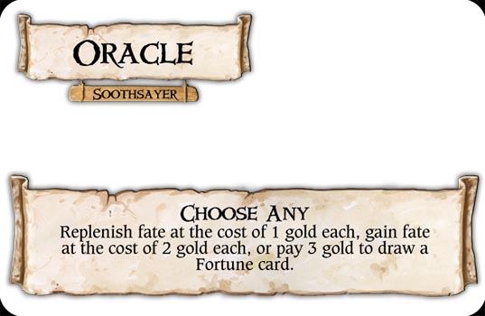
Help me choose which is better:
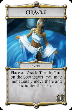
or
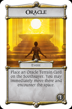
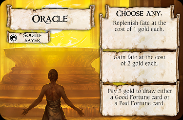
Help me choose which is better:
or
I think I would prefer the first example, with the single scroll.
Also, instead of the second (third) scroll for the Soothsayer, I would add it underneath the bottom scroll. A bit like the "realm effect" scroll on Realm cards.
I think I would prefer the first example, with the single scroll.
Also, instead of the second (third) scroll for the Soothsayer, I would add it underneath the bottom scroll. A bit like the "realm effect" scroll on Realm cards.
That would leave almost no room for artwork, and artwork is important.
It will use no more room than you are doing now.
I didn't understand your meaning. I like that "tavern sign", nice. Can you send it to me?
Meanwhile, take three on the layout.
I didn't explain it very well to be honest ![]()
...and funnily enough I didn't actually save the file! I can remake it though if you'd like.
Email me and I'll send it on to you.
Sent via GK mail ![]()
I'd love to read that mail ![]() But what is GK?
But what is GK?
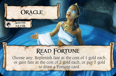
Help me choose which is better:
or
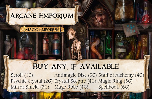
I like the first one better. I might be biased by the blue color though, because blue's my favorite color. I don't like the 3rd set at all; too much of the art is covered. On the first template, if you can make the terrain card text semi-transparent, that might be best. More art is better.
I'd love to read that mail
But what is GK?
The MiM Forums. I still refer to it as Gamekeeper ![]()
All looks great. The illustrations etc as usual are perfect ![]()
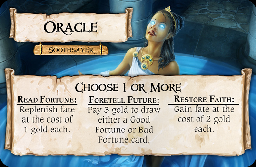
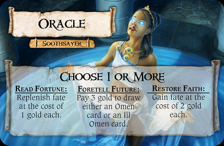
Definitely prefer the blue-coloured illustration Oracle design as you guys did, it fits with the City board art style better. TalismanIsland is right, it definitely looks better with the single-scroll look. But your also right Bludgeon, it loses too much artwork.
Shrinking the scroll more, altering the text layout and possibly moving it a few more milimeteres down, as TalismanIsland suggested, would work to a happy medium I think ![]() I'm intrigued by these 'Fortune' cards
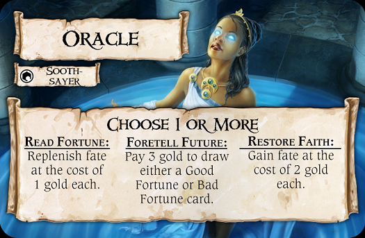
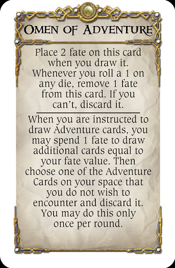
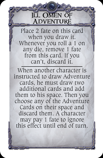
I'm intrigued by these 'Fortune' cards ![]()
Disgaree on the 'tavern sign' on talismanIsland's design though! It is too small for the text on it and doesn't match the art-style or quality of the scroll work. Sorry im picky, having been in the illustration and design profession!
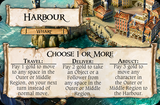
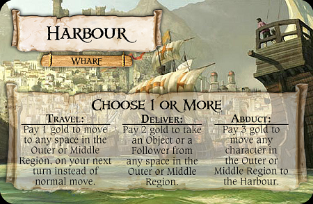
Harbour looks good too, illustration great, though I'm not too sure about some of the the actual options though! Paying to move another character to the harbour. Unless I'm missing something I'm not too sure 'why' you'd want to do that unless you just wanted to upset their game-flow/position, or in reverse your doing them a favour ![]() Plus, I'm not sure how 'realistically' that would all work if it's the former - your meant to be literally just kidnapping them or something!?
Plus, I'm not sure how 'realistically' that would all work if it's the former - your meant to be literally just kidnapping them or something!?
your literally just kidnapping them or something!?
You quite literally are!
Had to chance art btw, old was great but didn't work with bottom frame
I think "tavern sign" is lovely.
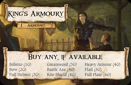
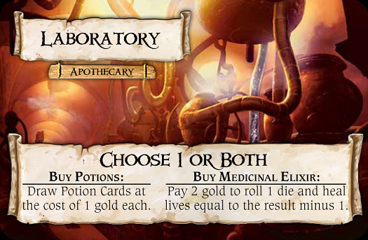
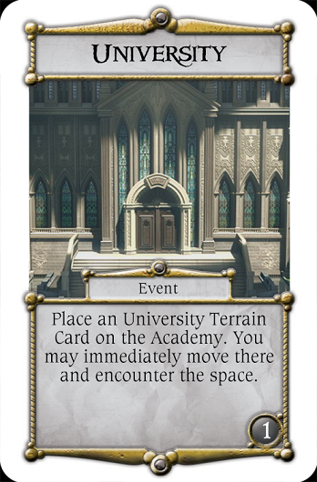
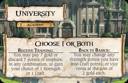
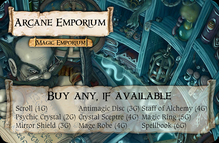
The rest of updated terrain cards:
I like the latest version very much!
Thanks!
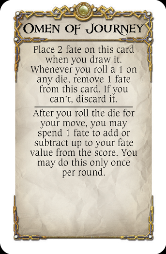
full version of the soothsayer space. I don't have Omen card backs yet.


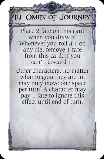
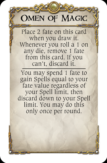
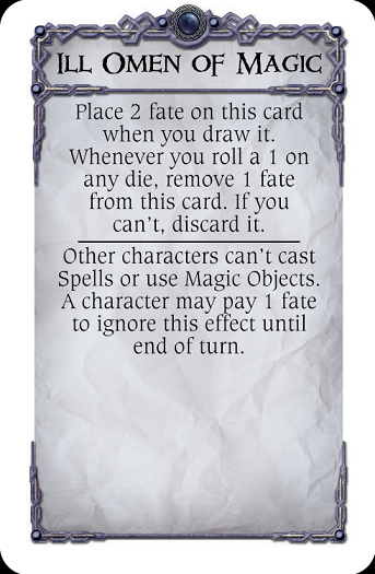
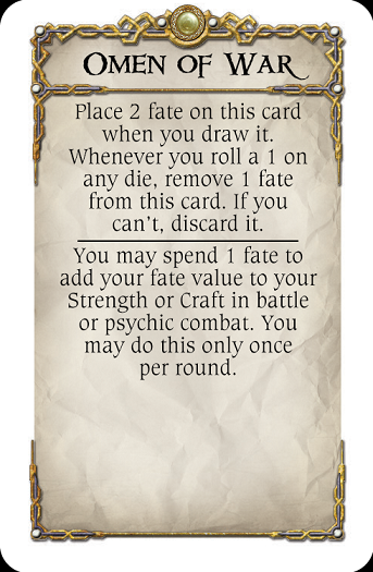
Something simpler
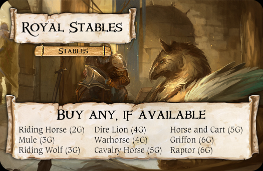
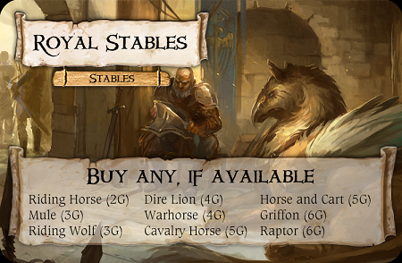
Other names for riding horse you could use palfrey,rouncey or courser ( all forms of riding horse) destrier or charger (knights war horses)
Edited by Robb 1An idea for the Sorcerer:
Royal Sorcerer's Library:
You may discard any number of spells you have and gain 1 gold for each, and then you may look at the top 6 spells from the spell deck and buy any that you choose for 1 gold each, if your Craft allows. Discard any spells you did not buy.
An idea for the Sorcerer:
Royal Sorcerer's Library:
You may discard any number of spells you have and gain 1 gold for each, and then you may look at the top 6 spells from the spell deck and buy any that you choose for 1 gold each, if your Craft allows. Discard any spells you did not buy.
Not bad idea at all.
An idea for the Sorcerer:
Royal Sorcerer's Library:
You may discard any number of spells you have and gain 1 gold for each, and then you may look at the top 6 spells from the spell deck and buy any that you choose for 1 gold each, if your Craft allows. Discard any spells you did not buy.
Nice :-)
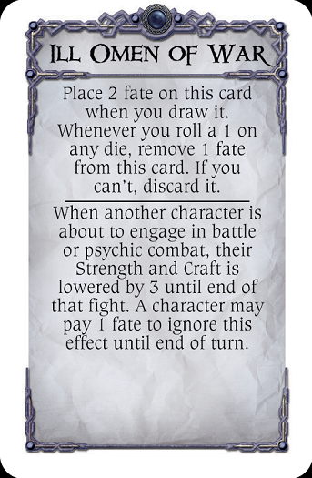
Love the ideas behind the Oracle and Omen stuff, loks great too :-)
As long as no-one mixes it up with the mechanics of the Omen theme from the Harbringer expansion - sure they won't though!
Thought of an option you could have on the Rogue's Guild, slightly different to my earlier ideas posted as I know you don't like the idea of turning the non-shops too much into shops!:-
Partly inspired by your Oracle/Omen design, one option on the scroll of the new Rogues Guild space would be to 'Join a guild of your choice for 3G' (not sure what price you'd want)
The guild choices would probably be along the lines of Assassins or Warriors Guild, Merchants Guild, Thieves Guild and Magicians Guild (semi-inspired and in keeping with the theme of 1 of the City expansion Alternative Endings)
You'd then receive a small perk for being a member of the guild. Ie; Merchants Guild could be "You receive a discount of -1G on all objects bought from any shop in the City" etc
You'd have to create a small 'Guild' card set like you have just done the 'Omen' deck for your new Oracle. You would only need to do 4 different types of card, one for each Guild, detailing the perks of the membership just for reference (bit like a Destiny card from Woodlands) for the players to take.
Edited by PhoenyxAnother idea for the Rogue's Guild is to upgrade it to the Anarchists' Guild (from the 2nd edition City)
Neutral character may heal for free and roll a die to see if they get something from the guild, like a spell or gold or something else.
Good and Evil characters may change to the alignment of their choice.
Some more tinkering with visuals
Ah, playing around with photoshop layers I see!
I like the new Emporium and Harbour illustrations better, but I prefer the scrolls at full opacity rather than semi-transparent :-)
Edited by PhoenyxI just had a thought that maybe I'm overcomplicating things for myself. Why not make those terrain cards do things in addition to original space they are in, and not instead. That frees a lot of space for text and art.
I know that's not how normal terrain cards work, but those cards are bound to specific spaces, so adding one text in the description of the keyword is not a big deal.
Opinions?