Sorastro's Painting

What would you recommend instead of ivory. I was thinking pallid Wych flesh? Thanks
What would you recommend instead of ivory. I was thinking pallid Wych flesh? Thanks
Thanks for the tips. Was thinking a week ago about the wampa. Thanks again
Thanks for the tips. Was thinking a week ago about the wampa. Thanks again
No problem dobby! Enjoy your wampas! ![]()
Is it just me or does the tail on that wampa make it look adorable?
I was also thinking that a while ago, but didn't post it because I thought people might think I was weird. Glad I'm not the only one!
I painted my wampas a while back. I had to go through so many reference photos to figure out what the palms of their hands and the bottom of their feet are supposed to look like.
Having looked over many, many reference shots of Wampa hands, I came to the decision that a Luke-warm flesh tone would work pretty well.
Having looked over many, many reference shots of Wampa hands, I came to the decision that a Luke-warm flesh tone would work pretty well.
I actually wanted to paint the palms more of a pink-ish colour but the only shots I found from the film where the palms are visible suggest to me that they're just white (and somewhat bloody) which I was a little disapponted with because I think they look great with more of a skin tone ![]()
Ha ha! "Luke-warm".. love itHaving looked over many, many reference shots of Wampa hands, I came to the decision that a Luke-warm flesh tone would work pretty well.
I actually wanted to paint the palms more of a pink-ish colour but the only shots I found from the film where the palms are visible suggest to me that they're just white (and somewhat bloody) which I was a little disapponted with because I think they look great with more of a skin tone
Haven't watched the video yet but looking at some google images of wampas a 3:1 bugman's glow/cadian fleshtone with a reikland fleshade or druchii violet (because it seems to work with everything) wash with minimal highlighting looks to be viable. I'm planning on painting these two over the weekend provided I can find the ivory paint and some snow/glue from the art supply shop.
As soon as I finish the bantha riders The wampas are next because in a couple of months we will be doing a return to hoth campaign. Just need to get those and the others of the box painted before we play.
Hey Sorastro, I just wanted to say a big thank you for the video series, I picked up the core and a few expansions in December and your guides really helped! Finally finished the core yesterday (bar the AT-ST) and stuck some pics up (https://community.fantasyflightgames.com/topic/239842-54nch32-ia-paintworks/)
Thanks again!
Thank you so much! You've done a fantastic job with those ![]()
Have some Greedo everybody; he was a lot of fun to paint and one of my favourite sculpts in the game (along with Boba) ![]()

I really wanted to reach out and say ....thanks!
I got sucked into IA about 6 months ago. And I took some vacation over the holidays and was getting bored. I thought to myself what a great idea it would be to pain the miniatures in IA. I ran into your painting series and haven't looked back. you do an amazing job of instruction and direction. I am through my troopers, droids, engineers, and guard. I am workign on my officers and then tackling my AT-ST's next.
Thanks again!
Thanks a lot Nalaedge! I'm happy to hear that you're finding joy in this wonderful hobby ![]()
IT really is exciting. Teaches patience and focus. And even relaxation. Your videos are a amazing!
I think I've asked this a few times now so sorry if it is getting to be bothersome, but any word on the album you were working on?
IT really is exciting. Teaches patience and focus. And even relaxation. Your videos are a amazing!
Thanks a lot Nalaedge! You're right about how painting trains us to be patient and calm ![]()
I think I've asked this a few times now so sorry if it is getting to be bothersome, but any word on the album you were working on?
Not at all! A couple of months ago I upgraded my PC and I'm now running higher bit-rate VST instruments; long story short - it's taking quite a while to individually swap out the old instruments in each music project file and then re-edit and balance the tracks. It is still absolutely on my agenda though! I think I might even take a couple of weeks off from creating videos just so I can blast through it. Watch this space... ![]()
So, I started painting the Imperial Assault figs about a year-and-a-half ago. I really think Sorastro does the best job of explaining how to paint these (and other) figures. His vid quality is off-the-charts and he gives detail descriptions of what he is doing and how to accomplish the look he is going for.
I had earlier posted my results for the first few Sorastro vids which can be found mostly here https://community.fantasyflightgames.com/topic/133635-sorastros-painting/page-42
So here is what I have been working on:
1. Luke
So, this was a disaster. I painted Luke before Sorastro’s vid. Terrible. Matted colors, no quality to any details, highlights are not vivid or realistic. Let’s just move on.
Grade: F
2. Saska Teft
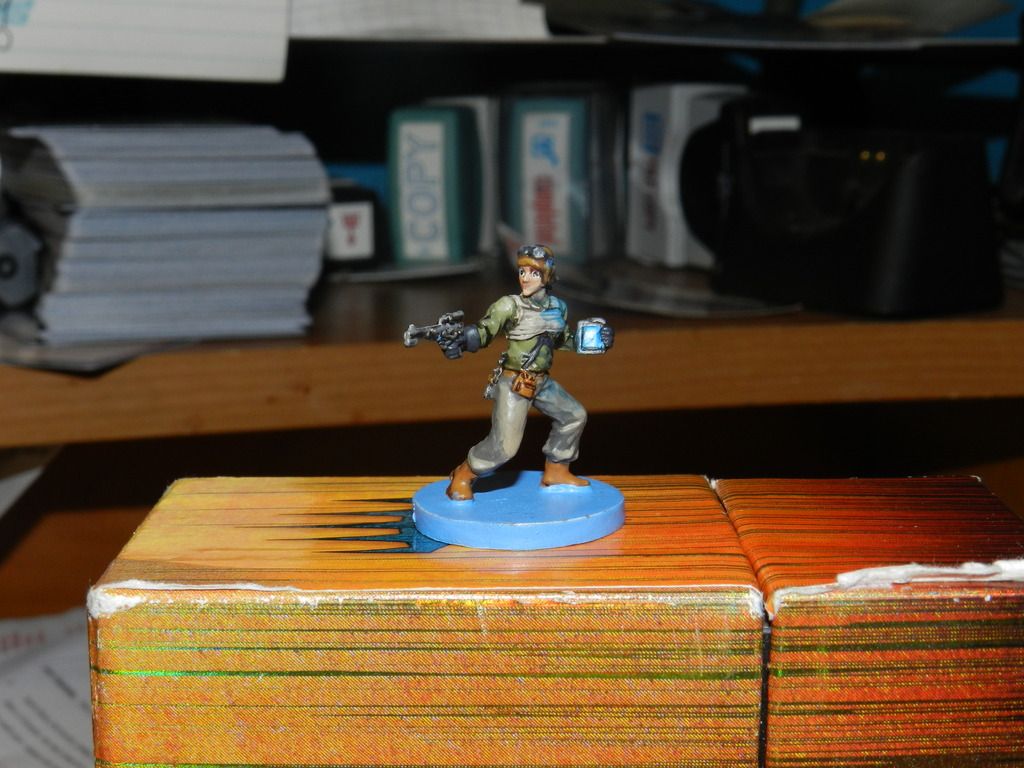
So, I think my problem with Saska is I didn’t like the model itself; she is tiny, she has a boring pose and the most notable thing about her is that she’s carrying a really bright iPad. The pad I could handle okay and I did a decent job on the “glow” effect; I also did a decent job on the detail work. But the colors came off drab and I clearly mailed-in the legs. Overall this is a mediocre model that I mediocrely painted.
Grade: C-
3. Gideon Argus
Meanwhile, Gideon is a great model that I just plum missed. My Gideon looks way too much like a cartoon (both the standard one of the left and the more “Scottish” version on the Right); while the actual figure is austere, mine comes across as clowny. Its not all bad; both versions have good use of color; I like the way the beard came out and the weathering looked good on both. However, I am still not great with the details and it showed.
Grade: C
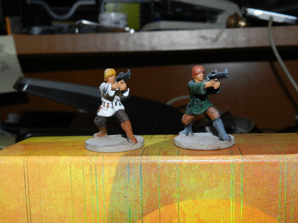
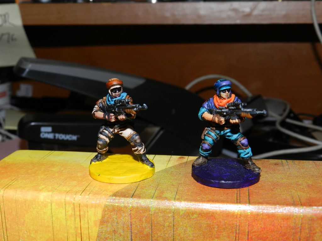
4. Rebel Troopers
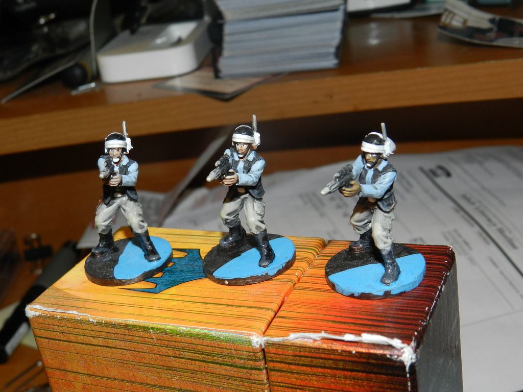
All things considered, these guys were decent. While later models (ie: the Saboteurs) are very “fiddly” the Troopers are very regimented and simple. The colors came out great and its one of the few times my eyes ame out great. I also liked the sharing and some of the highlights. But I think I needed to be more detailed in the legs and arms especially. Good but could have been better.
Grade: C
5 Princess Leia
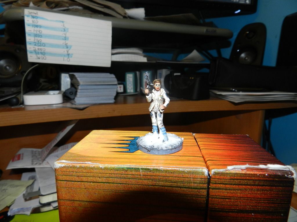
I wish I could judge her from the neck down. I loved the uniform (I added in some blue patches where the uniform “meshes”; I liked the way the boots came out, the insignia and the gun. All fine. Even the skin tone worked. Finally, I loved using Citadel’s Mourn Mountain Blizzard product which looked perfect here. But … That face…. I just blew it. I could not apply the details for the makeup and its such an obvious distraction. She looks like a 3-year old put on her lipstick and eye-liner. Just a terrible finish. This is the last model that I actually just flat-out disliked what I produced.
Grade: C
Trying to keep posts small.
This group represents some of the better quality paintings I did recently
6. Fenn Sigis
So, both the standard one of the Left and the alt version on the right I felt were very strong. I really liked the model overall and loved how his entire outfit worked really well; so it was great to paint and everything came out pretty good. I also think this was the first time my alt version came out better than the original; I liked “alt” Fenn’s purple helmet and scarf etc. But … blotchy colors on both, crooked eye-wear and several other problems. Very close to a good job.
Grade: B-
7. Lando
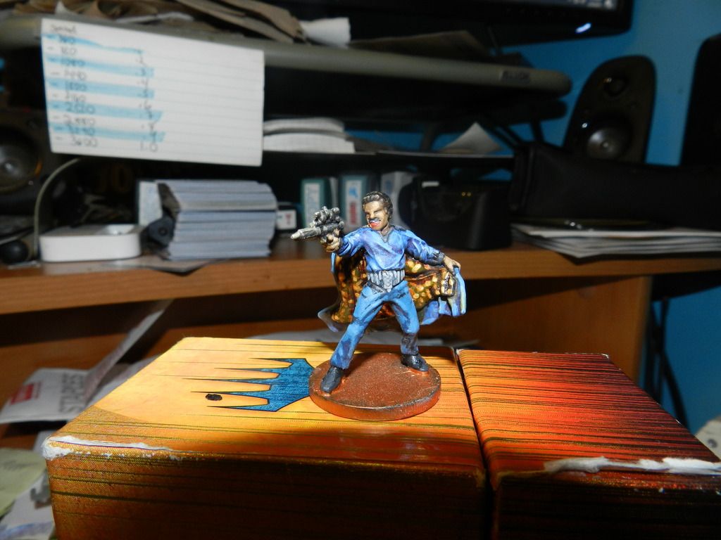
My biggest problem with Lando was his face; his skin tone (Billy D. Williams’ skin is a pretty flawless) is a cream-brown, but mine comes off dull and loses Lando’s vitality. Further, the mouth-moustache-teeth area is not great (but I ultimately thought it came out fine). His outfit came out well, but the shading was hit (top) and miss (legs). But one are that came out great was the cape which is an area of emphasis. I also liked his hair and the look on his face. Overall, this was not quite good, but better than I thought it would come out.
Grade: B-
8. General Weiss
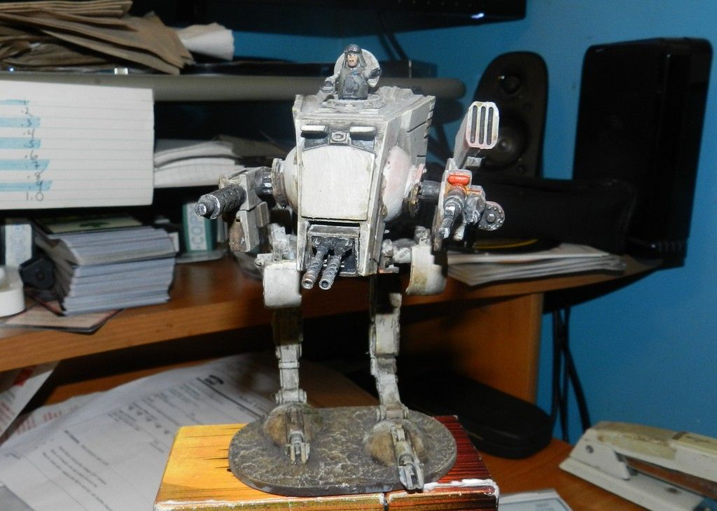
When compared to my original AT-STs, the General came out much better; I just did a better job this time with the colors and the tone of the piece. I also loved the lower half and painted it much better than the prior one. Also, the weapons came out better and so did the feet and ground area. Now, with that said, it still looks dirtier than I wanted; I didn’t like the way the General himself came out (my General looks filthy, and the model itself just looks silly- and I think his arms are way too short). And while I got the light right, I screwed up the glow effect and it looks like I splashed fruit punch on the AT-ST’s side. This one’s not great, but better than others.
Grade: B-
9. Rebel Saboteurs
I was pleased with the final product, but had a fit painting these guys. They are very “fiddly” in that they have all these little details that are a challenge, but when you look at the final model it’s a great outcome. I loved the grenade strap and the glowing pouch on the hip; and the backpack is good. Also, the alien race is fun to paint with nice skin tones. The uniform was hit-or-miss for me and while I liked the camo version on the right, I thought that these guys were too plain on the lower half. Also, the goggles bugged me and it shows in the final product. I also opted NOT to paint the rebel insignia on the camo version (to preserve the camo). But still, I liked painting these guys when they were done.
Grade: B-
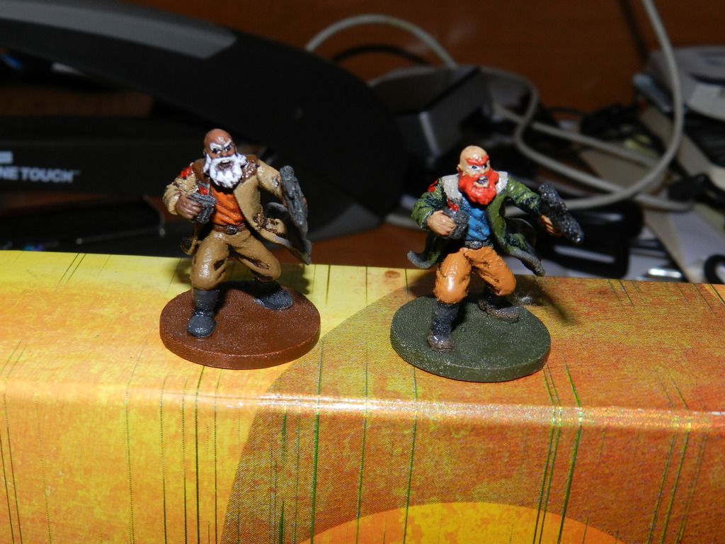
10. Biv Bodhrik
So, there are problems with this guy: the legs seem splotchy and plain; his torso is dirtier than I had hoped and I never did paint the rebel insignia on the shoulder pad. But … otherwise I loved this guy. I loved the model and his pose works; I also liked the gun, the strap. Also, in real life, I can’t really see his beard very well, but in the pic the beard looks great. Finally, I loved the shoulder pad’s orange burst and the stormtrooper’s arm is great. I just enjoyed this guy a lot.
Grade: B
Finally will be the ones I thought came out the best.
These models are the ones that showed real improvement
11. Chewbacca and the Wookie Fighters
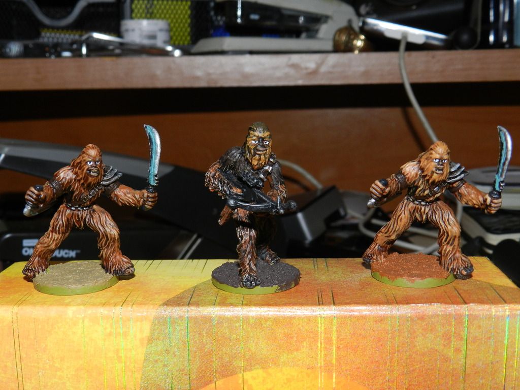
I wanted three Wookies that all looked differenta t the end; Chewbacca is a dark model at the end and so I intentionally made the two fighters different- one a reddish-brown and the other a creamy caramel brown. To me, all came out pretty good. I tried some bue tech paint on the swords which, frankly, missed the mark. But the fur and weapons overall were great and I loved the way Chewie came out. Sure, the left-most Wookie has that unfortunate horizontal line of shade on his right left, but overall I had fun painting the model and they came out looking pretty good.
Grade: B
12. Stormtroopers (Regular, Heavy and Kayn Somos)
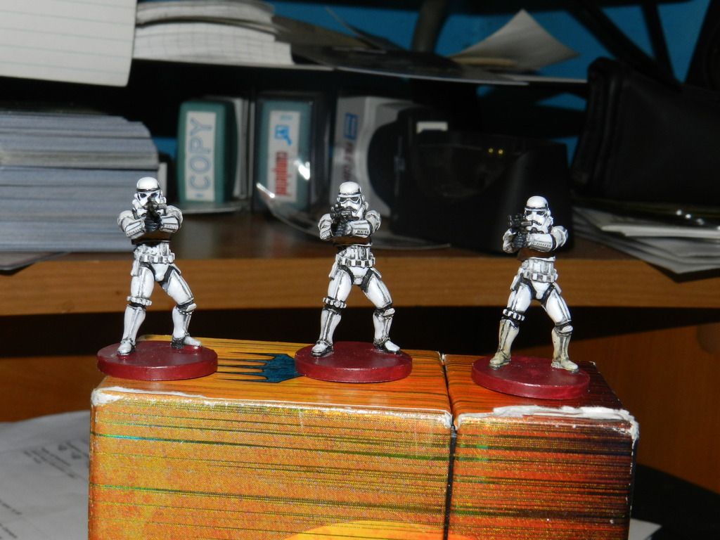
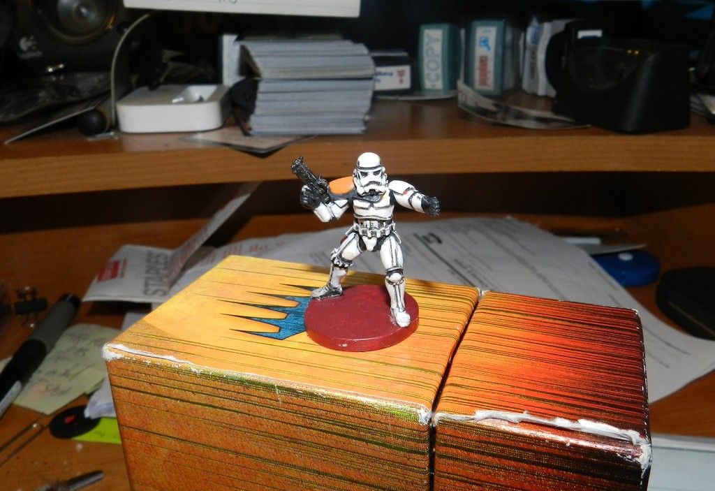
I got better painting the Stormtroopers. When I saw the vid I painted both the heavy Stormtroopers and the enemy pack. My original troopers were splotchy and the colors were too thick. But I did better with thinner colors, better brush control and I spent more time on the detail lines and black foundations. Still not perfect (the heavy troopers’ faces are not great) but it’s a vast improvement.
Grade: B
13. C-3PO
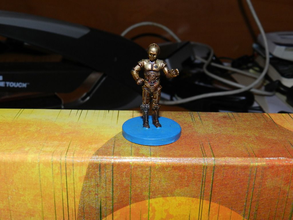
Overall, I ended up being satisfied with my C-3PO, but I thought he would have come out better. Mine ended up way too dark and a bit too dingy. However, I loved how the wiring at the stomach came out and the shine provided by the Sepia wash (I used a full-immersion wash rather than Citadel’s wash) was terrific. I also liked the contrast between the left and right legs. I just wish I got him shinier.
Grade B
14. Royal Guard Champion
I wanted to paint this model as soon as I started, but I held off until I got sorastro’s vid. Glad I waited (See Luke Skywalker) I got two- one to paint with the original color scheme (right) and one in a more contrasting black. I loved them both. Great fig, the colors stuck well, I did well with the details (few as they were), loved the way the capes came out and the contrasts between the main platting and the red. In the end, I prefer the red-black color scheme but both were great.
Grade: B+
15. R2-D2
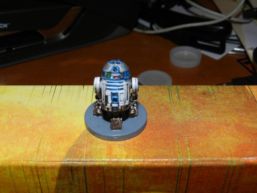
Maybe I got lucky, but I thought I hit R2 well. He’s super-fiddly but somehow I got most of the details to stick-0 the center vets, the blue stripes, and even the top white line I was ablt to get to stick. I opted for transparent green lights rather than blue because, well, R2 has enough blue. I even liked how the dirt and weather effects came out. But… not perfect; my highlights got lost in the detail work and his back (not pictured) is wayyyyy too dark. And if I could go back I would change the foot-wiring from copper to either bright gold or silver because it blended in too much with the weathering. Anyway, stunned R2 came out so well.
Grade: B+
Will end with my best efforts and a re-imagined bonus piece.
The finals
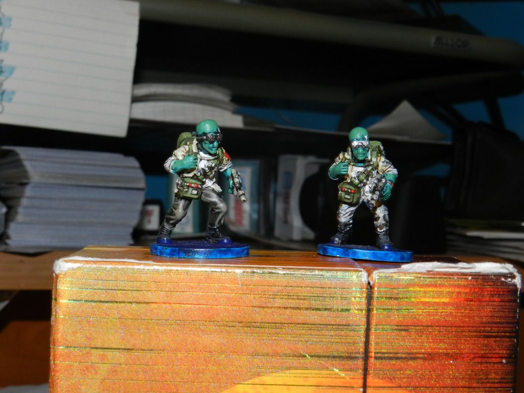
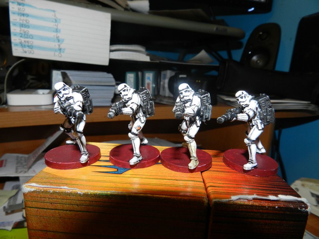
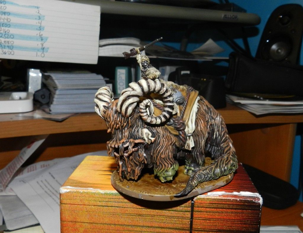
16. Wampas
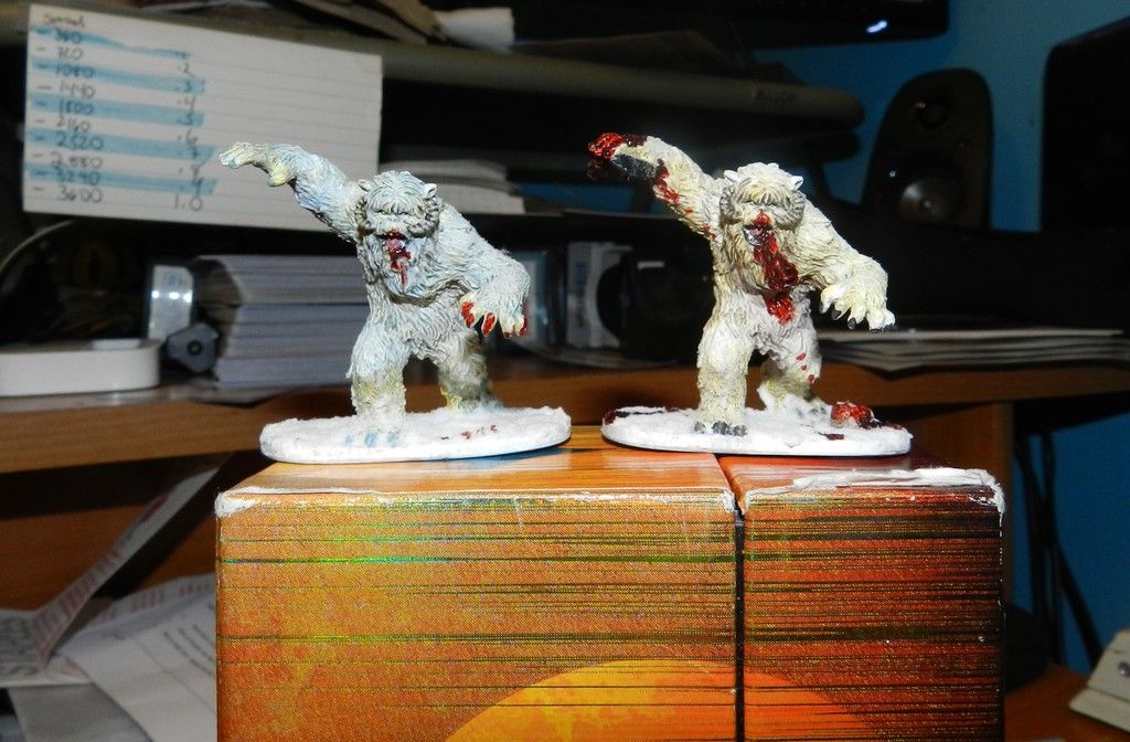
I did two different models – one the standard method (eight) and one a more ice-blue version; loved them both. The model is very forgiving and when there are mistakes the fur hides them. I also liked the ears and horns, all came out great. Now, on the left I stuck with the traditional painting sorastro did. For the right I went further with the blood and gore, gluing a disfigured miniature to the hand and a dismembered head on the ground. Lot of blood. Lots of fun.
Grade: A-
17. Tusken Raiders
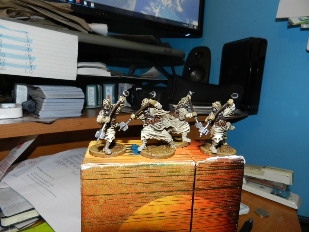
Pretty stunned. When I first saw the model I thought it would be a disaster, but the simple color scheme mixed with being careful made these better than I expected; I was stunned how well the head-wraps came out most of all. I also liked the ground effects, but was underwhelmed with how the weapons came out. But I could not be happier otherwise.
Grade: A-
18. Mak Eshka
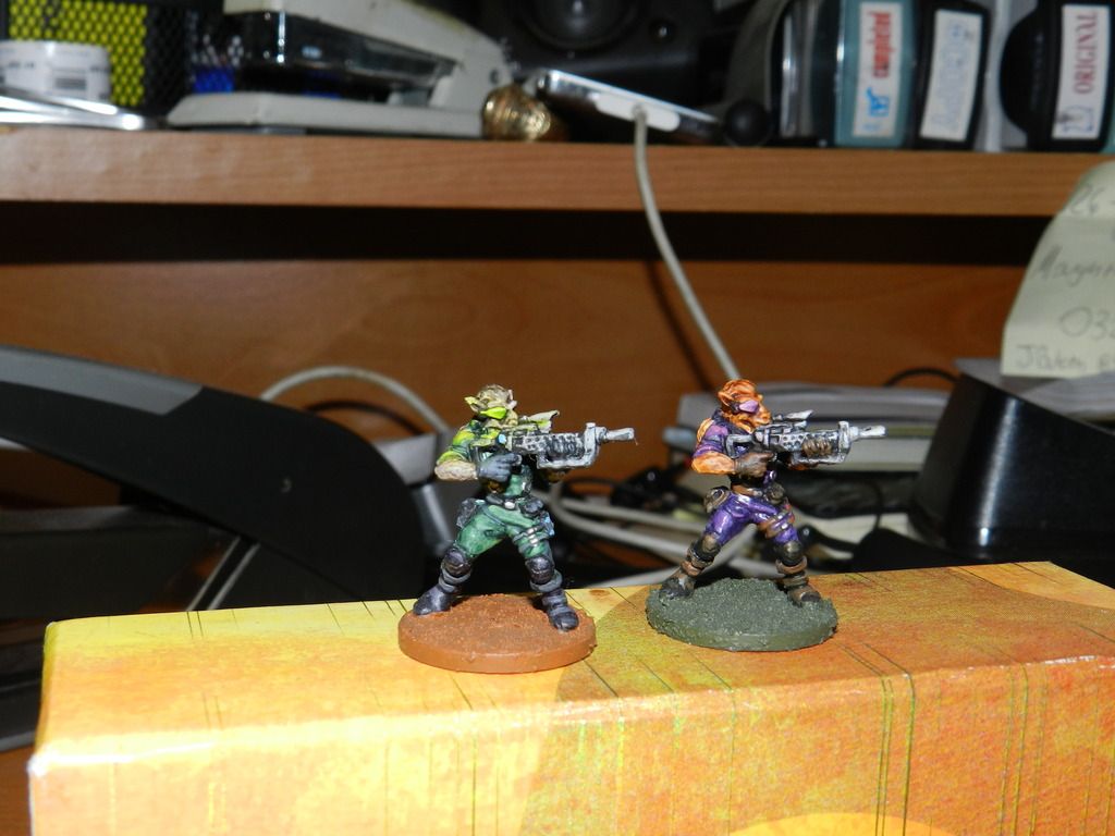
Very pleased with how these came out. The guns, the outfits and the detailed boots and equipment packs. Also, loved how the skin/fur tones worked with both color tones. The eye piece is the central element and in both I thought they came out fine. I will say that because the outfits are close to the eye-piece color, both “glow” effects are missed. But overall I am pretty happy.
Grade: A-
19. Bantha
From start to finish, I loved this model and he came out great. The fur, the baggage, the ground, all of it came out great. I loved the horns and the mouth especially. ON the down-side, the feet came out green and I don’t recall ever using green. The only thing I wish I had done differently was paint the top-cloth a red or bright blue just to use a different color to draw attention. But no issues with this guy at all.
Grade: A
20. Han Solo
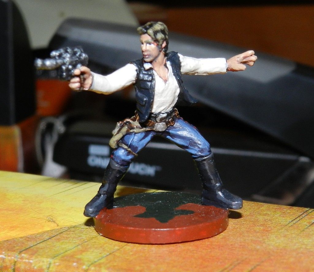
All things considered, when compared to the actual guy who was in the actual movie, I was thrilled the way Solo came out. The outfit, the skin tone, the eyes, the weapon, everything I thought came out great. Yes, the belt and holster could have been better, but given the high expectations of painting this character I was very happy the way he came out overall
Grade: A
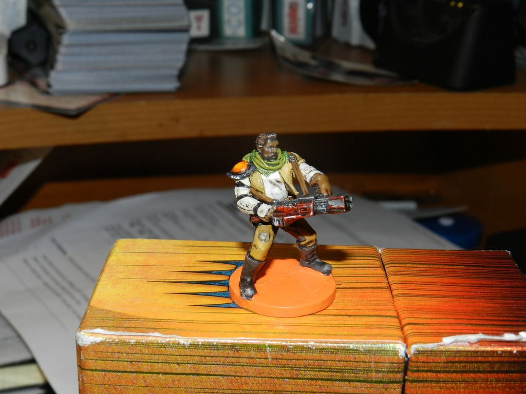
21. Loku Kanoloa
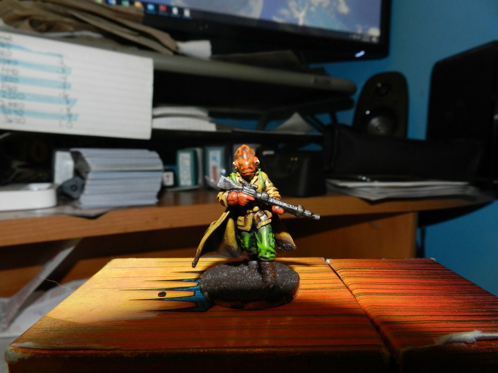
Stunned really. I cannot believe I got the head right. The highlighted pants came out well and I loved the jacket and weather damage. Its just incredible to me that sorastro got me to paint a Mon Cal head correctly. Stunned.
Grade: A
BONUS MATERIAL: ANN the NUN (Re-imagined)
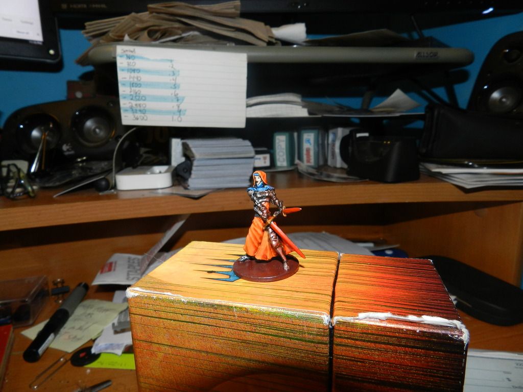
So, I liked Anne the Nun from the Zombicide series, but I wanted to use her for a Star Wars Camping so I redid her as a Sith Apprentice. She’s not perfect and I hated the face, but the armor, clothing and skirt all came out great and I liked the glow effects from the swords etc. IN other words, if Anne the Nun was Anne the Sith Apprentice, this how I think she would look.
Hope you enjoyed; criticism and comments welcome and thanks to Sorastro for producing such informative and addictive videos.
Edited by RockroiAwesome Rockroi! It's always nice to see other people's work and extra pleasing to see such self reflection and improvement! Thanks for sharing ![]()