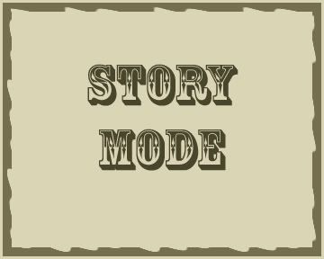
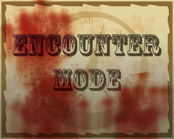
I plan to make a standee to represent the current status between story mode and encounter mode. Just a strong raised visual just in front of the GM screen that I can flip to the accurate side to make sure everyone's on the same page.
I hit a block deciding what colors to use to represent each. My gut said Red (Encounter) || Green (Story), but I want to keep the color visuals different than Reckless/Conservative.
With this in mind, any advice on what colour scheme I might consider that doesn't overlap with the colors of game components and the mental associations (thus ruling out Blue, Green, Red, Purple, Yellow, Black and White)?
===
(If the space seems worth using, I am also considering using similar standees to represent some global elements such as weather and lighting, but that's a bridge to cross when ready)