Parakitor's painting (re)animated

By Parakitor, in Runewars Painting and Modeling

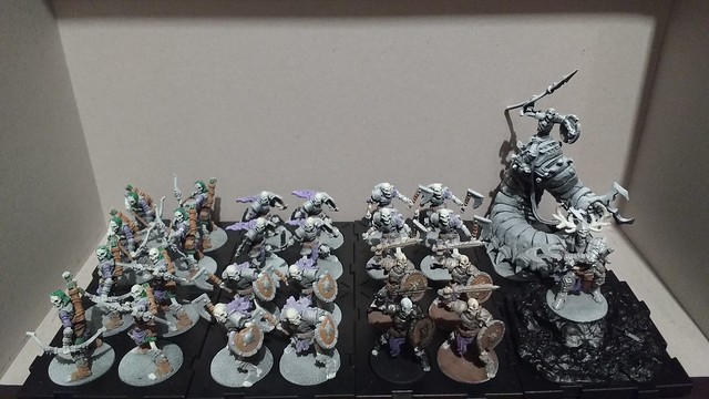
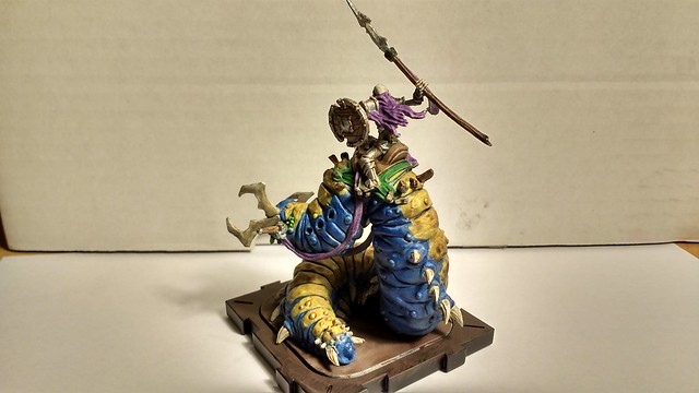
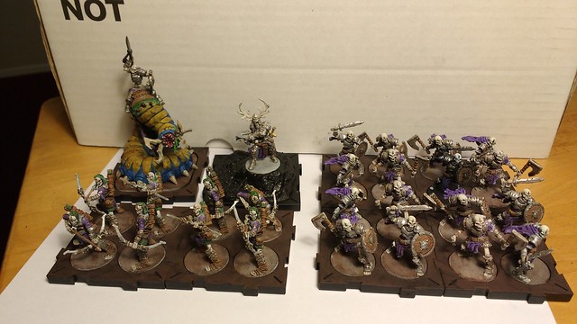
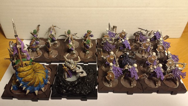
I finally have enough of my army painted that I feel that I can start a thread with my work in progress. And by "finally," I mean that I've been painting a few nights a week for about two months, and this is all I have to show for it :P . I am a very slow painter, but I am enjoying the process. The only miniatures I have painted before were a Firespray-31 from X-wing, and a handful of Imperial Assault, but I got bored and quit those, mostly because I played X-wing way more than Imperial Assault, so it felt like a waste of time. Now, I'm trying my hand at painting up the dreadful army of Waiqar the Undying!

After trimming, cleaning, and gluing my figures, I decided to prime in black. Unfortunately, the paint was way darker than I wanted, so I decided to give that zenithal highlight technique a try; the one that @Sorastro always talks about. I used Army Painter spray primer.

35697301971_cdbc7b603f_z.jpg

35441358580_8067c7576f_z.jpg

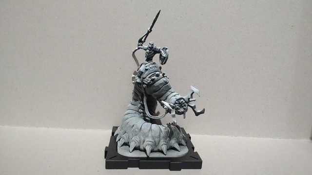
I think it turned out well, for the most part...except for one major flaw: I held the can of primer too far away on my third pass of black to get the undersides, resulting in a grainy texture on all of my skeletons! So I had a choice: press forward, or try to strip the primer. After reading a bunch of threads across the web, I decided to press forward. If it turned out terrible, I could always drop some cash for a new Core Set, and stick these guys in the back ranks.

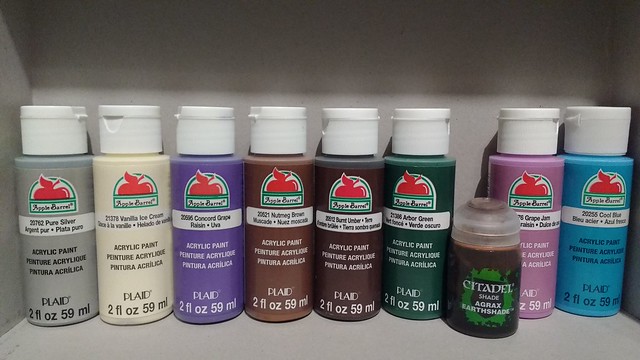
Now that all my skeletons were primed, I needed some paint. Since I'd rather spend my money on miniatures than paints, I decided on Apple Barrel brand paints, and Agrax Earthshade for my shade/wash.

35660743382_a726ac9192_z.jpg

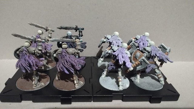
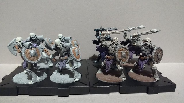
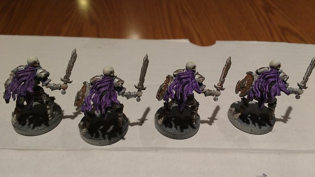
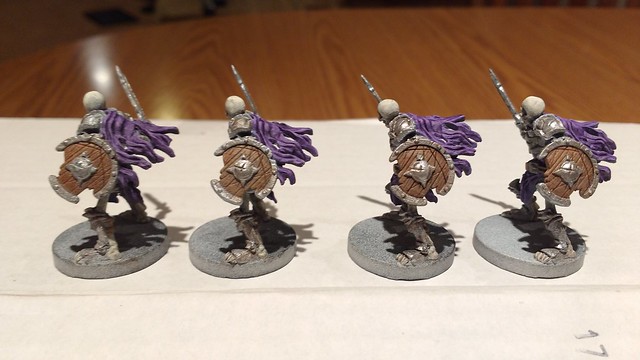
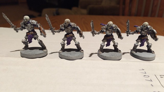
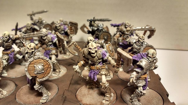
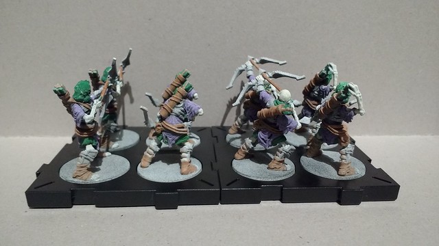
And, now, onto the skeletons! So far, all I have managed is base painting.

35441365000_2e3a5da78b_z.jpg

35660749972_75ee00cc64_z.jpg

35829739685_05a9a9a0f9_z.jpg

35697304801_7979537a4f_z.jpg

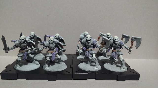
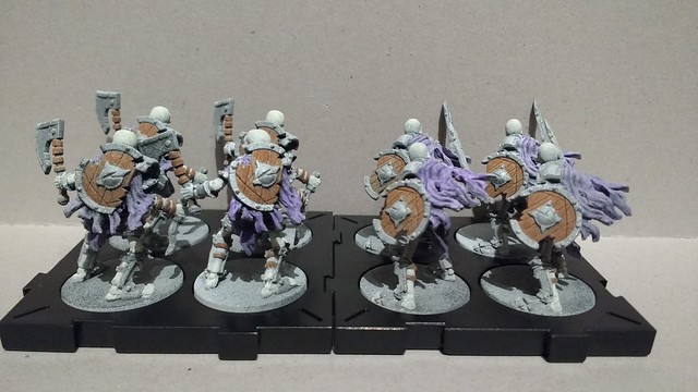
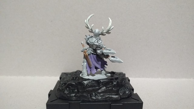
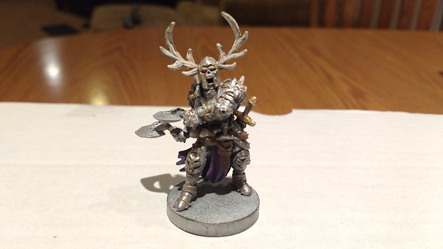
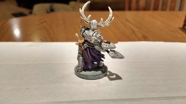
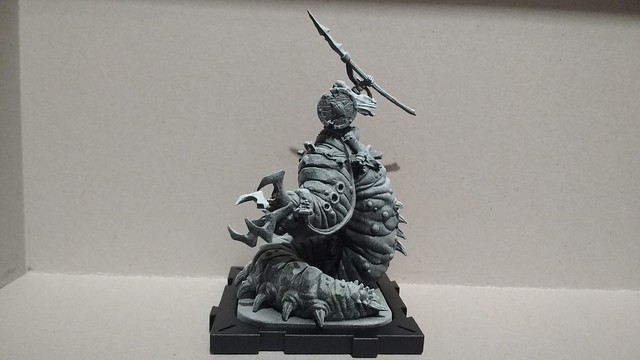
As you may be able to tell, the silver is not doing a very good job. The grainy texture really stands out, and it's not very metallic. But I really like the zenithal highlight technique. Priming in black means that if I miss a spot, like the underside of the figure, it's not nearly as noticeable, but priming in white allows for a more vibrant purple cloak and white bone color. The highlight technique doesn't take much extra time, and offers the best of both worlds. I'm a fan.

Edited by Parakitor

Continuing on, I managed to successfully shade one tray of Reanimates so far. It was a bit dark, and I was nervous about going over with highlights, but that has actually been my favorite part of the process so far. It's a lot of fun just going over those high points and seeing the model come to life! I think the cloaks may even need a few more highlights, so I may revisit them. (EDIT: The ones with upraised swords are washed and highlighted, the others are not.)

35660747412_22983fb2a1_z.jpg

35441363580_3ab0dbfa5f_z.jpg

The detailing on the skulls is what I'm really excited about. In a lot of the artwork for this game, you see skulls painted onto the Reanimates. That always seemed odd to me, but I liked the idea that each Necromancer would have his own mark on the soldiers he reanimated. So after a lot of searching and discussing with @Budgernaut , I decided to paint an inscribed rune on each of their foreheads. This rune is a callback to the old Diskwars, and is the symbol for the "Resurrect" spell, as seen in the bottom left-hand corner of the photo below.

35661368762_87401ca1e1_z.jpg

Eventually, all of my skeletons will have this rune painted onto their skulls. It's simple enough to freehand, but interesting enough to look like it's intentional. So excited!

Edited by Parakitor

Finally, here is Ardus Ix'Erebus. As an aside, there is a family of moths called Erebidae, pronounced "Eh-ree-bid-ee", so I pronounce his name "Ix-eh-ree-bus." (EDIT: Erebus is Greek for deep darkness, or shadow; a fitting name for both a nocturnal moth, and an undead soldier marching forth from the shadowy mists.)

35441360530_984a8d1bbb_z.jpg

35019851343_cb5da9d446_z.jpg

As I said before, the silver I chose was pretty bad. But after about 5 layers, it finally started looking like metal. I should drop some money for miniatures paints in silver and gold. Speaking of gold, I am trying to decide how much Ardus needs it. The artwork has little gold, so I thought maybe I could skip it, but looking at it now, I think he needs a little something else. What do you think?

In closing, a shot of my "painted" collection so far.

35789402206_95f8164135_z.jpg

Edited by Parakitor

Looking at your washed figures, I think you got the perfect brightness for your base coat. When the wash darkens it, it looks just right.

I agree about putting gold accents on Ardus. Otherwise he kind of just blends all together. I'm having an especially difficult time separating his skull color from the rest of his helmet (which may just be from the picture), but if you put gold on the edges of his helm like in his picture, it gives you a distinct separation between the skull and the helmet.

It's a bummer about the grainy primer. Now I see that this is what went wrong when I primed my Runewars (boardgame) figures. I'll have to try spraying a little closer next time.

I'm excited to see your figures in-person this weekend!

I'd say what is missing, if anything is contrast. There are three types of contrast we have while painting, lighting/brightness, colour, and luminosity (shininess?).

For lighting, it isn't really there, not strong enough to pick up from the tabletop at minimum. That's why highlights, even if simply dry brushed make such a large difference.

Colour, aside from quality issues you are having is all very samey, washed out/pastel. You could benefit from bolder purple, whiter bine, etc. It all kind of blends together right now, particularly the armour v the bone.

The last one can be such as gloss v matte. Gloss armour, matte bone, etc. Likely too much work for rank and file, great on special units. Satin with metallics that are reflecting can give some of this otherwise.

As with all things, we need to exaggerate contrast a bit, to make it visible in such small scale. It will enhance separation and distinction. Highlighting the metal a different method than the bone would also bring that across (washing everything with brown though, not so much). Mini scale, macro contrast looks best.

Contrast. Good advice. First, I'll try to layer more of this silver on, and hopefully it gets a nice, shiny metallic appearance. If it doesn't, I'll probably buy some higher quality metallic paints. Do you think making the armor a darker gun metal color would provide good contrast? I'm not very fond of glossy metal, so getting contrasting color + contrasting lighting in one go seems like a solid choice.

As for the purple cloaks, I think I just went skimpy on the highlights. It was my first try with the technique, and I didn't want to over do it. I'll add another layer of purple, leaving the crevices dark, and then go back over the peaks with a layer or two of the lighter purple. That ought to do it. I think it will stand out when I improve my skills.

Oh, you probably meant the base coat. Yeah, looking at it again, they do look way too pastel. I'll give them another layer of purple as well, to make it a bolder color. At least I have the hang of thinning, so I'm not losing details.

I'll post more pictures when I have made some progress. Thanks for the suggestions, Darthain!

Darker armour might be quite nice, I would think. Might be a good option. It would certainly improve separation all around. I can't provide metallic advise, but most use mica, fineness of that can matter. Vallejo as I understand uses aluminum powder or somesuch. Nice metallics btw, I like them a good deal, but I've limited experience with others as I like those as is... The secret of shiny metallics is they let you get away without or with very little highlights should you choose not to. Room lights do it for you.

Highlighting is weird, I almost always feel it is too far, until I'm near done then it all kind of comes together. An advanced push your luck game, really.

Edited by Darthain

OH MY GOSH!!! Are all miniatures paints this much better than craft paints?! I just bought some "Chainmail Silver" by Game Color, and I am completely floored by what great coverage and shine it offers in just one coat. Amazing! I think I may just accept that I wasted $30 on craft paints, and start picking up more colors from this brand. The difference is night and day. Pictures to follow this weekend, hopefully.

Yes, they are, and I don't even like game color much (greatly prefer model color). The model colour metallics are excellent, game colour I've used a few and are good. You will want to thin them slightly, the game colour especially, to avoid a 'hammered' look (or not).

Edited by Darthain

I had tried Citadel black, white, and gray before, and I wasn't feeling/seeing any difference. Now I'm a believer in hobby paints over craft paints.

I've been thinning paints with distilled water, but this color in particular seemed to dry in my dish really fast. Thinking I may get a retarder/thinning agent. Recommendations?

P.S. Thanks for all your help and suggestions!

1 minute ago, Parakitor said:

I had tried Citadel black, white, and gray before, and I wasn't feeling/seeing any difference. Now I'm a believer in hobby paints over craft paints.

I've been thinning paints with distilled water, but this color in particular seemed to dry in my dish really fast. Thinking I may get a retarder/thinning agent. Recommendations?

P.S. Thanks for all your help and suggestions!

I don't much care for citadel, particularly the lauded 'good coverage' chunky chalky ceramite white. Their shade and technical line though.

I'm in Toronto, dry winters, very hot summers. To get around rapid dry I use a wet palette. I bought one, but you can make your own (the proper paper and such works better though). This allows me to use reasonable quantities of paint without drying issues.

I don't much bother with distilled water unless I'm making stock (small bottle of flow aid, Les' wash stock, etc) otherwise just tap from my rinse cup, hah.

I've appreciated all the help so far, so one more question to get your opinions (the more the merrier). I just saw that I can get the 50 paint Army Painter bundle for $90 on Amazon. For somebody with virtually no paints in his collection, is this a good investment? It's $35 off list price, which is like 14 free colors. People that have purchased sets like this: do you use most of the paints, or do you feel like so many languish on the shelf that it's not worth it? I think that I'll be more open to creative painting with the colors at my fingertips, rather than waiting until Friday to pick up the colors I need from the shop.

I have no experience with army painter, but I know a lot of the folks at bgg are sorely unimpressed with them. Thick paint with bad coverage, apparently.

https://boardgamegeek.com/thread/1769273/starter-paint-sets-bones-gw-ap-or-vallejo

Lot of info in there. My advise is buy what you need for you army palette for now, expand later. Amazon has terrible prices for paint typically (in Canada), hobby stores will do you much better.

Also, my personal preferences which will have little to no bearing on yours:

Vallejo/P3 (p3 thin to glaze very easily with only water).

Citadel (bases are way too thick, have some unique colour, shades/technical are nice, thinned and put in a dropper can be quite serviceable)

Reaper master series (a bit too thin for me)

Edited by Darthain
14 hours ago, Parakitor said:

OH MY GOSH!!! Are all miniatures paints this much better than craft paints?! I just bought some "Chainmail Silver" by Game Color, and I am completely floored by what great coverage and shine it offers in just one coat. Amazing! I think I may just accept that I wasted $30 on craft paints, and start picking up more colors from this brand. The difference is night and day. Pictures to follow this weekend, hopefully.

I really needed to hear this. I've been getting excited for painting after I move into our new house, but wasn't sure whether to go with the craft paints I have or buy miniatures paints. I was leaning heavily toward investing in miniatures paints, but wasn't quite ready to make the plunge. But with this endorsement, I think I will. It may mean I hold off on getting the Elves so that I have enough funds for the Uthuk as soon as they release, but I think it'll be worth it.

@Darthain Thanks for the link and other info!

Oh yes hobby paints are definitely worth it. Get good ones and apply them properly they come out amazingly smooth and uniform, and the special paints are amazing cheats.
Dont forget washes. They're nicknamed "liquid skill" for a reason :D

On 7/13/2017 at 10:38 AM, Parakitor said:

I've appreciated all the help so far, so one more question to get your opinions (the more the merrier). I just saw that I can get the 50 paint Army Painter bundle for $90 on Amazon. For somebody with virtually no paints in his collection, is this a good investment? It's $35 off list price, which is like 14 free colors. People that have purchased sets like this: do you use most of the paints, or do you feel like so many languish on the shelf that it's not worth it? I think that I'll be more open to creative painting with the colors at my fingertips, rather than waiting until Friday to pick up the colors I need from the shop.

I use army painter and I haven't had too many issues with it. Though I got the mega paint 2 bundle. I use a spray on primer from AP to start with then just base details with okay results if my hands stay steady.

If you are having trouble with drying paints, take a paper plate, put a wet paper towel in it then put a piece of parchment paper over the paper towel. You can find all these materials at a local grocery store and make yourself a cheap wet palette.

36 minutes ago, Vineheart01 said:

Oh yes hobby paints are definitely worth it. Get good ones and apply them properly they come out amazingly smooth and uniform, and the special paints are amazing cheats.
Dont forget washes. They're nicknamed "liquid skill" for a reason :D

Although washes have a few uses, I often avoid them as they look sloppy, so on my spearmen, where I'm painting say tabletop ish quality I'll use them, but heroes, golems, etc? No, won't touch a wash, too sloppy.

On ‎7‎/‎14‎/‎2017 at 1:57 PM, Darthain said:

Although washes have a few uses, I often avoid them as they look sloppy, so on my spearmen, where I'm painting say tabletop ish quality I'll use them, but heroes, golems, etc? No, won't touch a wash, too sloppy.

Isn't a sloppy wash (I guess this means running and problematic) determined by the approach, skill and patience of the painter? Can you elaborate on this advice, as I'm inclined to tell the original poster to take it with a heavy grain of salt..

2 hours ago, Blutsteigen said:

Isn't a sloppy wash (I guess this means running and problematic) determined by the approach, skill and patience of the painter? Can you elaborate on this advice, as I'm inclined to tell the original poster to take it with a heavy grain of salt..

Yes and no, the problem with washes is generally a lack of control, washes are designed (whether by product or the painter mixing it) to flow, into crevices and such to fill them, with minimal pooling and staining, but they will do both. Even the most precise pin wash will make some mess, again, designed to flow. If I'm painting for quality, I need the paint to stay where I want it, so glaze at most (that will stay put). Check out my Armada thread or runewars thread of you want some examples, my more recent work has all but eliminated washes due to the lack of control, and approached different methods to attain the same results.

Darklining? Base coat darker shade or 2 (mix black) then the base color selectively. If I use a wash, I clean up with the base colour to eliminate the slop flow and slight staining. Effectively I want everything to be intentional, not by product.

Edited by Darthain

I finally have some updates to show. I was too busy playing, and not painting enough. That said, I'm going to repeat that I am incredibly slow at this, so not much progress. But here it is.

36616160946_413df4b016_z.jpg

35853332113_514cb9d0d2_z.jpg

36493135962_ea911f967a_z.jpg

36616161856_2969179c08_z.jpg

36616161906_a88cdf32c1_z.jpg

35853333043_6b31cd7a02_z.jpg

( Link to album )

Sorry about the lighting. The hunched over skeletons make it hard to get a good look at their fronts. Ardus Ix'Erebus is basically done at this point. If you have any suggestions, I'd love to hear them. I still consider myself in the learning stages, so I'm happy to read your advice. I applied Agrax Earthshade as a wash selectively in areas that I thought needed to have more contrast, and then went over again with silver to clean up the wash. His belt and holstered weapons could probably use some attention, and the wash is still a bit heavy in some places, like his legs, but I'm calling him table ready for now.

The Reanimates just need eyes and the rune on the forehead, and then they're complete. I used a purple ink from Army Painter to shade the cloak and purple cloth pieces, and Agrax Earthshade from Citadel for everything else. Highlighting the fingers, toes, and raised portions of purple cloth were some of my favorite parts. It makes the whole model just come together. Now I just need to shade and highlight three more trays...and then start the whole process again on another 2 trays. I may actually wait until I have another expansion so I can do another 4 trays at a time.

First, I'm jealous you are playing not painting, unfair.

It is coming along nicely, good work so far. There is something super satisfying when a shade/highlight combo finally comes together, as they can look quite garbage in interim.

Are your metallic that large a flake, or are you having grain issues with your spray primer (guessing primer, as the cloth and bone shows it as well). Couple things could be happening there, well a couple causes, end result is the same, the paint is drying before it hits the model. You may be spraying from too far, or it might be too humid, or not humid enough, or just too hot. Tricky stuff, for example I pretty much can't spray varnish in Toronto at least in summer, but GW corax white has yet to give me grief, oddly, but it wasn't August hot yet either.

Edited by Darthain
2 hours ago, Darthain said:

You may be spraying from too far.

First off, thanks for the encouragement.

Second, yes, I sprayed too far away, but I didn't want to be bothered stripping it and trying again. I figured if they were awful enough, it would be the impetus I need to buy a second core ^_^ . The first pass was good, but I messed up the distance in the second pass. These will never win any awards, but it's good practice, even if the primer is messed up. Can't wait to do some more painting, and hopefully show off some cleaner figures.

29 minutes ago, Parakitor said:

First off, thanks for the encouragement.

Second, yes, I sprayed too far away, but I didn't want to be bothered stripping it and trying again. I figured if they were awful enough, it would be the impetus I need to buy a second core ^_^ . The first pass was good, but I messed up the distance in the second pass. These will never win any awards, but it's good practice, even if the primer is messed up. Can't wait to do some more painting, and hopefully show off some cleaner figures.

Best of luck, Waiqur really benefit from a second core as is (even a 2nd core isn't quite enough for them, wanting a good 11-12 reanimate trays minimum).

Update time! Here is my Carrion Lancer: Daqan Bane.

36990194476_2d2fdaf202_z.jpg

36782395650_acb53dc133_z.jpg

36990192946_ca66284726_z.jpg

Now you know what you get when a carrion worm is raised on a diet consisting solely of Daqan Spearmen, or at least their armor. I could have gone for gold, but I think I'm going to try the cartoony look for my Daqan, so this guy gets a golden yellow coloration. I can always go back over it if I don't like it. I need to do something about the wash, because it looks like, well, like I just kind of doused him with a wash. Some careful highlighting with a drybrush technique ought to do the trick, but I'm calling him fine for now.

Here are my Reanimate Archers.

36782393830_fc6fb9b5b8_z.jpg

And group photos.

36782391920_989400c43c_z.jpg

36990189536_4a0814b811_z.jpg

Close up of Reanimates with their resurrection runes.

37179813715_4b16e2a8d3_z.jpg

I just realized that most of their circles are too big, so it comes off looking like an upside down female symbol. *shrug* I'll get better with practice. I foresee plenty more Reanimates and Reanimate Archers in the future.

My next project is to set up a makeshift light box. I had one for LEGO creations a few years back, but of course it wasn't worth moving with it. After that, I intend to get some basing materials and get these guys on muddy terrain.

Looking very good, love the female skeleton army and the yellow and blue worm. I would actually recommend to go back in liberally with your base yellow, then mix in some white for the highlights.