The Perpetually In Progress Works de los DUR

By DUR, in Star Wars: Armada Painting and Modification

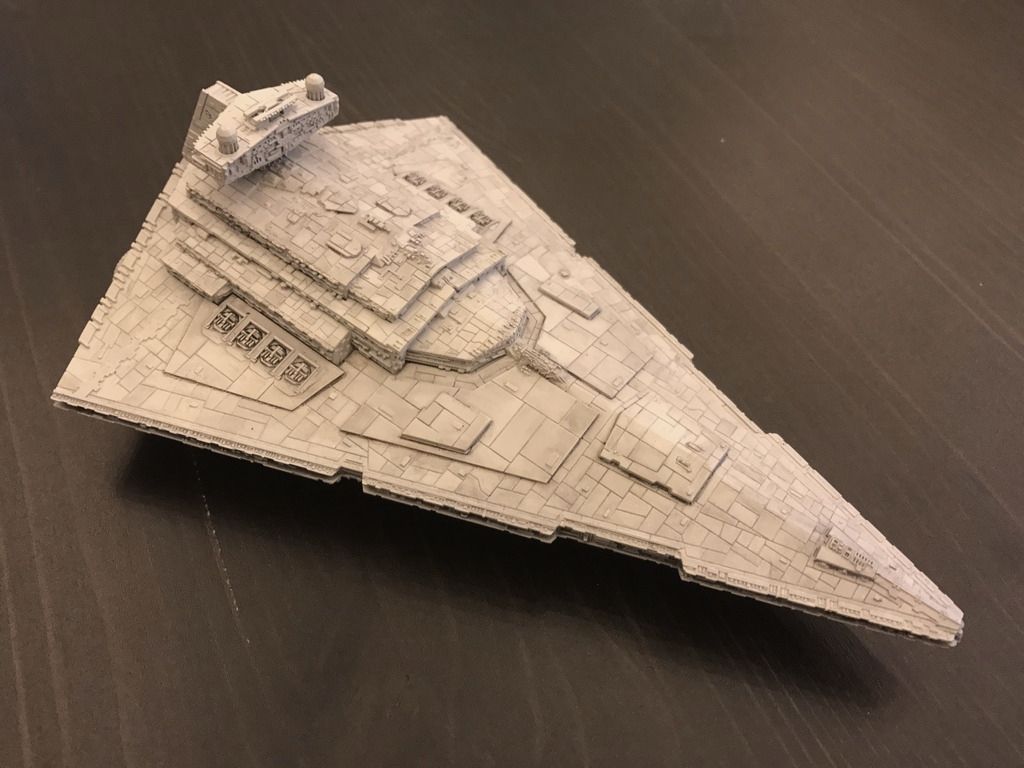
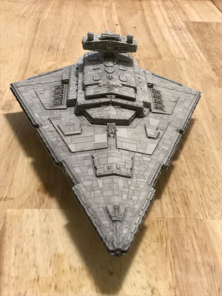
I actually finished one of my ships! (well, except for lighting effects, but, hey, close enough!)

The VSD Obsoletor:

IMG_0178_zpsefuxy371.jpg

IMG_0171_zpsykvqrka2.jpg

IMG_0163_zpsvwcvpwfm.jpg

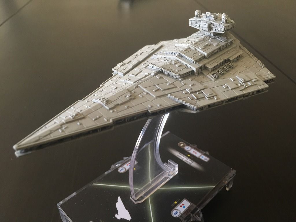
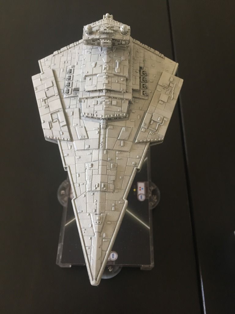
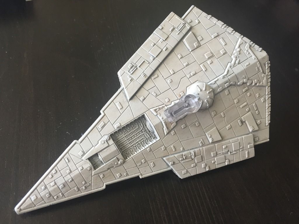
I wanted a nice and gritty feel, but not quite scrappy (that I'm saving for the rebs). The main goal was having something that looks like it could have been one color at some point, but that had enough interesting stuff going on to not look like a blob of paint (i.e. I wanted some panel modulation without overdoing the highlighting).

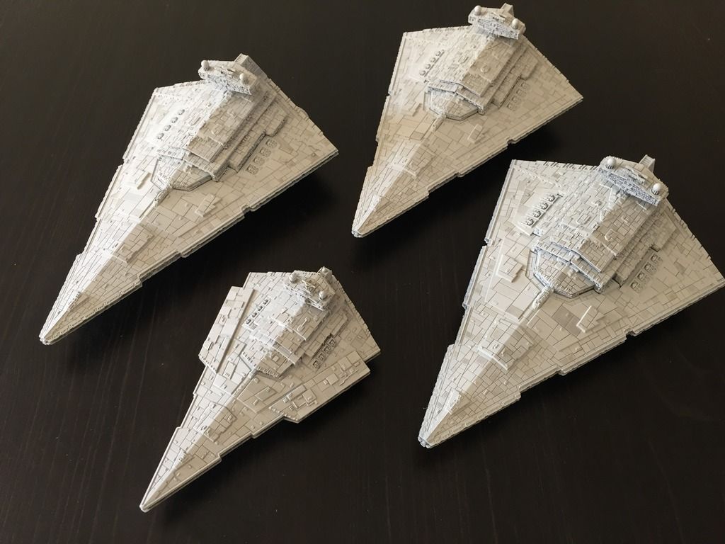
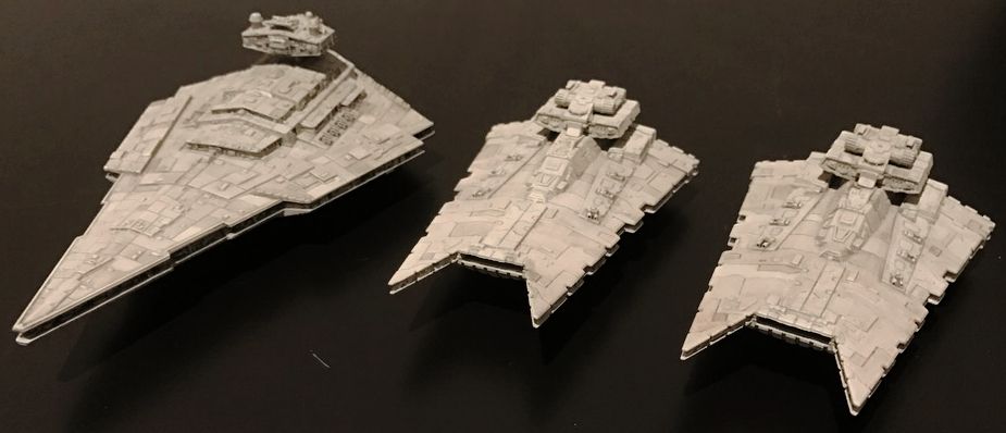
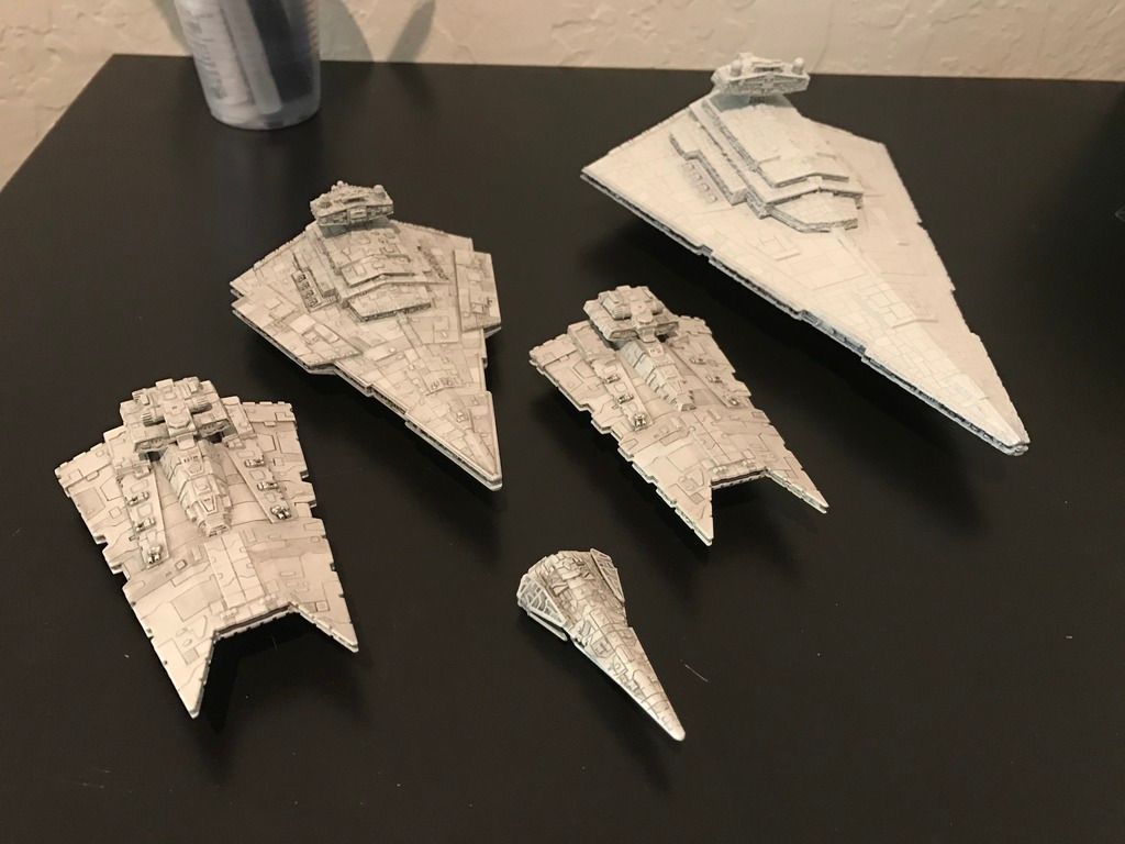
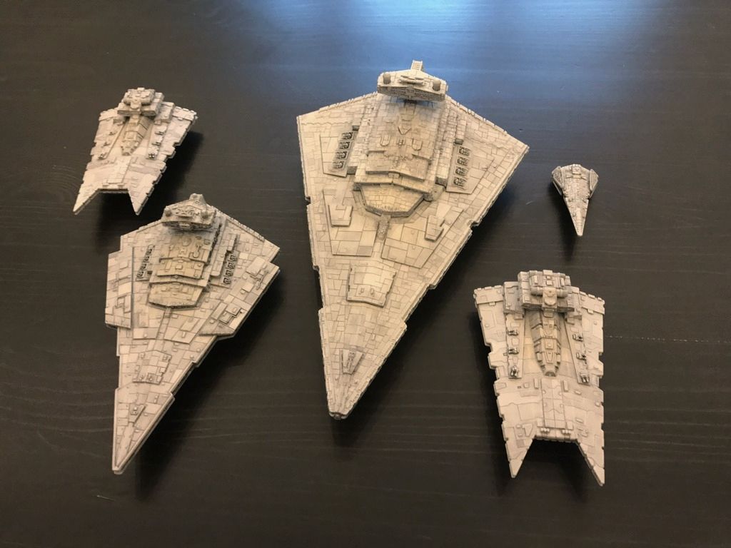
I've also got some glads that are having the same treatment done to them: they're at various points in the weathering (I use watercolors and pigments).

IMG_0176_zps5mdl3t7s.jpg

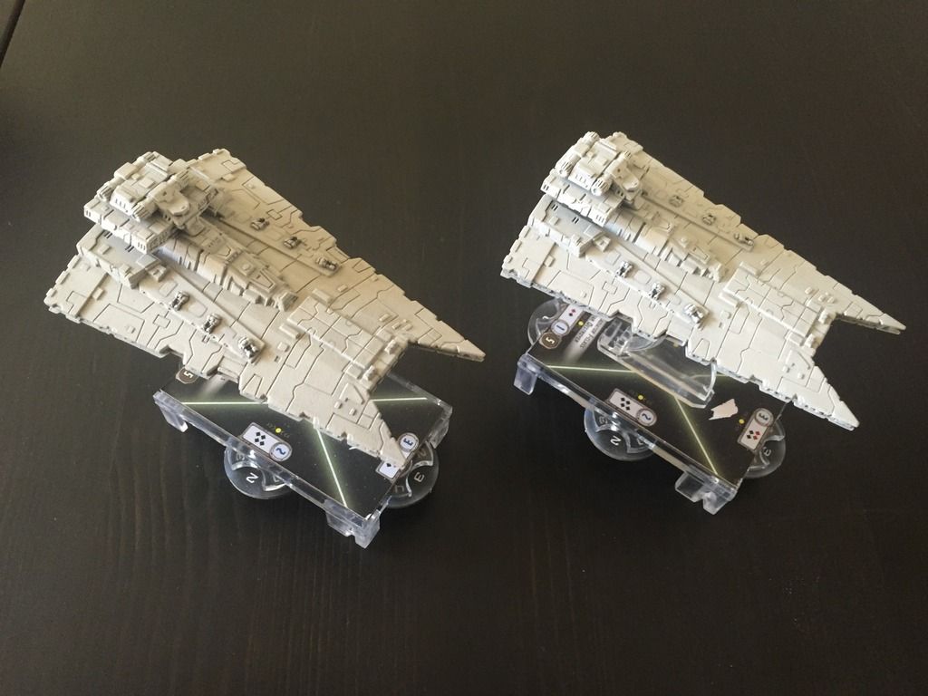
Both have been modulated with watercolor and the left one has undergone the first stage of weathering powder. I will then selectively remove it to create some streaking and completely remove it in other places for some clean panels here and there.

The three brothers...

IMG_00141_zpshp3plsnw.jpg

Absolutely love them... The off-colour panels aren't too strikingly different, and still keep the "white star destroyer" feel...

Very cool. I like that the ISDs still have a touch of color on the darker panels.

Seeing these kind of painjobs makes me wonder why FFG felt the need to paint the VSD (And every other Imperial ship since then) the way they did.

It the movies they look like this! Did they feel like that would look unpainted or boring?

Just so it doesn't seem like an afterthought, I do like those Destroyers DUR, even if I usually find it hard to make it look scaled between the various decks without exaggerating the features. It is a myriad of different plates and yeah, that is still really impressive and involved.

That said, I think you nailed it exactly Dras. The ships look relatively unpainted in a store display. The way that the FFG stock destroyers are, they really are remarkably dark, but scale wise and with filters vs. plain models from ROTJ and the likes, it just wouldn't scream 'painted miniature' if they were like the filming models. After all, I hadn't a clue that Star Destroyers white rather than grey until seeing the production shots. They always appeared to be purple, blue, or green tinted and I never questioned it. The MC80's are even 'worse' for that.

Post Scriptum: Oh, and I forgot to mention, great work on the snub-nosed VSD DUR. It's something that really does seem fitting with the supposed retrofits in the Civil War period 'core' fleets rather than the older outer rim sorts. Very nice touch :)

Edited by Vykes

Thanks all for the kind words! I'm actually inspired to work on them some more: every time someone pays me a compliment I take up the brush again- if it weren't for the forum, I don't think I'd have gotten past my first neb-b.

The "three brother" have actually had some more panel line decontrasting done, which unfortunately also removed the panel differentiation a bit too far. It was a lot "bolder" in real life than is showing up in the pictures: the VSD in real life looks halfway between like it does in the picture and what the ISD's look like, which is more what I'm going for in terms of overall look for my imps. My problem is I keep trying out new techniques as well: the latest one I'm trying is a combination of airbrushed water color, masking with post-it notes, and streaking using a damp q-tip with a final touch of weathering powder. The main problem is that since it's so easy to fix, I keep restarting when I find there's just a smidgen of something I don't like! :)

Of course, my other problem is taking pictures in poor, yellow lighting so that nothing looks proper. Oh well...

I have way too many hobbies. I'm also working on milling out some AR15 parts for a ground-up custom airsoft rifle that, so far, has parts manufactured in Sweden, Hong Kong, Japan, England, and the USA. I also am in the process of designing LEGO semi-transforming spaceships for a non-FTL sci-fi setting I dreamt up and hope to write about some day, and customizing various toys my OCD compulsion makes me dislike (mainly star wars and macross!)

Here's my flickr link:

https://www.flickr.com/photos/48877562@N05/

Beautiful star destroyers! Painted very much in the movie colors, and the subtlety between the lighter and darker shades is wondrous. :)

009_zpsthoyrc6v.jpg

Thought I'd try out the new iphone 7 camera- it does work a whole lot better than the 6 in low light, but not enough to compensate for my bad lighting :)

The above ships are my 4th or 5th (?) attempt at using my preferred weathering method: preshade panels in black/grey/white primer, then testor's camoflage gray base coat, then watercolor pencils/weathering powder on top.

This time, I think I might be actually done with them. No, seriously!

* Oops, forgot to mention: still need to retouch my pinwash on the "wire-y" hull details and guns and modulate the bridges on all 3 ships. Then I'll be done. Mostly.

Edited by DUR

My freshly repainted (yeah, simple green is just too tempting!) ISD waiting to get weathered up to join the rest of the fleet...

Also, I snuck a raider in there! Being small does make finishing one of these guys in an afternoon a piece of cake.

IMG_0480_zpshn4get0x.jpg

I think Vykes's feedback is dead on: the multi-panel greys do a good job of masking the height differences, which is a shame given that these details are really what make the ISD so iconic. So, I went back on the major panels and worked in a good amount of black, then feathered it away with a dry brush (another plus for watercolors!). This required yet another round of panel decontrasting, but I'm liking where this is headed. IMG_0510_zpsrdigiavk.jpg

IMG_0520_zpswuieux21.jpg

And in case anyone was wondering, yes, I did strip my other two ISD's :P .

Really now, though, I'm approaching "satisfied." From tabletop distance, looks like a white ISD. Close up, looks nice and textured

Edited by DUR

Oooooh oh I'm liking these. They still look a lot more uniform than than FFG's, lighter than a the majority, but the slight exaggeration on the plates suits the size and scale of the ships in question. Those -look- like white destroyers to me even if they are darker than the actual colouration. Frankly DUR, mate, I think you nailed the scale vs. reality ratio on the newer ones. Love 'em.

The only gripe I have is that they look like New Republic Star Destroyers in that white color. Lol. Look great though.

The only gripe I have is that they look like New Republic Star Destroyers in that white color. Lol. Look great though.

200_s.gif

New Republic? I'm just going back to my Pre-Yavin roots! It's too bad I didn't do that paint job on Mel's ISD-I kit though... if I were braver and not afraid of popping my ISD apart, I'd rather have done those guys.

That pic reminds me... time to seal the suckers up and start on the lights.

I'm used to the Legends timeline still. Lol.

Why cut off the antennas?

Why cut off the antennas?

1. Top one broke :P

2. I thought it worked better with the other Imp ship aesthetics. I made the flat-nosed VSD while eagerly awaiting wave 2 back in the day!

3. Just to be different, I suppose

Get those lights done!!! Looking forward to see what you do with the lights!

I've been thinking about doing my own Star Destroyers, and I too want to go the pristine white look. I'm curious what shade of white you used for these guys?

I've been thinking about doing my own Star Destroyers, and I too want to go the pristine white look. I'm curious what shade of white you used for these guys?

Testor's camoflage gray, acrylic: even though its a federal standard color (FS36622) the acrylic is WAY whiter than the spray enamel or lacquer (and definitely a whole lot whiter than Vallejo's FS36622). In all of my pics, the panels that are brightest that are nearly white are pure Testor's paint. Everything else has varying levels of pigment and black watercolor darkening it down.

I was recommended that color by the experts on the RPF forum as a close match to the studio's floquil paint: those guys are downright obsessive about their paints!

Really nice mate. Some of the best I've seen, as am not really a fan of overdoing the Imp stuff. Well done!

Ben, I promise I'll be working on those lights... some time before the Apocolypse :P

Anyways, more subtle touchups to ye olde ISD: a lot was done on the underside, that I did not photograph (PS: how many of you actually bother painting the bottom carefully?)

Starting on the edge highlights, but need to clean up.

IMG_0566_zpshknx3ixr.jpg

Nice! The bottoms are where I experiment or hone a technique.

They is good, yez! Fantastic ISD, one of the replica-esque ones I can't actually do myself but love the look of. I have to try watercolours some time.

As for the bottom. Uuuuuum... yeah, I tend to make it stylistic so it's always a lot darker, gets only one pass instead of 2, but it tends to not matter because I do a lot of lighting effect work for hangars that overpowers the rest. So it looks more complicated.

Nice! The bottoms are where I experiment or hone a technique.

I'm going to try my really, really weird ideas for lights on the bottom first. I'm trying to source some light blue, die cut glitter which I'm going to use for the points (I can find tons of other colors, can't seem to find this one... maybe I need a frozen sequel to come out first? :P ). Then, I'm going to glaze blue ink around each dot, followed up by a very small dot of strontium aluminate aqua glow in the dark pigment. I have no idea how this is going to work, but the idea was if I flash my ship with black light and then take a pic in a darker room, I'll have a nice glow. The glitter is there to act as a miniature reflector to help gather/disperse the low level light/catch overhead light.

Worked for my glock sights, so we'll see? Although I didn't use glitter, I very, very carefully cut out reflective foil. Works like a charm in low light (I would splurge for tritium sights, but I hate the idea that they dim every year...)