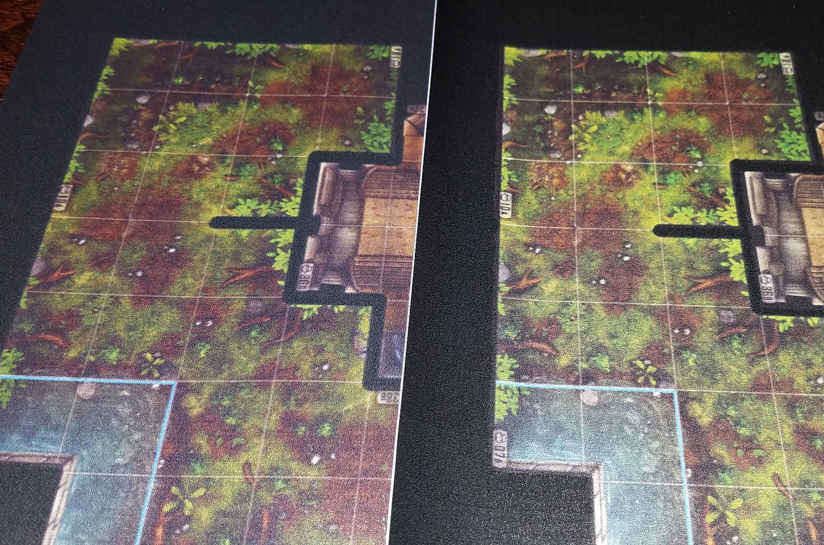
Here is a photo of the new maps that I got done. The one on the left was with no brightness and contrast changes. The one on the right is with a brightness of +30 and a contrast of +50. Might need to be increased a little more but that is a real good start. Sorry for the bad photo quality from my phone.
Did you make the changes in a photo editor or is it possible to do via pixelart's website?
Thanks!
You will have to use either photoshop, gimp, or other photo editor. I used photoshop to change the brightness and contrast for the maps. With the brightness set to +30 and contrast set to +50. All the lines are better visually than before. I hope that helps everyone with future printings.
