SirRunOn asked me to ditty up his own DiY sector. Here it is

SirRunOn asked me to ditty up his own DiY sector. Here it is
Yay!
It's all perty!
More seriously if there's anything anyone needs to know, the Clockwork Crusade is long past. The doors "Around the Bend" to Abidel are long open.
Just watch "The Last Path" from Scarus. For it may truly live up to its name.
Edited by SirRunOnStarting to continue the work.

Getting things ready to do subsector by subsector. However I don't know what fonts to use, etc...
I'll see what I can do, but I can't for the life of me figure out how to do those wavy lightning looking warp routes FFG likes.
Edited by SirRunOnSerious question here guys.
I've hit a snag.
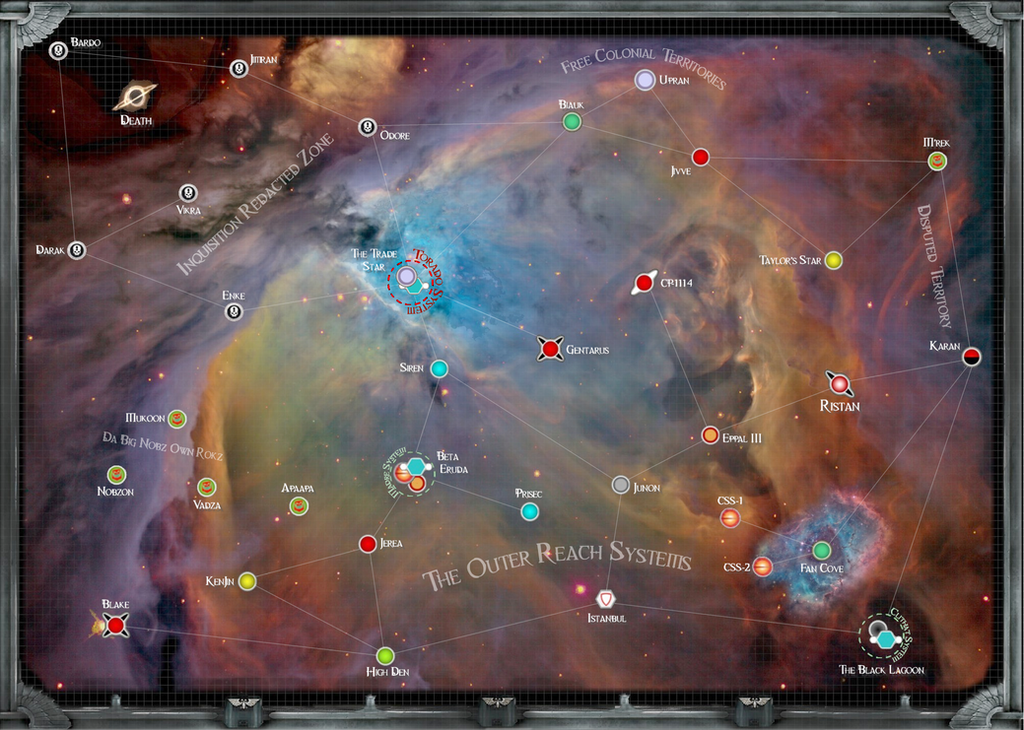
Does anyone know what image Cogniczar used for the Rifts of Hecaton? Doing the Fenris Reach is driving me nuts without it. I need to find out what he used, or a trick to extract it from the image.
Visually things have improved a little though.
I think that look works.
I used the Rifts of Hecaton for the Rifts of Hecaton. I'll send you the image by itself later on wednesday night. =D
Cool, thanks.
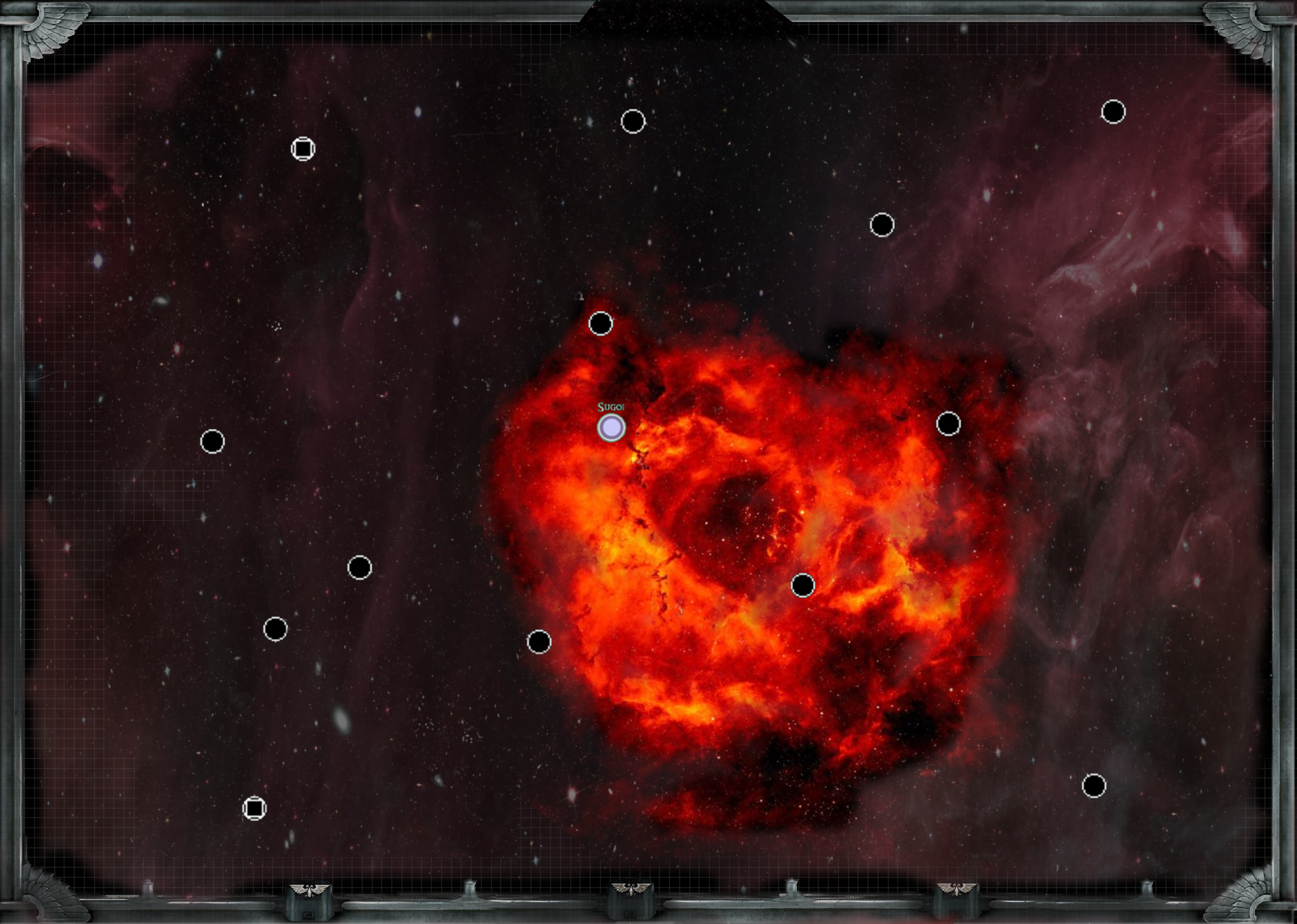
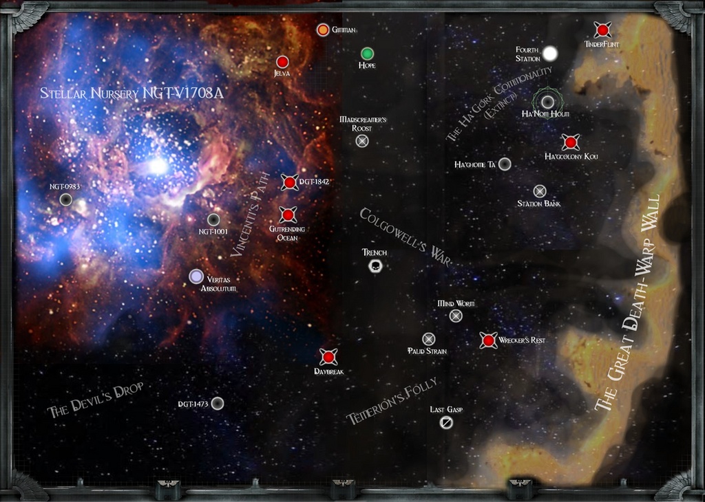
Can anyone tell me if Triton Sub here is too much? I'm a little at odds about it.
I don't know why, but it just doesn't look as good as the other ones. Of course writing in binary doesn't help...
Thanks for the input.
*rubs the back of his head*
Heh, yeah. I do like the curving name thing a little much since I've gotten Gimp. It's so cool I'm overusing it a bit.
Hrmm... I've been having to stretch the backgrounds to fit the 2000x1350 standard size. Maybe I can get a bigger version.
I've been having to place the titles over the warp routes on pretty much all the maps. I agree it isn't a perfect situation, but unavoidable in many cases. Not sure where to put the unknown darkness tag across all three systems it applies to. I don't think it would look good under instead of above.
Not sure how your language handles negatives. Doesn't seems much to violent?
Sorry, my english is ridiculous. ![]()
Oh, a GIMP user, congrats! F*** Corporations! Yay free software!! I'm overysing all the time the new tricks I learn. But... but, **** it! It's so cool... xDD
What I'm trying to say is that looks much more better if the whole map has a coherent format of labels. If you take account of the destinator position and use of the map It's easier to do. Example: In a classic page/poster map I try to avoid labels difficult to read without turning it or my head.
About overlapping labels, you could use an old trick. Opacity! Change the font for geographical area (like in official W40k maps; see Rifts of Hecaton or sector names of the Koronus expanse map, for example) to distinguish them and reduce or increment their opacity, change their color, etc. Test it.
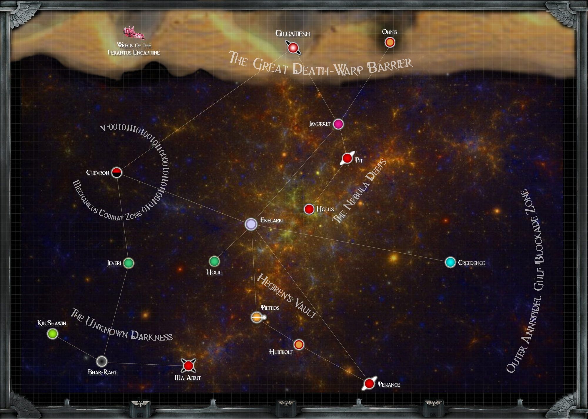
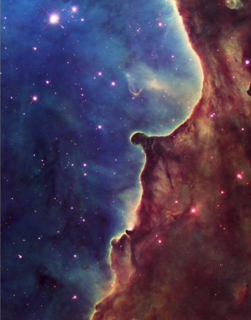
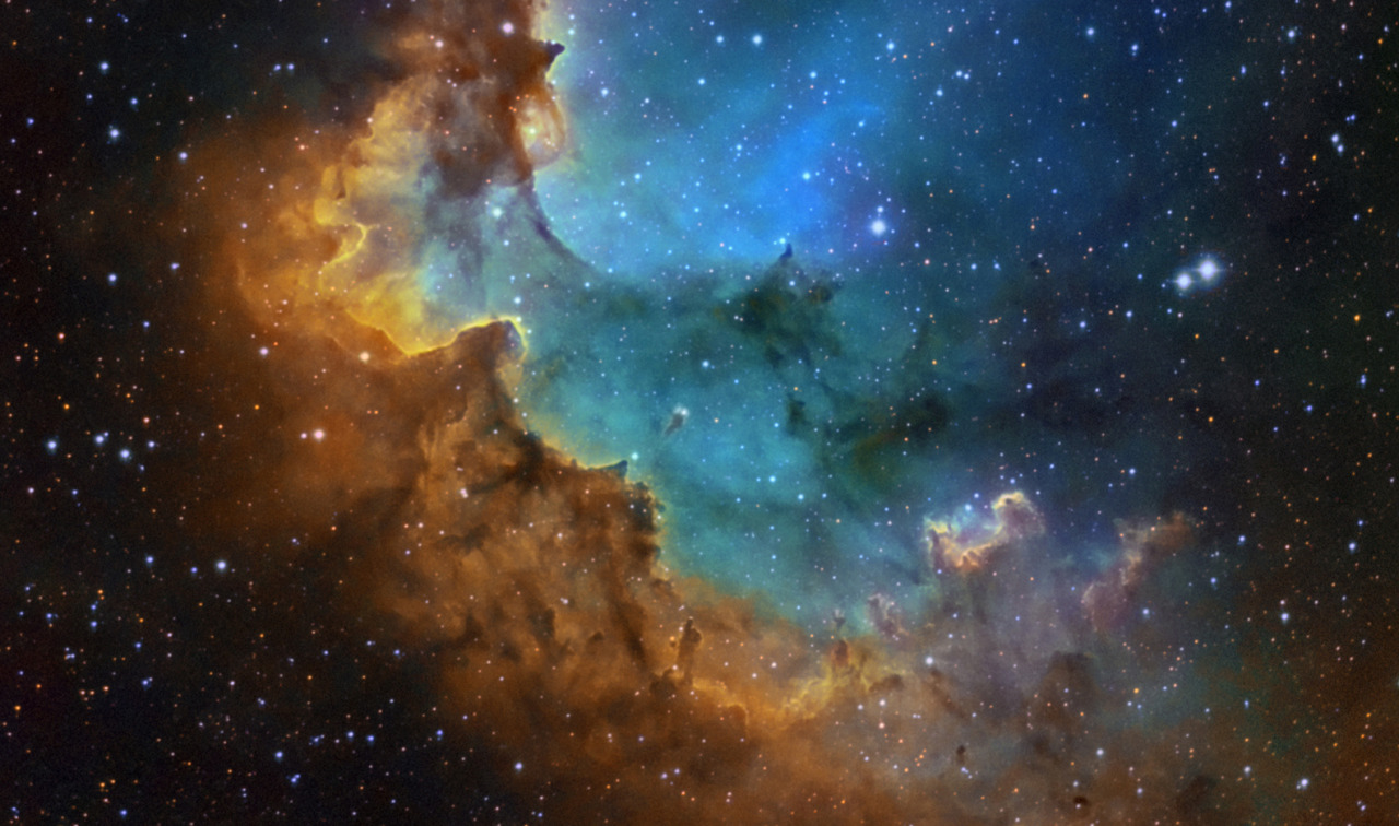
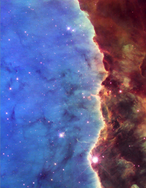
Finally, the Great Death-Warp Barrier. Your image seems me too plain and passive. A few examples of more vivid barriers. 1 2 3 4 5
Oooh, those images are pretty. I wasn't expecting such hard boundaries in space. I've been using erase at 10% effect to soften the edges of the wall one click at a time.
All the Death-Warp Wall images come from:
The image has a pretty hard line, but I just can't get my head around something solid like that in space.
The opacity of my second text layer(the one with the titles that are curved or at an angle) is 60%, I usually use 50% but that makes the warp wall title bleed out too much.
You're right I should have just left the Annspidel title flat. I'm a little curve happy. The Mechanicus Warzone on the other hand... err... it's the part I was having trouble with because I just can't seem to get it to fit in the area without making pretty rings.
The other two maps with the death warp wall don't have the same problems but they're INSIDE the barrier, and this one is OUTSIDE.
and

to me look considerably better than the Triton Sub map.

Ooh cooooool!
You used the blur tool. Heh I seeeee what you did there. ![]()
Thank you very much.
After seeing your maps, these videos could help you with your work. These are only a first contact with Blend possibilities.
Blend images in Photoshop / Blend images in Gimp
Enjoy them!
Hmm,
Hate in videos like those when they just do something in the background that makes a massive change and they don't explain even a little bit of it. I don't think I'm at a level to use those videos yet. I don't even know how to get something I pasted to stay on the image. I keep switching back from my old 2000 edition photo studio to gimp over and over. At least I can PASTE in photo studio.
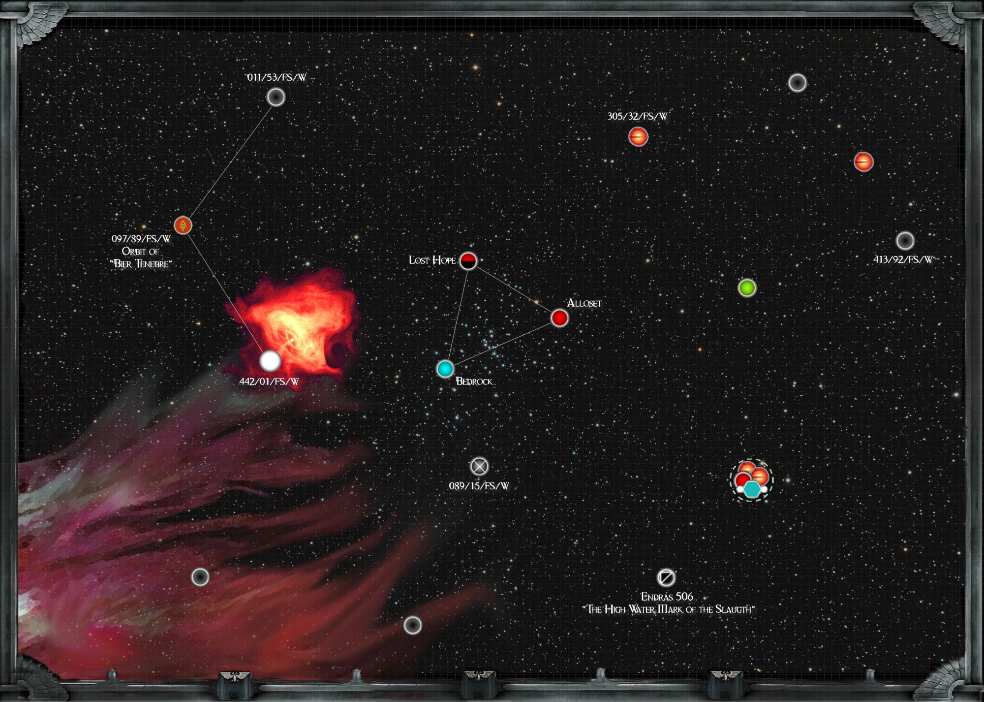
Working on Fenris now that Cogniczar has provided the materials. Not quite done with the "Storm of Ancient Rage" yet, but the image I found has real potential.
Sorry. Well I choosed a couple of short videos, because I didn't want to saturate you with a 30min video explaining all blending options. You're right, the best way to learn is following your own rhythms of enthusiasm and expertise.
Nice start! And yes, indeed. That image has real potential. Do you use any source for the position and names of systems and planets of each sector you create?
My position and name source is subsector maps from our local 1990's era Battlefleet Gothic campaign.
Almost all the information and ships come from that. The new stuff comes from my head.
*scratches his head*
Well, this version is too rough and WAY too big to put anywhere else so I'll just link to it.
Just watch out for the long download time. It's a bugger.
Figuring out how to refine this into something visible over two pages of a pdf might be interesting.