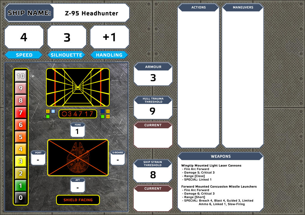
[Starships]: Player Dashboard

By GM Hooly, in Star Wars: Edge of the Empire RPG

Evening All,

Just seeking some feedback on this graphic I've done for my players.

Its designed to have some tokens or dice in certain positions on the play map to make this easier to track.

[EDIT: Below are the links to the latest versions]

STARSHIP PLAYER SHEETS

Starship Player Action Sheet v3.2 [ UPDATED 26/02/2015 ]

Starship Advantage and Threat Sheet v1.0

STARSHIP DASHBOARD SHEETS

Starship Player Dashboard (Blank) PDF (Silhouette 0-4) [NEW] [ UPDATED 27/06/2015 ]

Starship Player Dashboard (Blank) PDF (Silhouette 5+) [NEW] [ UPDATED 27/06/2015 ]

You will also need the following Fonts:

Electra Light Pro

Electra Medium Pro

EotE Font

COMPLETED SHIP SHEETS

AIR SPEEDERS

T-47 Airspeeder (Incom) [ UPDATED 27/06/2015 ]

T-47 Airspeeder (Alliance) [ UPDATED 27/06/2015 ]

FIGHTERS

A-Wing [ UPDATED 27/06/2015 ]

B-Wing [ UPDATED 27/06/2015 ]

X-Wing [ UPDATED 27/06/2015 ]

Y-Wing (BTL-A4) [ UPDATED 27/06/2015 ]

Y-Wing (BTL-S3) [ UPDATED 27/06/2015 ]

Delta-7 [ UPDATED 05/03/2016 ]

LIGHT FREIGHTERS

Firespray

Ghtroc Light Freighter [ UPDATED 27/06/2015 ]

Lambda Class Shuttle [ UPDATED 27/06/2015 ]

YT-1000 [ UPDATED 14/02/2015 ]

YT-1300 [ UPDATED 27/06/2015 ]

YT-2400 [ UPDATED 27/06/2015 ]

MEDIUM FRIEGHTERS

Action IV Transport [ UPDATED 27/06/2015 ]

Wayfarer-Class Medium Transport [ UPDATED 14/02/2015 ]

Edited by GM Hooly
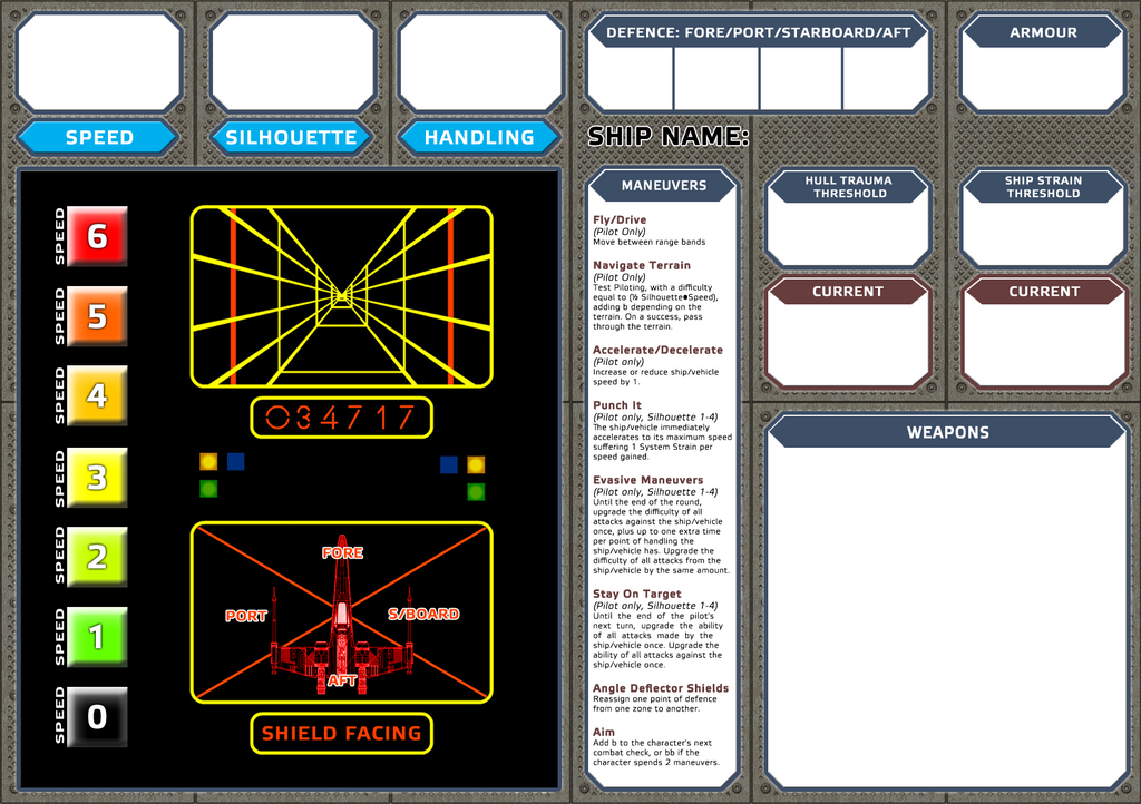
starfighter_dashboard_by_hooly1138-d8dmi

And here's an example of the Z-95.

z_95_by_hooly1138-d8dmjef.png

I imagine if it were laminated and used with dry erase pens it could be very useful.

The first thing that springs to mind though is "ouch! Printer Ink!", especially if I have to print 4-5 of them off.

Is there any way you could do a more 'minimal' version, without the background graphics and targeting computer etc? I only ask because I do see a use for it.

Some common actions such as Gain the Advantage and Fire Discipline could be a handy sidebar like the manoeuvres side bar you have there.

Good work regardless though!

I LOVE IT.

Though I agree, a list of actions would be good (maybe in the space currently used for the DS trench)?

This is really good. My pilot character would find this incredibly helpful the next time we get into some space-type combat. Is there a way to do a form-fillable version of this?

Very nice. Impressive even. And just to reiterate.

  • Less black. Maybe more of gray shades. As noted killer on printer ink.
  • Maybe dump the trench run and shield graphic in favour of just a ship image (if you are going to do a bunch for different ships) or if it is going to be form fill-able, a spot to load an image.
  • Also, maybe use some of the space and break up the common moves into maneuvers and actions.

I like it though.

It'd be nice to give this to Ogg so he could fold it into his Char generator.

It looks great. Having said that, here's my thoughts:

I think you might want to differentiate between Sil. 1-3 ships that only have Fore/Aft arcs and Sil. 4+ ships that have more. Currently your Headhunter sheet implies it has 0 shields on 3 arcs.

For the sake of economies of space, you might want to put the defence value boxes on the facing diagram? Then the PCs can easily put tokens on a given arc if they boost shields and see the total defence value. To be honest, you probably don't need to write the facing names there as unless your PCs are so stupid they try eating the dice they'll already know them.

If you wanted to go super condensed, you could put the ship armour in the centre of the arc diagram so it's a full defence diagram.

A slightly more generic/stylised ship image on the arc screen would probably also be good, as it'll clash a bit to have a detailed X-Wing on your Y-Wing/Falcon sheet. Unless you use a ship-specific image? Online game tools like Vassal often have libraries of fairly simple top-down ship sprites available.

Similarly, you could merge the ship maximum speed into the speed gauge- have those speeds > maximum done as an outline, rather than a full coloured box. That way a PC with talents that buff speed can still keep track of higher speeds. Then just have 'Speed' as a title for the column rather than repeated for each entry.

Aesthetically, 'Ship name' stands out a bit when all the other titles/properties are put into a neat box.

The targeting computer is nice, but something of a space hog- it might be a better use of space to fit in ways to spend advantage/threat in space combat, as those are what my PCs tend to struggle to remember.

Also with some talents you can get a higher speed than you have listed. IE a pilot in a tie with full throttle a couple times can get going speed 7 or 8. With some mods they could get to a 9 or 10.

Wonderful! Thanks for your ingenuity!

I imagine if it were laminated and used with dry erase pens it could be very useful.

The first thing that springs to mind though is "ouch! Printer Ink!", especially if I have to print 4-5 of them off.

Is there any way you could do a more 'minimal' version, without the background graphics and targeting computer etc? I only ask because I do see a use for it.

That was my intent regarding dry/wet erase pens, and having it laminated.

The intention was also to have it printed at a Kinkos or similar (here in Australia, I'd do it at an Officeworks).

I could try a minimal ink version, and see how it looks.

Edited by GM Hooly

You have some great ideas there. I was looking at my generator's vehicle sheet and I think adding a "Current Speed" track would make it more useful. I'm also thinking of how to add "Current Shields" boxes to the shield diagram. And having actions and maneuvers on the sheet would be really handy, especially since I can never remember them all :)

This has definitely got me thinking. Great job!

This has definitely got me thinking. Great job!

Coming from you sir, that is high praise indeed! Thank you :)

This version is a work in progress. Let me know your thoughts:

starfighter_dashboard_1_1a_by_hooly1138-

Nice. Looking good.

ludicrous-speed.jpg

The "10" Speed box should be plaid.

;)

I really dig what you're doing here, man. Plus, you've got your sheets looking very FFG-esque. I couldn't get my boxes to have the "triangle corners" when I did my Jedi Career trees 2 years ago. I like where you're coming from with the second image, with the Shield Zone Facings so we can add in numbers or dashes if there are no facings on that size a craft.

I would totally print this at Staples or Kinkos; a lot cheaper than blowing printer ink on it. I also would laminate these sheets, but unless it's the "campaign vehicle" I'd probably leave them as generic as possible to let the PCs fill it in as needed. I like the Targeting Computer graphic, but I'm a graphically inclined guy. If flat on a table, the pilot can per-emptively move in setback or boost dice that apply to their next roll into that targeting computer box.

Weapons box needs to be bigger (especially for the generic-style sheet), or the weapon descriptors reverted to how they are in the book. Some ships out there in the PC's hands have 3 or 4 possible weapons to choose from (lookin' at you, B-Wing).

What about shuffling Armor, Hull Trauma, and System Strain back to the top and moving the Actions and Maneuvers bars down next to the HUD plate? Does that give enough room to add in a cheat sheet for spending Advantage and Triumph in vehicle combat?

Dangit Darth, you beat me to the plaid comment. :(

For the pop culturally challenged :)

This version is a work in progress. Let me know your thoughts:

starfighter_dashboard_1_1a_by_hooly1138-

I would recommend shifting the weapon above action and maneuvers. Maybe be stretch it a little to help fill in a little space.

Just a throwing my two cents in on this. But great design idea.

This version is a work in progress. Let me know your thoughts:

starfighter_dashboard_1_1a_by_hooly1138-

I would recommend shifting the weapon above action and maneuvers. Maybe be stretch it a little to help fill in a little space.

Just a throwing my two cents in on this. But great design idea.

I agree with SynysterDreamer: moving the weapons up higher. Perhaps have it to the right of Ship Name and make it as tall as Ship Name and your Speed/Silhouette line. Extend it across the rest of the top there to cover more of the weapon systems (as some ships, even fighters, have more than two systems).

I would then move the Actions and Maneuvers down to be side-by-side with Armor/Hull/System. Make them a bit wider to allow for players to write in their favorite manuevers and actions (or have them pre-typed) and you're good to go!

Also, with that idea in mind: if you can squeeze in a "current modifiers" or "current condition" tab in order to track critical hits, astromech maneuvers, etc, that'd be pretty awesome.

I'd consider adding a sub-box next to shield boxes with Total Defense - Talents and special actions can increase zone defense. With this box at a glance everyone can see what's the current value.

Something I would suggest from a graphics point of view is to have the targeting computer right above the weapons section.

Also from a graphics point of view, instead of the diamond plate design, have the background be similar to classic Star Wars dashboards:

console.jpg

Y'know, black areas denoting function with white sub-function areas outlined in pinstriping. I know this goes against the "save ink" thing, but it would look more in-universe.

OK, my next pass (Version 1.2). Feedback always welcome, and thanks to those who have provided feedback already:

starfighter_dashboard_v1_2_by_hooly1138-

That looks real nice.... Now if we can get oggdude to output a character and ship onto this :P

Could we do a version for gunners? IE Chewie would get one of these and then Luke and Han would get a different sheet specific to them being at the guns. If one is using the deathstar escape as an example.

Edited by Daeglan