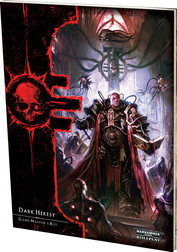
So having found a picture of the new cover today, yes I am slow like that, must I say that I am rather disappointed over how the new edition looks. It is like someone have taken a lesson from the GW guys in cover making, making it look like an action movie instead of showcasing a little piece of the awesome setting that we know and love.
But what do you other think about the new cover?