What does people think about the new cover?
Wait a minute how come the GM Kit gets a better cover design than the core book which we all know the core book is the main selling point? I have to agree with MajorTomK in that the kit looks better. I rather go with the MajorTomK route, or go with minimum stuff than what we have for a cover now.
They have a cooler looking GM screen for two reasons:
- It makes the GM look cooler
- The players have to consistently stare at it for a much longer period of time, not to mention more often

On the red outlining... You all know that's the colours of the Inquisition and how the rosette often appears? Black stylised 'I' bordered with a scarlet or blood red...
I actually like the black and red I. I question the necessity of a second edition, and the picture is bleh, but the I I like (and the GM screen is quite cool too.
Icon as is and solid black background would be awesome.
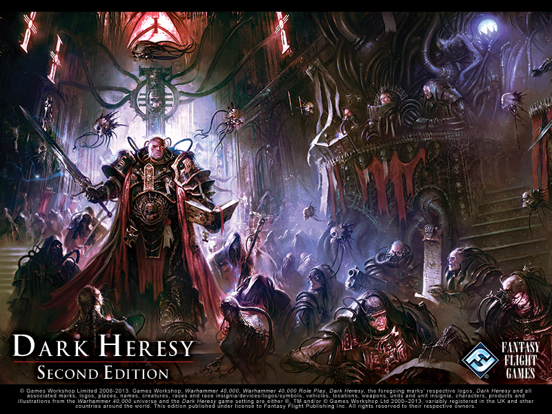
I actually don't like the large symbol on the cover. There background image is actually a pretty epicly detailed painting showing a bad ass inquisitor surrounded by a bunch of sinister looking cultists and servitors?. So why spoil it by using the least interesting part of the image and cover it with a simple plain black symbol. it's such a waste of the painting. I think the current design belongs on the back of the book.
I think the cover looks great.
BYE