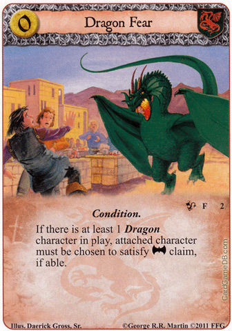
1. Apologies if, for my first post, I'm going over old ground but I wonder if anyone else agrees with this point. I'm comparitively new to the game but, being a big fan of the books and television series, there was something I noticed pretty quickly when I purchased a couple of copies of the base game. The card art was very inconsistent. With a few notable exceptions (Cersia, Chella) the standard is at best okay and mostly, well, ugly. Cards like Great Keep, Grey Wind, I never bet against my family, Insidious Ways, Renly's Courtier, Robb Stark, Eddard, Shadows Blessing, You've killed the wrong dwarf, etc are all difficult to look at. While the art is secondary in importance to gameplay, it's certainly something I look for in the game, and a big reason for why I stuck with Magic so long before becoming fed up with having to spend so much money to compete. It's not just that some of the graphics are dodgy, but there's no consistency to the style of the art - some of them look like cartoons while other's are far more realistic.
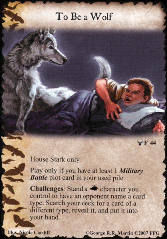
However, would it be fair to say the art has improved noticably as the chapter packs have been released? I don't own them but looking at A Song of the Sea on Card Game DB I can see some pretty impressive looking cards. Cards like Victarian Greyjoy and Longship Golden Storm stand out but generally there seems to have been a significant improvement in the look of the cards across the board. A quick glance at the preview of the Kingsroad cycle shows some pretty impressive looking cards too (Jon Snow, Ygritte, Arianne) which is encouraging.
2. I'm sure I'm not alone in this frustration, but I'll voice it anyway. I've been really enjoying the game so far and looking to expand and improve my decks. However, I'm having a lot of trouble picking up the Greyjoy expansion as well as the chapter packs from the first few cycles (Ancient Enemies, Sacred Bonds particularly). Are they likely to be reprinted?
3. I live in London and currently my only playing partner for this game is my girlfriend. This wouldn't be too bad but I understand the game is better with more players. Does anyone else here live in London and fancy a few games at some point?