what do you find is the best and worst card artwork?

By Robby Stark, in 1. AGoT General Discussion

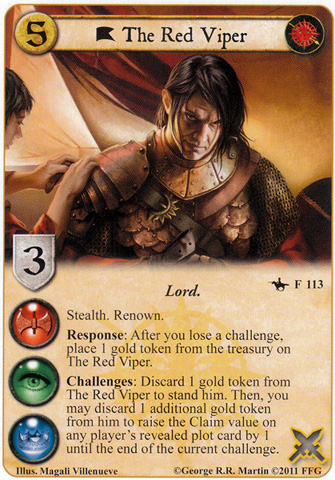
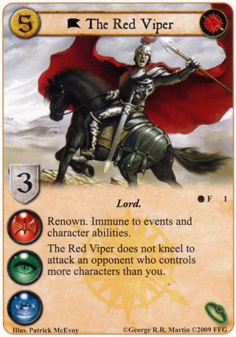
both of these oberyn martel artworks are genius in my opinion

http://www.cardgamedb.com/forums/uploads/got/med_the-red-viper-aps.jpg

http://www.cardgamedb.com/forums/uploads/1281901976/med_gallery_34_324247.jpg

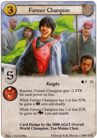
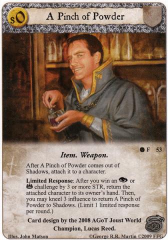
on the other hand I can't look at former champion or pinch of powder without going what the **** were they thinking?

http://www.cardgamedb.com/forums/uploads/1281901920/med_gallery_34_314350.jpg

http://www.cardgamedb.com/forums/uploads/1281901920/med_gallery_34_31508.jpg

especially former champion, he looks like some out of shape video game kid.

um… do you know that the characters depicted on "Former Champion" and "A Pinch of Powder" are intended to look like the players who designed those particular cards?

Kinda a jerk move to pick those two cards

I always thought Dragon Fear seemed a little… "off"

Edit: ok it looks just plain ridiculous

dragon-fear-qod.jpg

Lyanna Stark is a card with exceptional art. Core set Eddard, on the other hand, brings shame to House Stark. Its mostly his pose, but it just looks awful.

flipperlord said:

um… do you know that the characters depicted on "Former Champion" and "A Pinch of Powder" are intended to look like the players who designed those particular cards?

nah I mean it. former champion looks ridiculous. it's not that the actual kid posing for the artwork is ugly or anything, but it looks so out of place in the game of thrones universe.

the guy in the background of The Blackfish looks like an effeminate Harry Potter ;)

cooleo1c said:

Kinda a jerk move to pick those two cards

I always thought Dragon Fear seemed a little… "off"

Edit: ok it looks just plain ridiculous

dragon-fear-qod.jpg

agree. For me, this is the worst. On the other hand, Field of Fire is breathtaking

http://www.agotcards.org/cards/eng/medium/dragon37.jpg

dcdennis said:

the guy in the background of The Blackfish looks like an effeminate Harry Potter ;)

LOL

Dragon Fear is by for the worst. Lannisport brothel is next though.

Aeron damphair (VM) is amazing artwork

These are my favorites. They are cards from the CCG days though.

wes21.jpg

wes6.jpg

I think these were drawn before the days of computers and while Crayola was just starting to come out with some interesting colors.

No one has mentioned The Battle of Ruby Ford as the best art yet?!?!?!?!

Shame on all of you.

I would buy a full size picture of that and hang it on my wall. The artwork on that card is brilliant.

mdc273 said:

No one has mentioned The Battle of Ruby Ford as the best art yet?!?!?!?!

Shame on all of you.

I would buy a full size picture of that and hang it on my wall. The artwork on that card is brilliant.

agree, that's also one or my favorites

um… do you know that the characters depicted on "Former Champion" and "A Pinch of Powder" are intended to look like the players who designed those particular cards. WOW that is cool. Did not know that!

Best artwork? Anything done by Tomasz Jedruszek. Am i spelling that right? He's one of my favorite. So many amazing artists on Thrones.

I'm a big fan of the art on Griff. The Drogo art on the box in the current League kit is awesome, I remember seeing it on a banner at GenCon and being impressed, wonder when the card will show up and what type of card it will be.
Dragon Fear is the first thing that came to mind for awful art, but some of the other QoD Cards are pretty bad too (Hired Swords, I'm looking at you). The ones Bomb posted are just downright horrible, Arya apparently joined an 80s band at some point, and the card itself is horridly vanilla too.

Going to have to throw my vote behind Aerong Damphair (VM), although there are plenty of great cards to choose from (especially in that set!), including some really nice landscapes in the unpronouncable Martell locations. The artwork is very good, but the pose is inspired and I think does a phenomenal job of capturing the character. I'd like to give an honorouable mention to Seductive promise, for similar reasons - an unusual but excellent choice to represent the card name.

As for least favourites, "The Art of Diplomacy" bothers me. The artwork is lousy, and there were so many other good choices of representations for a card of that name.

Sokhar said:

Core set Eddard, on the other hand, brings shame to House Stark. Its mostly his pose, but it just looks awful.

he looks like he's reloading his sword like a shotgun

bumping this with to be a wolf: http://www.cardgamedb.com/forums/uploads/1281901580/med_gallery_15_111298.jpg

what the hell? the reason I hate this artwork so much is that all other ''to be a beast'' cards are gloryfing to their respective houses, however the starks get bran who looks like he just sharted himself. is this really what the artist thinks it means to be a wolf?

Robby Stark said:

bumping this with to be a wolf: http://www.cardgamedb.com/forums/uploads/1281901580/med_gallery_15_111298.jpg

what the hell? the reason I hate this artwork so much is that all other ''to be a beast'' cards are gloryfing to their respective houses, however the starks get bran who looks like he just sharted himself. is this really what the artist thinks it means to be a wolf?

Hahahahahaha. I play this card all the time without thinking about it. I forgot how half the card's art is awesome and half is terrible.

mdc273 said:

Hahahahahaha. I play this card all the time without thinking about it. I forgot how half the card's art is awesome and half is terrible.

Wait…what!? You have a version of To Be A Wolf with half awesome artwork? What's that? Some limited edition alternate art thing?