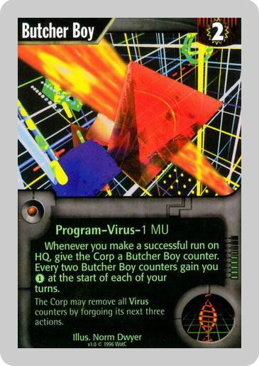
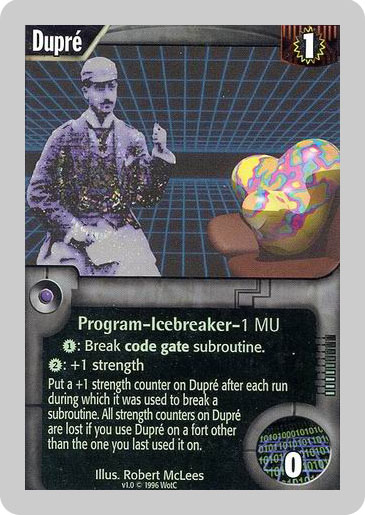
I like the new art. Every game doesn't have to be a shade of grey or brown. I would like to see a lot of chrome in corp cards and runner cards a bit more dark. I just don't like when different art styles are mixed together like Cyberfeeder and Tinkering (that is only art I don't like this far).
Your Reaction
oDESGOSTO said:


Yeah, I mean, one is welcome to either like or dislike the new style as one sees fit (I'm sort of weakly ambivalent, myself--to cast matters in terms of Dominion cards, I definitely like the art on Laboratory more than Shanty Town, but not enough to get worked up over it), but you're definitely not doing yourself any favors by choosing two painfully dated pictures, which, if I didn't know any better, I'd swear had been taken from the covers of the Young Jedi Knights series or somesuch.
oDESGOSTO said:
You compare the old and new card style by using Yu-Gi-Oh as your example? There are lots of serious scifi depicting less than perfect futures with clean environments like Gattaca, Minority Report, Transmetropolitan etc. With authors like Warren Ellis, Richard Morgan and Charles Stross cyberpunk has moved on from its roots originally envisioned by William Gibson, Bruce Sterling and others. The visual representation of the genre should also move with the times. Also there were some real stinkers in the original game like:

Mike Kimble better be a pseudonym

I was going to copy porn from the interweb but my modem broke down before I could download a whole picture

Because Tron is kinda cutting edge. Hey, I know let's do a whole bunch of card containing CGI. I bet they still look fresh after a decade of so.

Or maybe not.
Keep in mind, that we have just seen a handfull of cards (about 15 or so).
That's way to small a sample to judge the overall art style right now.
For the record: I like the Art so far. But I also like "oldschool" cyberpunk art.
I think the rest of the cards of A:N will look similar to those we've seen so far. In recent LCGs (LotR, and that cards that I've seen for SW) FFG seems to take care of maintaining the same sytle for the portraits. I think the artwork is pretty consistent (okay, some exceptions as always, but there aren't many, compared to other card games, and those are not as strong as in other card games).
I like the 2 original NR portraits oDESGOSTO showed more than the new artwork. But the 4 pics Mikko Leho showed really suck ;-)
HilariousPete said:
I think the rest of the cards of A:N will look similar to those we've seen so far. In recent LCGs (LotR, and that cards that I've seen for SW) FFG seems to take care of maintaining the same sytle for the portraits. I think the artwork is pretty consistent (okay, some exceptions as always, but there aren't many, compared to other card games, and those are not as strong as in other card games).
I like the 2 original NR portraits oDESGOSTO showed more than the new artwork. But the 4 pics Mikko Leho showed really suck ;-)
The art for W:I is mostly OK, but inconsistent and with some real stinkers in there. So far I like the art for Netrunner, much more than any of the examples shown so far from the original including the portraits, but it's showing signs of that same inconsistency already.
I do not mind inconsistency. As long as the art is good.. why dose every card need to look the same.. I like it when the art is diverse and shows different styles from different artists. Just as say a comic can have different art styles over time and though different books. I have no need for every single card to look like every other card.
Also in the original netrunner the art had a massive divide between "virtual" and "real world". All the bad cards linked are for virtual cards… so the "inconsistency" that is being complained about is in fact in designed and NOT inconsistent when you consider the entire set… the card art still sucks in those examples.. but I think you can appreciate what they are trying to do with these crazy looking cards.
Oh, I didn't want to make a bad judgement on art inconsistency. In fact, this is something I liked in old MECCG from ICE. You could see how differently the artists imagined Middle Earth, or elves and so on… So you could find some cards you absolutely liked in it. (The downside is, that you'll also find some strong dislikes, of course). If FFG is maintaining high consistency, then that just means that you know what you'll be getting when buying another monthly pack. If you like the style of the art, it's great; if not, then you'll know that you'll dislike it most of the time…
Mikko Leho, there are good and bad examples everywhere. I do like the new virtual world cards from this NR:A, of course they're better than the old ones. Even M:TG has seen worse card pictures and in these days you can't point a single one (badly drawn art as those back in the days).
But I guess this happens because of evolution. It's like Lukas said, he did SW Ep. IV, V and VI but couldn't do I, II and III because he didn't have the technology. I guess that old ugly artwork examples are just the same, they had the ideas but they didn't have the tools to execute those ideas, as they have right now.
And don't take me wrong, I'm not dissing the new artwork and art designers. I'm just criticizing the style they're using in this game. I was hoping some neo-futurism in the veins of Matrix or Repo Man, but they're giving us this cartoonized art, which IMO doesn't seems fit to the theme of the game (I'm mentioning the original NR game, I don't know the Android universe that much).
that is a pretty bad example as III, IV and V look way way way way better than I, II and III
booored said:
that is a pretty bad example as III, IV and V look way way way way better than I, II and III
How can III look both better and worse than itself? o_O Seriously though, define "better." Are you referring to the excessive use of CGI in the prequels?
In the "original" trilogy there weren't many open shots from the planets and cities visited, while in the prequels there are a lot of open shots, and I understand you can't go with Ep. I but those shots from Naboo and the Podrace stadium are just something that is worth seeing.
And as I mentioned before, I'll show the difference between now and then:

Of course the now example looks way better!
Just because the techno look on the old cards looks old doesn't mean that newer art in a similar style would be bad. TRON: Legacy and now Uprising have both done great jobs of updating the "inside the computer" look.
I'm ambivalent on the art style overall, and some do look better than others. Decoy is horrible, but Posted Bounty has a nice gritty look to it, and Neural Katana is more of what I'd expect from VR space. Some are just baffling though, like Ninja up there. What part of that art, exactly, says "Ninja!" to anyone? Pinhead's Dreamcatcher, maybe, but really… Ninja?
I assumed that the pinwheely shuriken thing was just Ninja's attack. You don't see Ninja.
^^This^^
subochre said:
I assumed that the pinwheely shuriken thing was just Ninja's attack. You don't see Ninja.
Indeed. One would think the flavor text is self-explanatory on that front.
I have to agree. I thought the pinwheel was the attack…not the ninja.
<shrug> Just doesn't look like it to me. Nothing in there says shuriken, or ninja, or war fan, or… well, anything the least bit ninja-y. Take away the title and flavor text, and consider what you see. That's my dislike.
Artwork in a game is always subjective though, I for one fell in love with the game for its artwork before I even knew what a Net or a Runner thereof was! Also, FFG have a great track record of improving their art over time, I'm sure once the cardpool is bigger art wont be that much of a problem
Could Ninja look better? Sure. But it's OK, certainly not bad enough to bother me or be any sort of issue.
BTW oDESGOSTO, where did you find the A:N images? I see Private Security Force and Decoy only in a fan of cards, parts of them hidden under other cards. The only pages with pics I know are the description page and the news page. Am I missing something?
If you RGT_BTN tracked those images you'd see I took them from BGG! ![]()
thanks!
of course his raises the question, how the BGG members could get those pics… probably a few runners amongst them… ;-) nevermind
The pics are from right here, on the FFG site. All it takes is a little figuring out, the addresses for the existing single card previews are consistent, fill in an equivalent for the cards in fans and Robert's your mother's brother!
What's likely is that these card images will be included in a future news/info update and they had the images already loaded onto the server. Nothing improper about it since the files are publicly readable (they're free to take them down / change the names / change the permissions if they wish, but why?)