Imperial Money

By Ikkaan, in Dark Heresy

God, its late and i finally got to do this...still not satisfied, but its a start...

Imperial 5 Credit Bill
Imperial 10 Credit Bill
Imperial 20 Credit Bill
Imperial 50 Credit Bill
Imperial 100 Credit Bill
Imperial 500 Credit Bill
Imperial 1000 Credit Bill

Special facts:

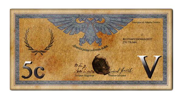
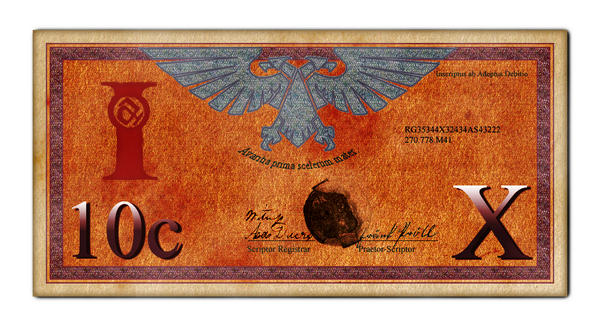
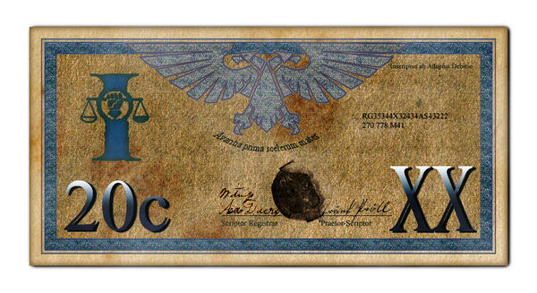
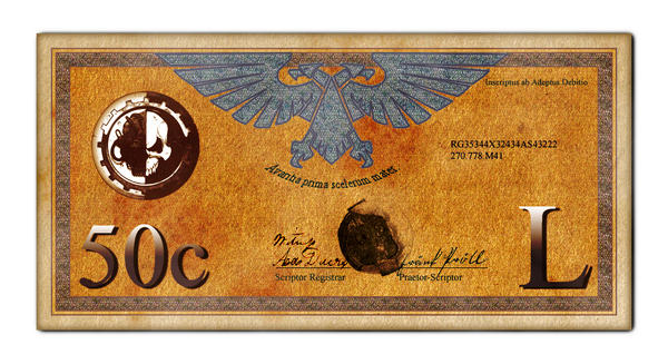
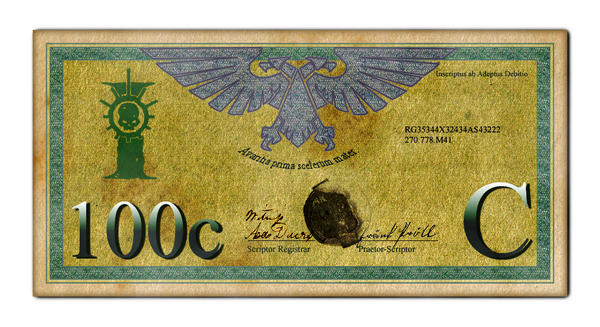
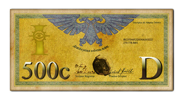
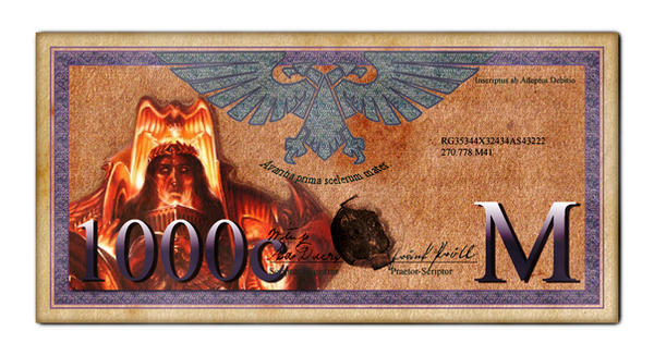
Each denomination shows the symbol of one of the adeptus in the high left, except the 1000C bill which depicts the emperor.

Value is stated in numbers to the lower left and high gothic value on the lower right (yeah, you get to use your education).

Bills are color coded and probably blind-readable.

Motto under the aquila means : "Greed is the mother of all evil"

Very cool! I like them a lot., they are very eye catching. You put a lot of good effort into the project. Very good show man, and keep up the good work.

If I may, I would like to offer a few suggestions on how you could step them up a few notches. At the very least, something to play around with.

-Adjust the Drop Shadow on the numerical graphics just a bit so that the numbers don't look like they are floating away from the shadows. On the flip side, you could try to increase the distance to put greater emphasis on the effect.

-You might want to try putting a noticeable matching texture on your faction symbols/Emperor graphics to better integrate them within the note. Or do a fairly faint texture to denote them as part of the note, but using a different printing process that makes them stand out. You can play around with this concept in many ways. Also consider brightening up the Emperor graphic just a bit so that it's not too dark and fits in a bit better with the lightness of the script's background material.

-Keep the numerical graphics with the smooth printing. It helps to offset them from the printed note, much like various forms of RL modern money. Also play around with the metallic gradient on the notes. Try increasing the range of the various color bands, or rotating them at different angles for different notes. Maybe even try other gradient effects for more of a holographic look as opposed to a straight metallic look. You might also want to try a brighter color range on the numerals on the 1000 script. This will help the "1000" stand out over the Emperor graphic which is already very dark..

-Consider removing the Drop Shadow off the Emperor graphic and implementing a slightly hazzy and very thin overall edge. That would help the graphic stand out better. On the flip side, you could make a more solid, wider, or styalized edge depending on how you want to reflect the design/printing process.

-Try making some alternate and commemerative currency with various other notable figures in the empire. They can range from various governmental figures (High Lords Of Terra et all), notable historical personalities, or heros and saints of the Imperium. Since there isn't always pictures of said individuals floating about, you could create your own. As long as the person looked the part, then that's all you need.

-Final suggestion would be to come up with flip sides of the currency. Then again, one sided script does have it's merrits too. in any case, put together some full sized high quality printable versions so that us GM's can use them to pay our players and keep track of funds in game. gran_risa.gif

Just some suggestions on my part. Take them as you see fit.

Thanks. I appreciate your suggestions, i´ll get to it later.

They look like they're going to be great props.

Is there any chance that they could be different sizes? If there's any one single thing that helps blind/partially sighted people that's it, that said even as a fully sighted person it's something that you don't realise how useful it is until you go somewhere that doesn't do it. It's not just a matter of scaling as some elements, such as the note number, remain at a constant size on all notes.

Oly said:

They look like they're going to be great props.

Is there any chance that they could be different sizes? If there's any one single thing that helps blind/partially sighted people that's it, that said even as a fully sighted person it's something that you don't realise how useful it is until you go somewhere that doesn't do it. It's not just a matter of scaling as some elements, such as the note number, remain at a constant size on all notes.

I know what you mean. Didn´t think of it....argh....too difficult. They smaller bills would need to be distinctive...

That is exactly what i thought when i started: ****, this is going to be complicted, i´m no designer.

Let me think about it. Maybe i find fluff excuses for the bills to be of equal size ;-)

Hey, I love the money, and I loved your tokens.

I also love the starmap, which I had seen previously on http://www.joachim-adomeit.de/wh40k/spacemap/map.html
Just didn't realize it was your work until I saw your deviantart profile. Would you mind adding Calixis to the map?

Darth Smeg said:

Hey, I love the money, and I loved your tokens.

I also love the starmap, which I had seen previously on http://www.joachim-adomeit.de/wh40k/spacemap/map.html
Just didn't realize it was your work until I saw your deviantart profile. Would you mind adding Calixis to the map?

Haven´t touched the map in AGES. If you supply me with Calixis position (or positions for its quadrant-corners ?) i would eventually do it.

I found the reason why the paper NEEDS to be the same size for all bills. The paper is produced by the Adeptus Debitio exclusively and shipped to print facilities everywhere in the imperium. Plans to use smaller paper formats for smaller bills never made it into practice as the imperial senate realized that sudden planetary recessions (due to trade restrictions, ending wars (uprising of democratists) or setting the tithe grade of a planet to extremis maximus) required the print shops to print massive amounts of large bills, and often resorting to emergency procedures like adding zeros to the value.

To avoid the inevitable rotting and moulding of useless small-sized stock of the emperors money paper it was declared that all bills should be of the same size. Praise the emperor!

The Map on page 252 of the Dark Heresy rulebook shows the position of Calixis, and I recall someone actually posting the coordinates from your map on a discussion forum.

Let's see how my google-fu is...

*10 minutes later*

Weak, it would seem. I think this was on the old BI-Forums, which have later been purged.

I estimate its coordinates as about x=579, y=1205