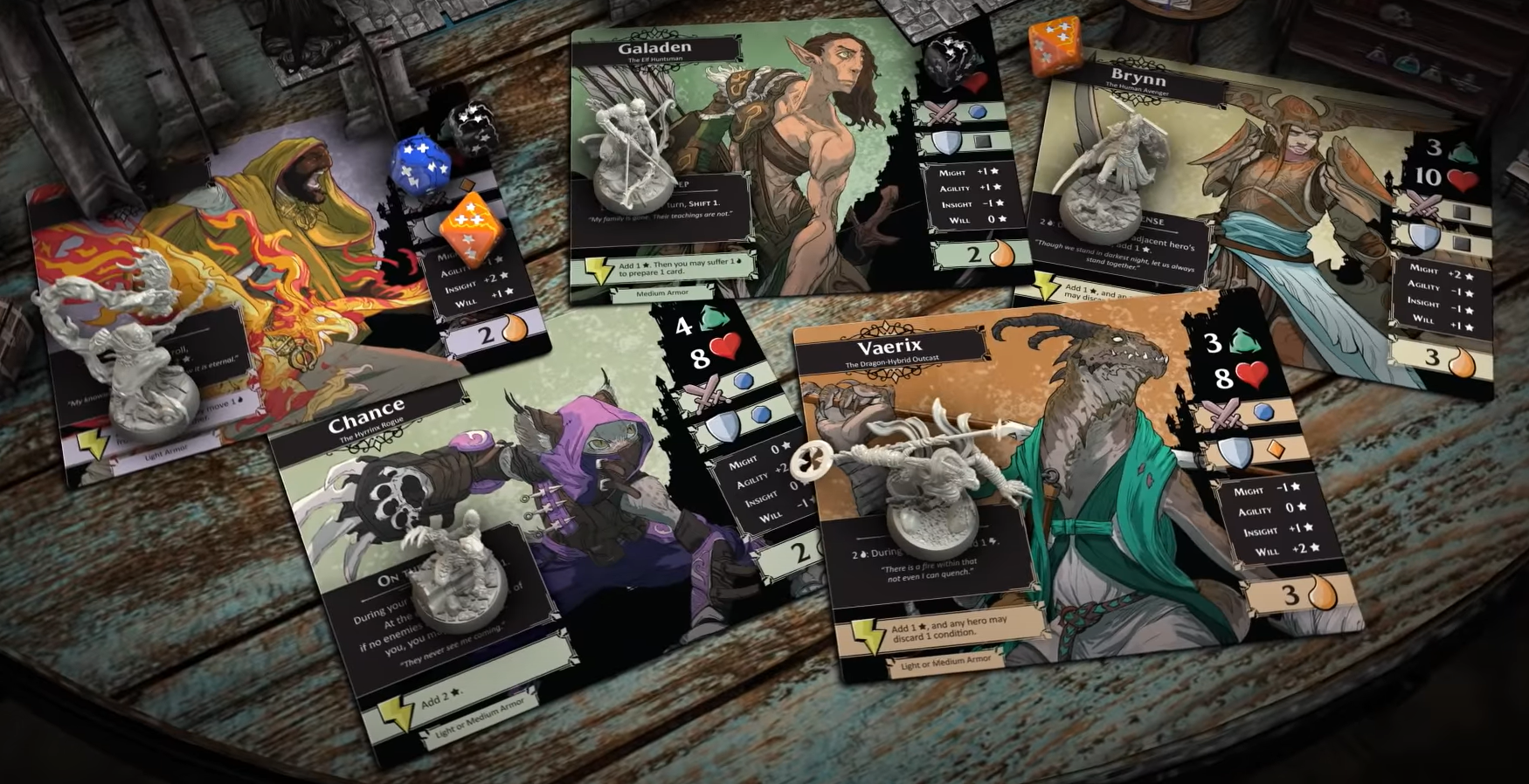
There's tons of complaining about everything atm, but I get why the app-driven route might be a compelling one to take, due to the space not being as crowded at this point. I get that 3D cardboard terrain is a cool idea if executed right (think of how awesome a Core Space game board looks!). Unlike some of the comments I've seen, I also like the character artwork most among all of the Descent games so far. The stylized look with its flat, earthy tones is simply the most characterful to me between those games. But... What happened to the design of the board components? Describing my impressions, bland, monotonous and generic would be the terms that come to mind.
How comes that cobblestone is made up of middle-to light gray, regular rectangular pattern all over with nearly no detail to break up the monotony and to add some character? No shadowed edges (might be a problem with tiling, bit still!), no different colored hues, nearly all rectangular shapes. It doesn't get better with the water. A homogenous, light blue mass with indistinct lines drawn across as water - seriously?
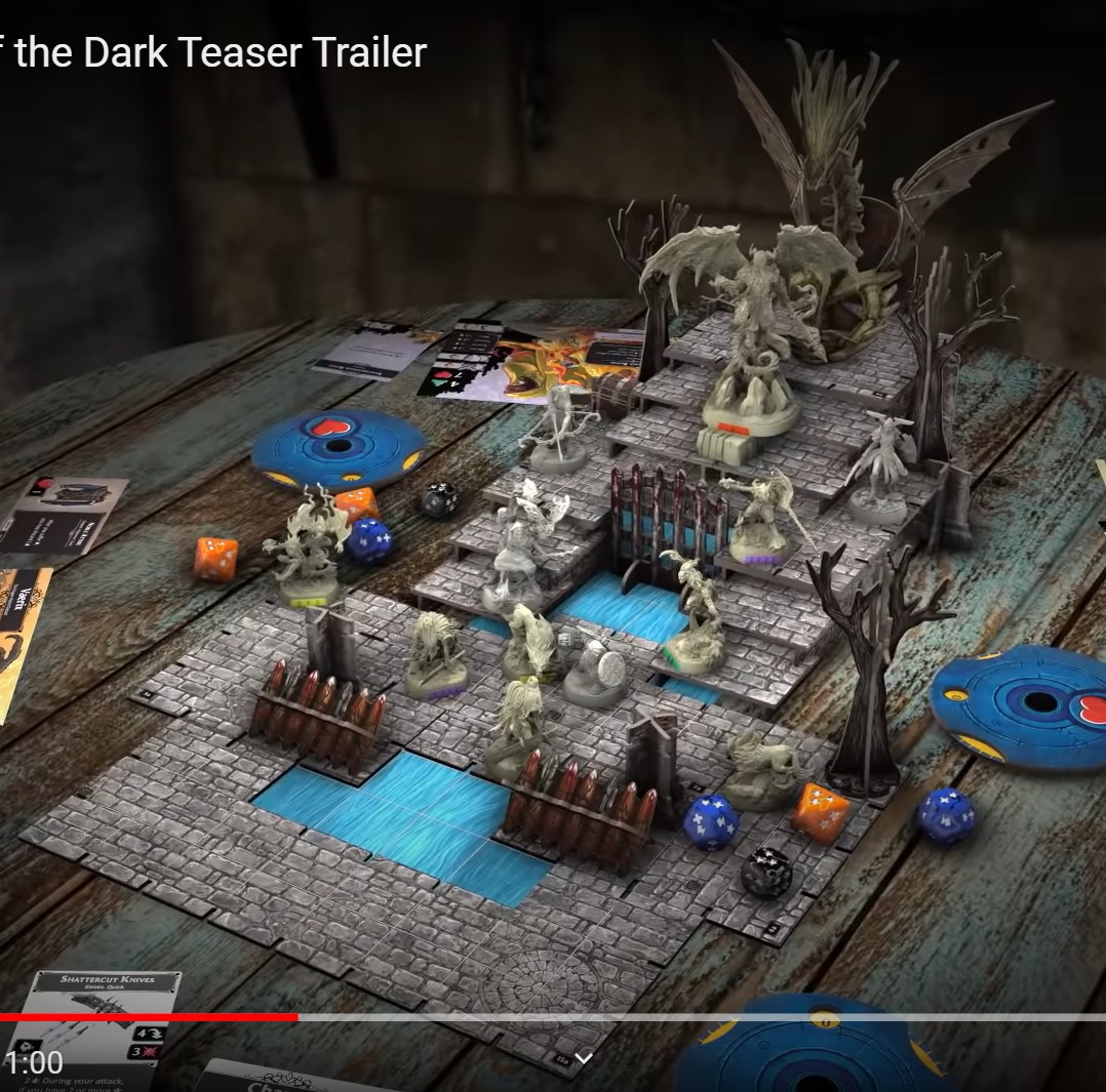
It doesn't get much better either, if you add grassy elements, lava and wooden planks to the mix:
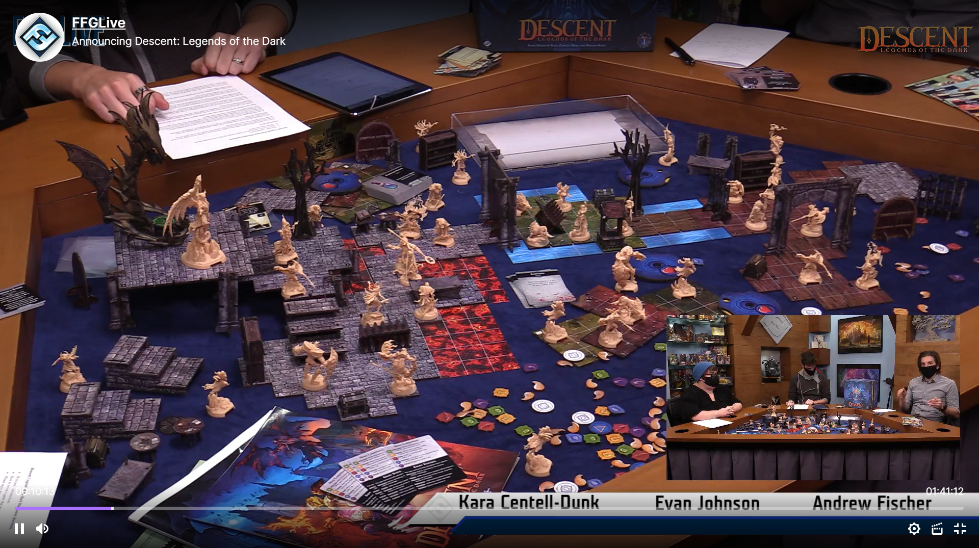
That game board to me is the definition of generic and indistinct. That's outright a regression more towards the generic and indistinct tiles of the 1st edition. And it absolutely doesn't fit in with the highly stylized, characterful character artwork. Those characters seem to come from a world, where there is more variety to cobblestone than light grey rectangular smallish plates everywhere. 😛 Where's moss`? Where's rubble? Where are different shapes, hues, broken stones, different patterns (other than that one circular shape, that doesn't really change the impressoin at all)?
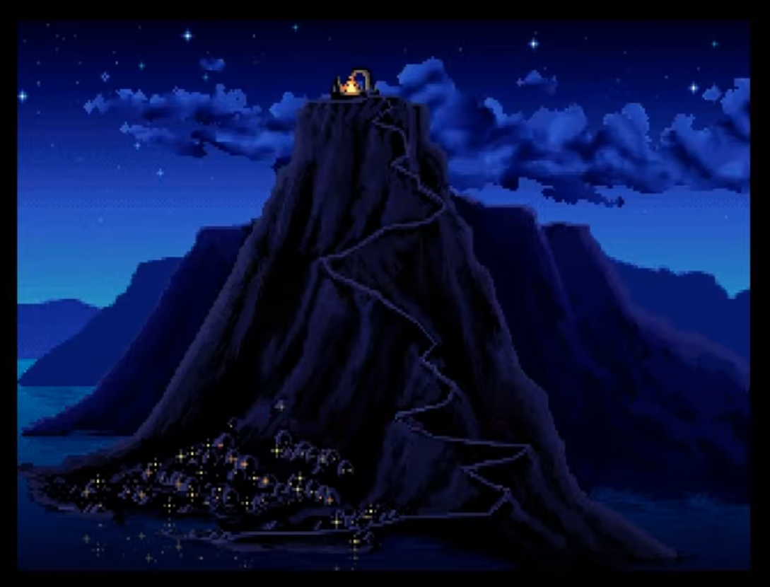
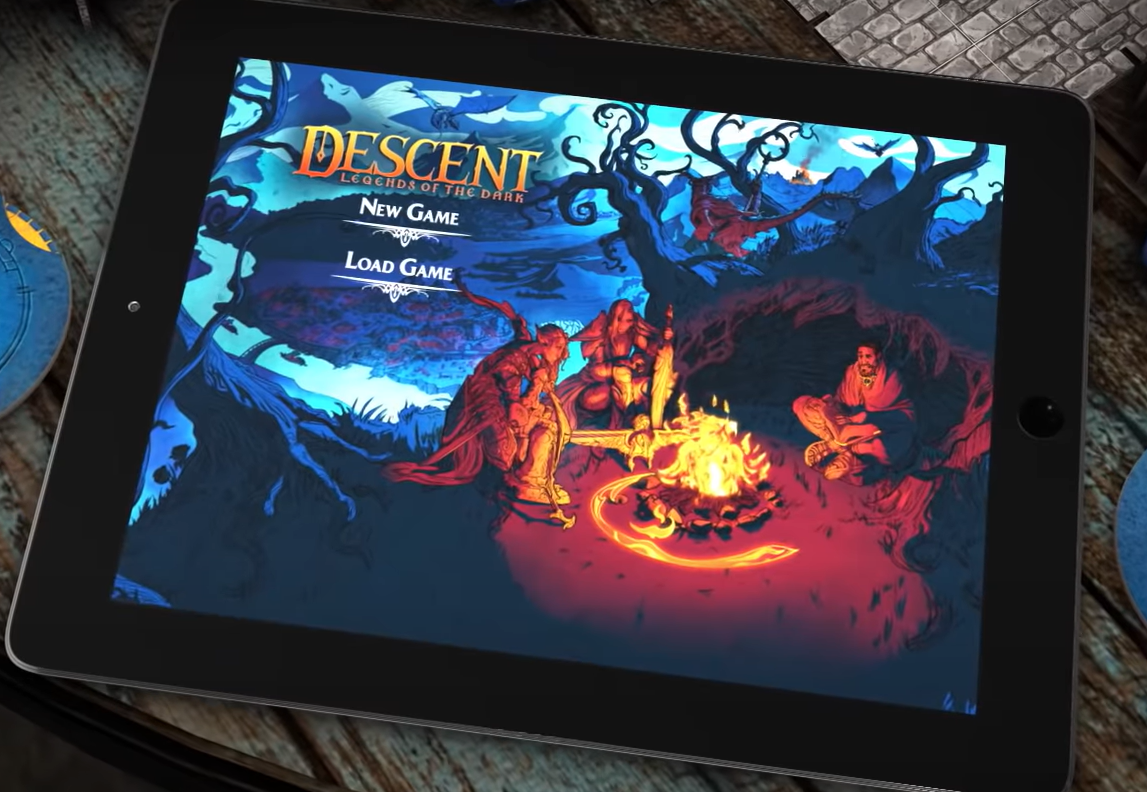
Or this menu sceen for that matter. Behold, there's moody lightning coloring the environment - not just light grey stone, medium green grass, light blueish, solid looking water and reddish lava...
Also, if those handful of staircase elements, the couple of dead trees, two or three archways and some doodads are all of the 3D elements in the game... There's an underwhelmingly executed idea - the terribly bland board artwork notwithstanding. For 175$, that is... Of course, the game may - perhaps - end up being pure genius and bliss in app-driven, dungeon-crawlery form, but if it does, it's despite the board artwork, not because of it.
Edited by BurnyBurns