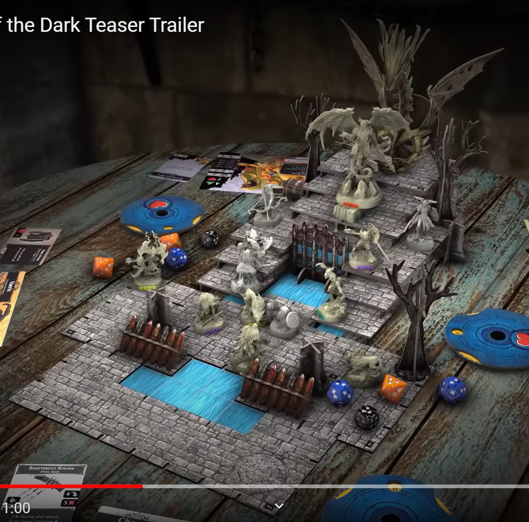
Huge gulf between quality of card artwork and board artwork - what gives, FFG?

By BurnyBurns, in Descent: Legends of the Dark

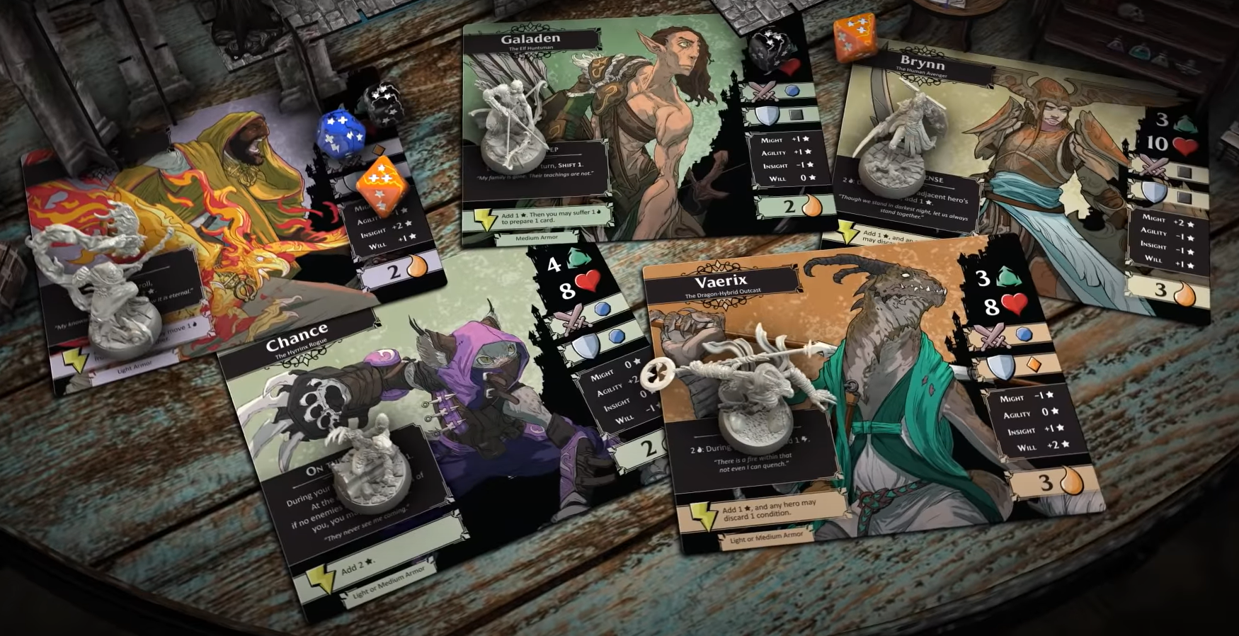
There's tons of complaining about everything atm, but I get why the app-driven route might be a compelling one to take, due to the space not being as crowded at this point. I get that 3D cardboard terrain is a cool idea if executed right (think of how awesome a Core Space game board looks!). Unlike some of the comments I've seen, I also like the character artwork most among all of the Descent games so far. The stylized look with its flat, earthy tones is simply the most characterful to me between those games. But... What happened to the design of the board components? Describing my impressions, bland, monotonous and generic would be the terms that come to mind.

How comes that cobblestone is made up of middle-to light gray, regular rectangular pattern all over with nearly no detail to break up the monotony and to add some character? No shadowed edges (might be a problem with tiling, bit still!), no different colored hues, nearly all rectangular shapes. It doesn't get better with the water. A homogenous, light blue mass with indistinct lines drawn across as water - seriously ?

legendsofthedarkgjjog.jpg

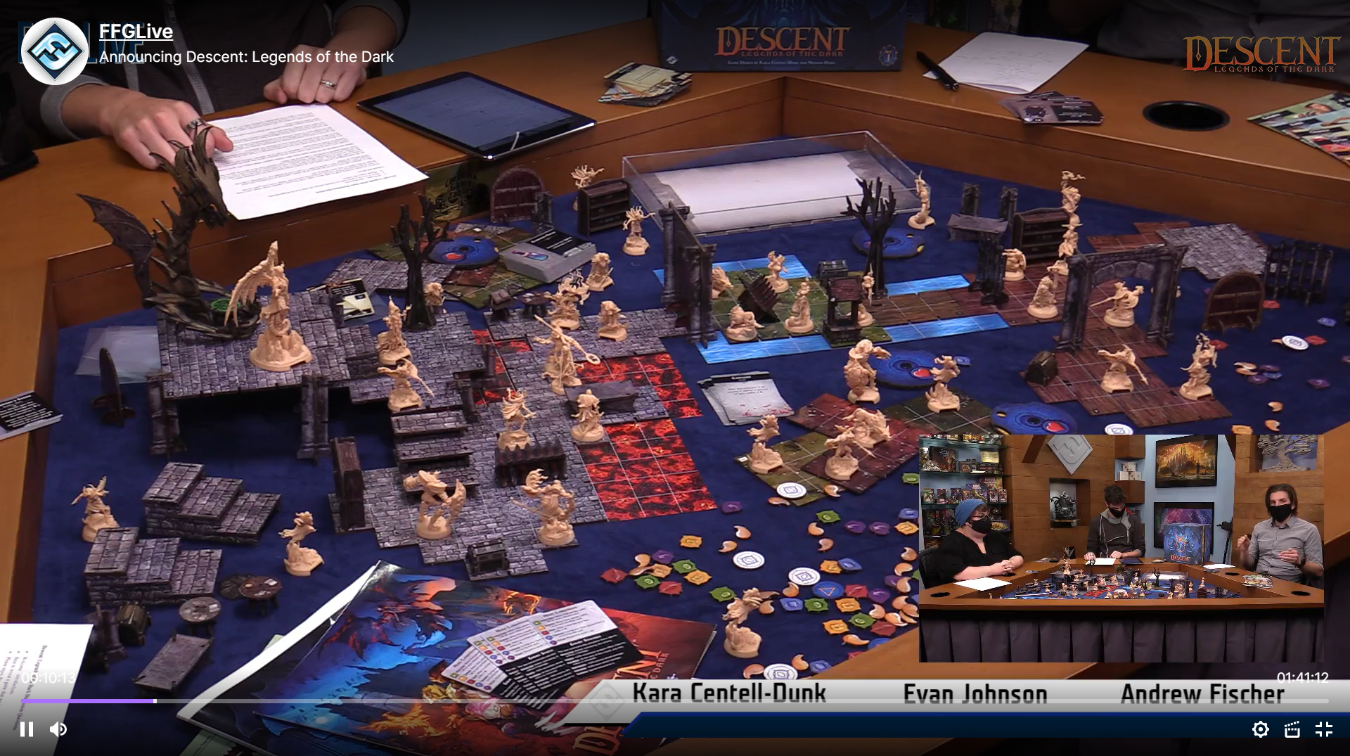
It doesn't get much better either, if you add grassy elements, lava and wooden planks to the mix:
dlotd_boardsujot.png

That game board to me is the definition of generic and indistinct. That's outright a regression more towards the generic and indistinct tiles of the 1st edition. And it absolutely doesn't fit in with the highly stylized, characterful character artwork. Those characters seem to come from a world, where there is more variety to cobblestone than light grey rectangular smallish plates everywhere. šŸ˜› Where's moss`? Where's rubble? Where are different shapes, hues, broken stones, different patterns (other than that one circular shape, that doesn't really change the impressoin at all)?
descent_charactersn2jz6.png

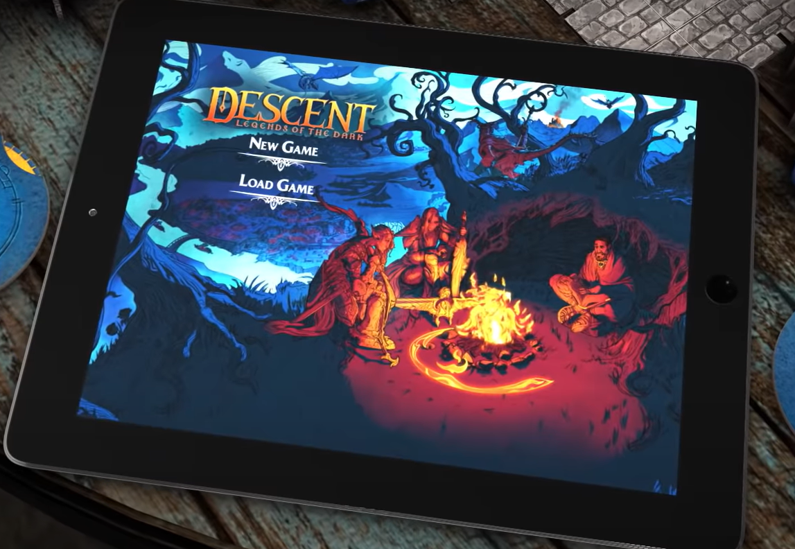
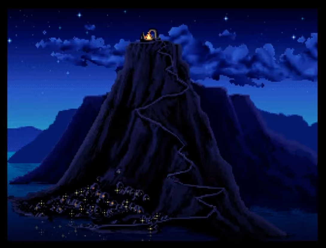
Or this menu sceen for that matter. Behold, there's moody lightning coloring the environment - not just light grey stone, medium green grass, light blueish, solid looking water and reddish lava...
app_menu0bknn.png

Also, if those handful of staircase elements, the couple of dead trees, two or three archways and some doodads are all of the 3D elements in the game... There's an underwhelmingly executed idea - the terribly bland board artwork notwithstanding. For 175$, that is ... Of course, the game may - perhaps - end up being pure genius and bliss in app-driven, dungeon-crawlery form, but if it does, it's despite the board artwork, not because of it.

Edited by BurnyBurns
I agree. Once again. I am not affiliated with the company.

ā€We want to point out that this is not 3rd editionā€.
-Is there another group working with a 3rd edition then?

ā€Because of the differences, this is incompatible with 2nd editionā€

- I thought we had already established that this is not a 3rd edition. I didnā€™t ask if Descent was compatible with Battlelore or Runewars either. Telling me that this is Descent for marketing reasons makes it only a bit less manipulating for that part.


So, people ask for continued support of the second edition and they donā€™t get it. Was Lost Legends deemed such a colossal bet it did not even get normal distribution? People are still searching for english Stewards of the Secret to this day. I am not the one mistrusting in my own product.


Still, people hope for a third edition instead to start over and have new players join. They donā€™t get it either.

They get an incomplete product (inspired by Descent) with:

Tiles and artwork that the verbal majority dislike. Extravagant characters and miniatures. Obligatory app. Price that almost says this will not sell good enough. A target group (?) with unclear characteristics.


And the company will be surprised if this tanks. Wondering if this will be an example of the Sunk-cost fallacy or worse.

That app screen as in BurnyBurns' post isn't too great graphically either- very saturated colours- feels too red / too blue like there's some high power floodlights in the scene leaving you wishing it were subtler, but the other app visuals look better (with what they did with Gloomhaven digitally the app should be really good- if not they'll have fallen rather short....)

The only bad thing I see are the terrain tiles and the price the rest great

1 hour ago, Watercolour Dragon said:

That app screen as in BurnyBurns' post isn't too great graphically either- very saturated colours- feels too red / too blue like there's some high power floodlights in the scene leaving you wishing it were subtler, but the other app visuals look better (with what they did with Gloomhaven digitally the app should be really good- if not they'll have fallen rather short....)

Personally, I love the style and color choice in the screen. Highly stylized, very expressive night scene, realized with a very limited color palette that I find very pleasing to look at. Conveys the impression of a group huddled around a warm campfire in a cold night perfectly for me.

Unlike the board elements, which imo carry very little mood at all. šŸ˜›

Edit:

1 hour ago, maul said:

The only bad thing I see are the terrain tiles and the price the rest great

Generally, I agree. Except for the term "only". The terrain, which is responsible for the first impression the game gives on the table, looks poor and the price is too high? That is, higher than Gloomhaven, higher than mini blender Kickstarter with more miniatures and better designed terrain? If "only" those two aspects are poor, that makes the whole thing a difficult sell.

Edited by BurnyBurns

I quite possibly only picked that up due to some prior conditioning- watching some Planet Coaster design vids where the lighting had been rather overkill - might be a bit pre-biased :)

$175? That is a considerable chunk of change. This isn't going to be my cup of tea (you can find me hoarding Armada miniatures), but... 175? YMMV, but that price tag seems to be on the expensive side. Then again who am I to say, I'll be picking up one of the new Armada starters, and that's only half a game for $100.

The art looks wonderfully unique, as for the board... yeah, they might have leaned harder some way or other. I had Imperial Assault and those board pieces did feel much more organic/lived in/what have you.

I'm interested to see how this goes. Back in the day Descent was my first dungeon crawler, and a good time it was :)

12 hours ago, BurnyBurns said:

Or this menu sceen for that matter. Behold, there's moody lightning coloring the environment - not just light grey stone, medium green grass, light blueish, solid looking water and reddish lava...

app_menu0bknn.png

I am sorry, to me it looks like Monkey Island initial scene in Skull Island... 30 years old...

AH monkey island, one of the best point and click games ever made!

3 hours ago, Tubb said:

I am sorry, to me it looks like Monkey Island initial scene in Skull Island... 30 years old...

What can I say? Great artstyle ages well. šŸ¤·šŸ»ā€ā™‚ļø

monkeyisland1rfj49.png

Edited by BurnyBurns
On 10/23/2020 at 12:11 PM, maul said:

The only bad thing I see are the terrain tiles and the price the rest great

Even price ?

On 25/10/2020 at 1:08, rugal said:

ĀæIncluso precio?

nobody forces you to buy

17 hours ago, maul said:

nobody forces you to buy

That's exactly what will happen, but I don't think it is what Asmodee wants (i.e. customers not buying their products) šŸ˜‰

Funny, I personally find the art matching. The tiles have the same blandness as the character style, but thatā€™s just my opinion ;) .

still curious about the gameplay, not that I would buy this version... but with this pricetag, they must be very confident about something within this game..

Iā€™m betting on Bardsung at the moment, but that will have to wait for some time before that game is released.

I don't even think we're close to the term force here. Generally a compelling aesthetic backed by an immersive gameplay would make me feel 'forced' to buy this, I gotta have it!

But from what I've seen so far I think it is the opposite, I feel forced to bypass this if nothing else but to send FFG a message that this is not the mark we are looking for in a game.
When they blow it out after it fails at 20% MRSP I might go halvsies with a friend to try it.

Somebody did say in one review that being colour blind they preferred the new tile style as with 2e they couldn't see the areas marked out as unique.

Meh, just my opinion here but I think the tiles look great compared to the character art we got. Maybe I'm not the kind of person FFG is gearing this product towards though. I guess this thread proves there are people who like the kind of thing legends of the dark offers.