Wow, the Hulk looks awful. I can almost accept the box art, but then to see the hero card art has him tearing some android apart? In addition to actually being drawn well (which this is not) hero art should be heroic but also generic enough to blend with the scenario you're playing. Fighting Ultron? Sure it works. Green Goblin, Wrecking Crew, not so much. With nearly 60 years of Hulk artwork, this is what they choose? The playmat is even worse! Caleb has to start checking in with the art department. The strength resource card looks fantastic, that should have been saved for the hero card!
TERRIBLE Hulk Art choices
Dale keown is the best hulk artist there ever was in my opinion! I would have preferred a picture drawn by him, but I think his hero card still looks good. I don't recognize the artist, maybe Carlos Pacheco? Still looks cool to me though.
I really don't know why they use so much poor art in this game. It has become a common joke among my friends to see how many times a terrible looking Captain Marvel will show up on a card.
Many of these characters have been around longer than most of us have been alive. Why don't they pick better art?
Doesn't help that their other games often have fantastic art.
1 hour ago, TechnoGolem said:I really don't know why they use so much poor art in this game. It has become a common joke among my friends to see how many times a terrible looking Captain Marvel will show up on a card.
Many of these characters have been around longer than most of us have been alive. Why don't they pick better art?
Doesn't help that their other games often have fantastic art.
I really have to agree with you. There are certain cards that look pretty solid but others that just give me the "WTF?!" face when trying to think about who decided that was the best picture to utilize. The only thing I can think of is that Marvel is giving them access to only a limited pool of images "approved" by them. Maybe due to artist rights/royalties or what have you. But using Google Images, I can make a better art deck for any hero in about 20 minutes, lol
What about the fact that your -- anyone's, really -- personal tastes are not good baseline for exposing the art of a bigger pool of artists?
I applaud the variety, regardless of what I think of it.
6 minutes ago, Ascarel said:What about the fact that your -- anyone's, really -- personal tastes are not good baseline for exposing the art of a bigger pool of artists?
I applaud the variety, regardless of what I think of it.
You are wrong! My opinion on the art is the ONLY opinion that matters, lol.
In all honesty, I know personal taste has A LOT to do with this gripe. Like, personally, I would have preferred they stuck with 1 artist for each hero for consistency but understand that is probably not the easiest thing to do.
I am also someone who hates the fact that the cards are colored by their aspect. Minor gripe but I would have preferred just a symbol or something. Not a fan of the Crayola look but it doesn't take away from my enjoyment of the game.
I believe they are specifically looking for modern versions of all these characters, which is probably why we get the artists we get. I'd certainly prefer some Kirby, Steranko, Byrne, Sienkiewicz, Buscema etc. Though I'm also an old man at this point so...
I think alot of the art is pretty good in this game. Only a bit of it is really bad (I agree Captain Marvel has some questionable art), but all the FFG LCGs have some stinkers when it comes to card art. Usually humorously so. L5R for example is a beautiful card game, but I hate the art on Banzai! and that's a pretty ubiquitously played card.
I like Hulk's hero side art. The play mats continue to have questionable art choices on them. I wish they just had the background art on them and not the foreground art.
Add: I would have hated if the cards weren't colored by aspect. That would be painful to break down after the game (I do it now with the AH:TCG scenario setup. It's fine but it's that extra layer of effort toward game breakdown). Right now it's super simple to sort the cards out and put them away. It's another factor that makes the game way more approachable and easier to get to the table.
Edited by phillos16 minutes ago, XCoconutMonkey06X said:I am also someone who hates the fact that the cards are colored by their aspect. Minor gripe but I would have preferred just a symbol or something. Not a fan of the Crayola look but it doesn't take away from my enjoyment of the game.
I don't mind this so much, I just wish they'd picked schemes for the heroes that were easier to tell apart from the aspects.
The art as a whole is pretty decent. Some of it is intentionally riffing on old comic book styles, some newer styles. I like the mix existing. Feels like looking at a comic book collection a bit, and believe there is some really bad comic book art out there.
OMG, Yes! I am not a fan of the mats. At all! I think the launch mat was pretty decent and generic enough but the actual hero specific ones leave much to be desired, especially seeing what they can do via the other LCG mats they have released (Arkham and LoTR mats are amazing!!).
I didn't like the art on the playmats either... until I saw them in person, especially She-Hulk. Now that Hulk playmat...? I don't think there's anything that will change my mind there. Since Disney owns Marvel I guess they're trying to cross promote "The Hunchback of Notre Dame" with that playmat.
The She-Hulk art is actually pretty good IMO. Some of the others are also pretty good. I like Doc Strange and the Ms. Marvel picture they picked is nice. Though given a choice I'd rather we had just the background for these mats. The foreground art is a bit distracting for a mat.
8 minutes ago, phillos said:The She-Hulk art is actually pretty good IMO. Some of the others are also pretty good. I like Doc Strange and the Ms. Marvel picture they picked is nice. Though given a choice I'd rather we had just the background for these mats. The foreground art is a bit distracting for a mat.
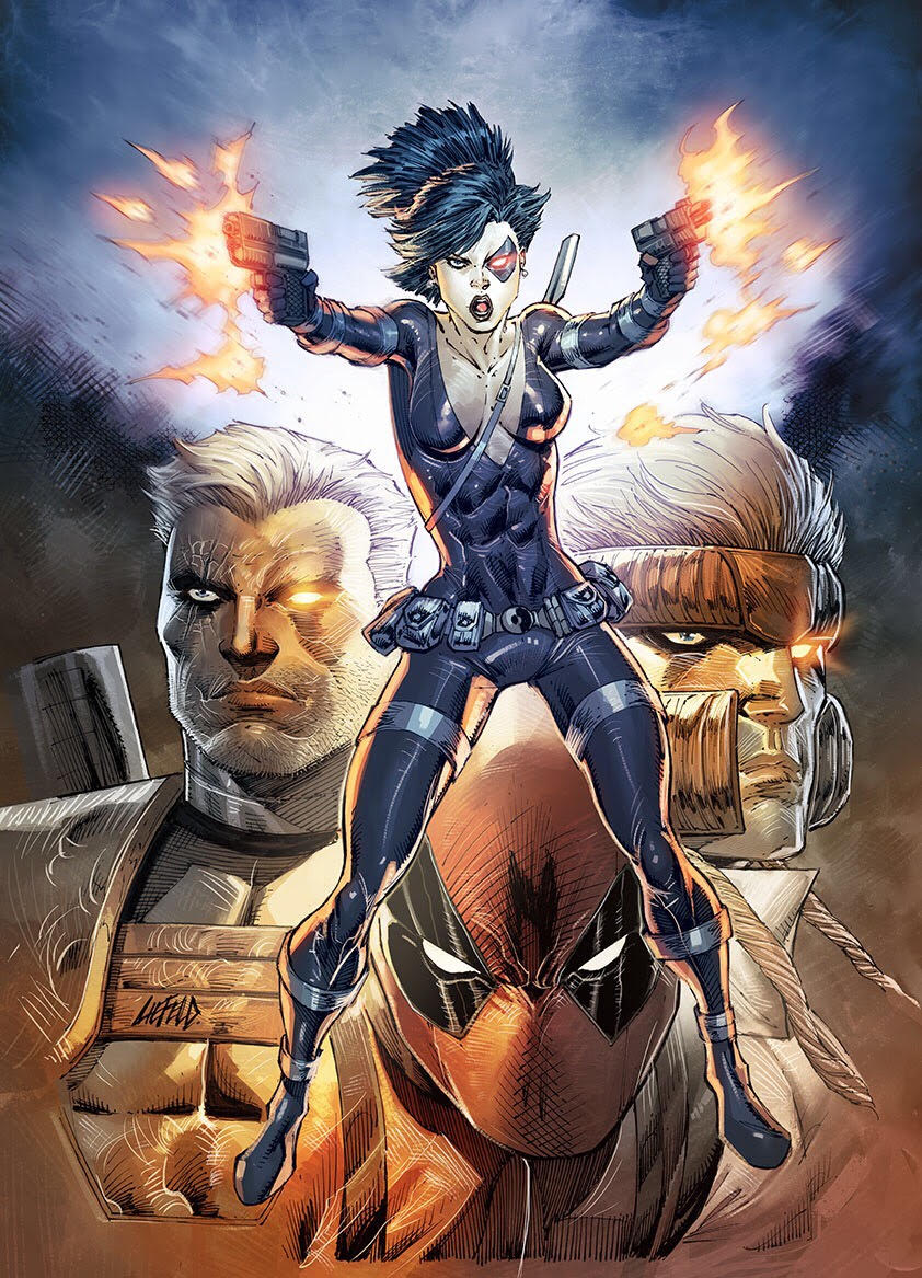
I have to agree, that most of the art that has been used is pretty good. I like She-Hulk, who happens to be the main hero I play. The Dr. Strange art is also good. I can think of better Captain America and Thor art, but they're not bad. As far as objectivity is concerned. It is possible to objectively evaluate art. I know Rob Liefeld gets beat on a lot in the comic book community, but he's an obvious example of objectively bad art that makes my point. Imagine this as your hero card?
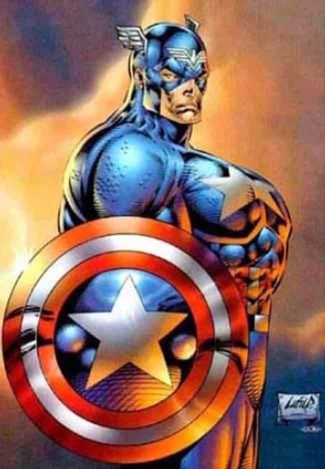
The Captain America play mat art is my vote for worst art in the game and it reminds me of Liefeld's take of the character. Big meaty sausage fingers and all. Luckily the art for Cap on his cards don't look like that. Cap's hero side art is fine, but not the best pick IMO. His other cards are all good. Fearless Determination is great. As is Cap's Shield and Heroic Strike. Indomitable is my vote for favorite art in the game currently.
Edited by phillosI am still trying, to this day, to figure out what Rob was thinking while putting that Cap art out. Like, how he thought basic anatomy could possibly work that way, lol.
Rob Liefeld might actually be an eldritch being, it's the only way I can think of to explain how he gets anatomy so wrong AND was that successful in comics.
Captain Cthulu
Basically he's being viewed from two perspectives at the same time. If you look at it for too long it will drive you mad. The human mind was not built to contemplate such things.
On 3/5/2020 at 3:31 PM, phillos said:Basically he's being viewed from two perspectives at the same time. If you look at it for too long it will drive you mad. The human mind was not built to contemplate such things.
Take 2 Horror
Wow, that picture is awful.
On 3/5/2020 at 1:05 PM, urloony said:I know Rob Liefeld gets beat on a lot in the comic book community, but he's an obvious example of objectively bad art that makes my point.
As an addendum to my earlier post, I want to say that not all Rob's work is... questionable. We need to also thank Rob for creating the following heroes (to name a few):