D2e Card Viewer - Image Project Revisted

By any2cards, in Descent: Journeys in the Dark

Recently, I received some new hi-res digital assets for some of the cards used within D2e, and subsequently the D2e Card Viewer. These assets are far better than those that I used when I re-did all of the cards. As I promised in the past, if this ever occurred, I would update the cards with the new assets.

One of the assets I received are for the Hero cards, which I had actually never bothered re-doing. Since the existing cards are a mix of various resolution scanned images, I decided to make them all look the same, with the new hi-res versions.

I have just completed re-doing all of the Healers.

More to come.
I have just completed re-doing all of the Mages.

Great job!

I found some minor issues:

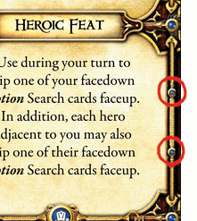
extra_circles.png?pub_secret=038e59800a
those two circles next to the heroic feat shouldn't be there. They are only on back side of the card.

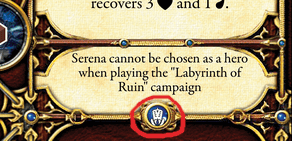
serena_expansion.png?pub_secret=d192e96d
Serena is from "Serena Lieutenant Pack" so she shouldn't have Labyrinth of Ruin expansion symbol.
Also bottom text is not correctly vertically aligned and expansion symbol is too big.

10 hours ago, AwesomeTree_in_the_Dark said:

Great job!

I found some minor issues:

extra_circles.png?pub_secret=038e59800a
those two circles next to the heroic feat shouldn't be there. They are only on back side of the card.

serena_expansion.png?pub_secret=d192e96d
Serena is from " Serena Lieutenant Pack" so she shouldn't have Labyrinth of Ruin expansion symbol.
Also bottom text is not correctly vertically aligned and expansion symbol is too big.

Thank you for catching those two circles. I have fixed all of the cards done to date (Healers & Mages).

I have also fixed Serena and removed the Labyrinth of Ruin expansion icon.

As for the size of the expansion icons ... that was done on purpose. I have always believed that their microscopic size virtually eliminated any value of having them, especially for us old folks. Since these cards are done with the card viewer in mind, I wanted them more visible.

I have just completed re-doing all of the Scouts.

13 hours ago, any2cards said:

Thank you for catching those two circles. I have fixed all of the cards done to date (Healers & Mages).

I have also fixed Serena and removed the Labyrinth of Ruin expansion icon.

Awesome!

13 hours ago, any2cards said:

As for the size of the expansion icons ... that was done on purpose. I have always believed that their microscopic size virtually eliminated any value of having them, especially for us old folks. Since these cards are done with the card viewer in mind, I wanted them more visible.

That make sense :)
They should have designed them better, initially I didn't even know that every card is somewhere marked with it's expansion symbol.

This morning, @Sadgit reached out to me and provided me a new super-hi-res template for the Hero cards. It is hard to believe, but it is better than the one I was using. You can actually see the graphics BENEATH the attribute values, the health, fatigue, and defense values, etc.

So, tonight, I re-generated all of the Healers, Mages, and Scouts using the new template. Thanks @Sadgit

I have just completed re-doing all of the Warriors.

All of the Heroes have now been completed.

I have just completed re-doing all of the Condition Cards, the Servant Cards, and all of the Overlord Decks with new hi-resolution cards.

Do you have thoses hi résolution cards in your Dropbox ?

3 hours ago, rugal said:

Do you have thoses hi résolution cards in your Dropbox ?

Yes. They have all been copied to my DropBox template directory. Here is a link again:

D2e Card Templates

I have just completed re-doing all of the Monster cards.