Custom Token Help

By hargleblarg, in X-Wing Painting and Modification

Hey, everyone,

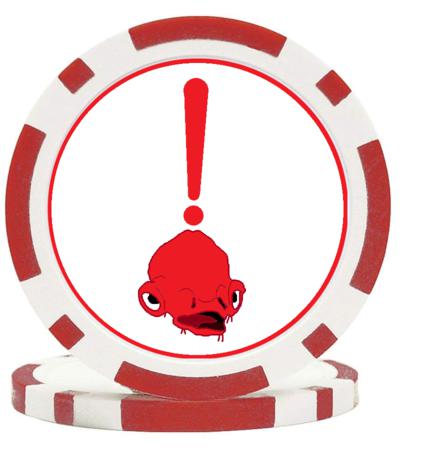
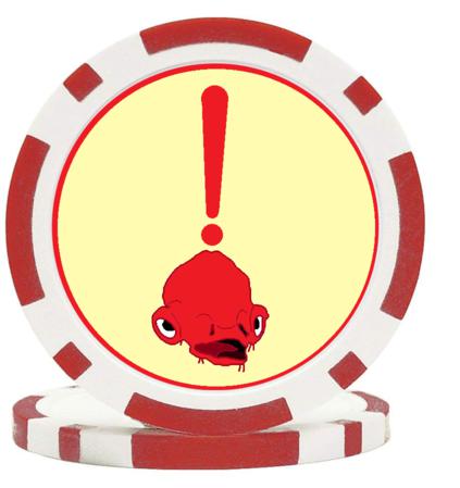
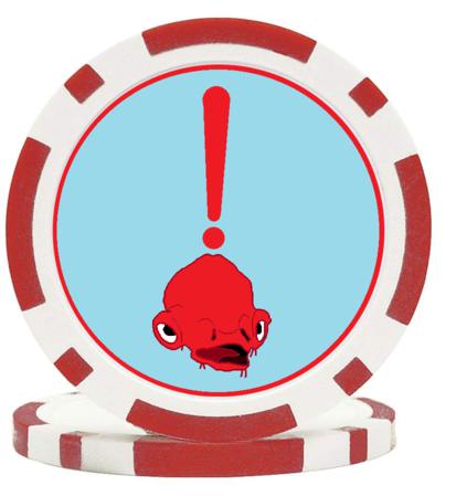
I've been working on making poker chip tokens for a couple months now. I'm working on improving my designs, and currently I'm working on an Ackbar stress token. I just need to figure out the background color, and I was hoping you could let me know if you prefer the white, the yellow, or the blue below.

Thanks! - Hargleblarg

Stress1_50.png.b1a540108f5effaaea43d39c16c8e173.png Stress3_50.png.0dc5c88e2e7eb70641fcc267cf7941b7.png Stress6_50.png.688091b2fcfcf7835e922bd7eae1da63.png

white matches the chip color better but i'd try to work in the triangle/square somewhere somehow.

The outlines on Ackbar should likely need to be thicker so they print well and read better at arm's length. You may have to increase the size of Ackbar.

Maybe something like this:

ukSkCam.png

I prefer the white background, by the way.

5 hours ago, Ghosthacked said:

white matches the chip color better but i'd try to work in the triangle/square somewhere somehow.

This ^

3 hours ago, Force Majeure said:

The outlines on Ackbar should likely need to be thicker so they print well and read better at arm's length. You may have to increase the size of Ackbar.

Maybe something like this:

ukSkCam.png

I prefer the white background, by the way.

Ackbar over the exclamation was my first design , but it gets too busy to be an effective token. However, I get mine printed at office depot and their printers do a good job capturing the image details, So Ackbar should come out fine. If not, I'll toy around with your suggestions for sure.

8 hours ago, Ghosthacked said:

white matches the chip color better but i'd try to work in the triangle/square somewhere somehow.

I'll dummy up a box outline to indicate that this is, despite evidence to the contrary, a "square" token

In any case, white seems to be the correct choice. Thanks a ton!

@Ghosthacked I added a more boxy outline

yr6Yang.png

The outline adds a lot to the look (and red and white are perfect Rebellion colors), but I don't know about the framing. I feel like Ackbar really should be a bit closer to the center, with a smaller exclamation point. Maybe with one exclamation point to either side, like what you see in Force Majeure's mock up.

On 3/20/2019 at 5:58 AM, Wildonion said:

The outline adds a lot to the look (and red and white are perfect Rebellion colors), but I don't know about the framing. I feel like Ackbar really should be a bit closer to the center, with a smaller exclamation point. Maybe with one exclamation point to either side, like what you see in Force Majeure's mock up.

I made a few changes and put the first few tokens into the world today

A73LQpSh.jpg