He has been known to take commissions...
Character Drawings/Models/Paintings/ etc.
Wu Ming said:
You are not alone. At least you got Commisar Fury.
Commissar Fury belongs to the world.
My latest character. Khan Attilas. He is drawn with the intention of coloring him, since I rolled up dyed skin and eyes when I made him. The only parts of his outfit that are his are his gloves and his boots, the rest was...aquired.
I'll post him in color, too, when I get him done.


My acolytes found this. They were very disturbed. Xenos remains should not be used to make a servo skull! What is going on?
The only clue they have is the designation "X978-1" branded on it. They were sent to look for it by their handler who appeared just as disgusted with it as they were when he first saw it.
Those are data-needles by the way. Yes I did find the skull in another book. Don't say its race if you know it (it's more fun to keep my players in the dark).
Trivia: If you want to know where I got the designation X978-1 from, check out the ISBN-13 for Dark Heresy  The X is for Xenos.
Wu Ming said:
And finnaly Brother Domis (May he rest in peace):

Not actually Brother Domis. While this is indeed the pic Brother Domis' player used as an avatar on the old forums (thus the confusion) this is actually a different psyker drawn for another player who specifically asked for a psyker w/ bionic eyes. The description given for Brother Domis was that of a bald Hugh Laurie w/ a psykana sanctioning brand.
Also, Brother Domis is not technically dead, he's just possessed by an exceptionally powerful daemon that has pretty much burned out his mind. (Yeah, yeah I know that's splitting hairs, but hey someone's got to pay attention to the fine points.)

Commissar Fury the miniature.
This is a Imperial Guard Stormtrooper. I made the sign of the Inquisition in the his right shoulderpad so he, or she, has been "drafted" to this organization. C&Q are welcomed.
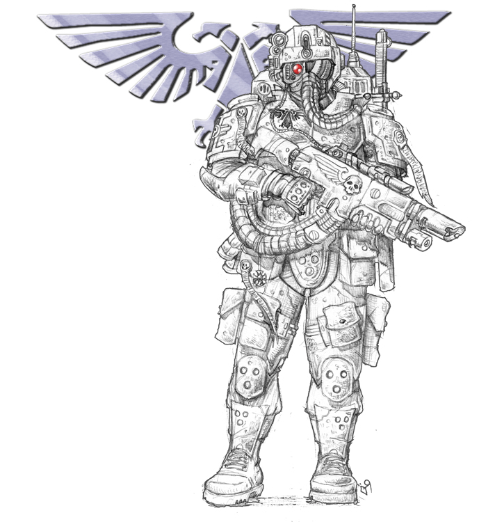
Wow! VERY nice Robban-O!
I was going to say "It's a bit too cyberpunk" but after studying it for a bit I think it's just right actually; I didn't originally notice the purity seals.
excellent pics - thanks
Totally awesome, Robban-O. My only comment would be that you don't need that big aquila in the BG. Your draftsmanship stands out all on its own, and that big honkin' thing just distracts.
Ripper.McGuirl said:
Totally awesome, Robban-O. My only comment would be that you don't need that big aquila in the BG. Your draftsmanship stands out all on its own, and that big honkin' thing just distracts.
Thank you all for the nice words. When it comes to the Aquila I just wanted to try something that I seen a couple of times on DA (Deviantart.com). That is to mix traditional pencils with digital work. It is maily because the reason why it is there. I learned a couple of things doing like using a borderline from a marking around the character. It's a technique made the trooper stand out better and which I probably use again on ordinary drawings.
You have a point because almost posted it cropped without the Aguila first but since I put almost a hour in to the little birdie I throwed it in there anyway.
My pencil sketches never come out so clean. If I use regular paper then my scanner picks it up in "bits", a load of broken lines in other words. If I use something else like sketch/watercolour paper then the texture of the paper itself interferes with the drawing (although it still looks better). Any suggestions?
By the way, I think Imperial Guard stormtroopers are the finest thing in the world (more interesting that Space Marines at least, because they're more human and mortal, although I don't want to spark off another huge discussion about Space Marines/humans), and this image has really driven that idea of awesomeness home.
Headhanger said:
My pencil sketches never come out so clean. If I use regular paper then my scanner picks it up in "bits", a load of broken lines in other words. If I use something else like sketch/watercolour paper then the texture of the paper itself interferes with the drawing (although it still looks better). Any suggestions?
What settings do you have on your scanner? I use "grayscale" and 600dpi because even with pencil lines you need the transitions in grey. Then I use photoshop to clean it up and adjust the levels of white, black and grery. This drawing is much more "crisp" compared to the original on paper for example.
That is exactly what I do. Grayscale, 600dpi. Edit levels in Photoshop.
And I end up with pencil lines that come out like this (before levels editing):

That's using basic plain paper and a B2 to H2 pencil (depending on what I'm drawing). I'll usually go over it with a technical pen afterwards since my lines are no less bumpy and wobbly by hand as they are with a tablet. I don't know how to use paths and lines in PS. 
Just as a note: this next image was scanned from watercolour paper rather than regular paper. It's a vast improvement, but the paper's texture can sometimes be a bother when adjusting levels since it isn't white white.

I personally never scan things in greyscale. I always scan in color and then convert it to grey in photoshop. I tend to scan at 300 dpi, since I don't generally generate artwork to be scaled up to giant posters or anything, and don't need images that huge clogging up my hard drive. You may also have it on some kind of text setting, which will often lead to a loss of detail.
Here is the color version of Khan.

Ripper.McGuirl said:
Here is the color version of Khan.
So taht's what Iggy Pop would look like in 40k! Tanks for clearing that up for me ;-)
This is my favorite piece out of what you've shone us so far. I love the highly graphical look of the colors and boots... niiiice :-D
Headhanger said:
That is exactly what I do. Grayscale, 600dpi. Edit levels in Photoshop.
Well it certainly looks strange. Are you using the same settings when scanning on thicker paper? Maybe you should try and have a couple of additional sheets of paper behind the ones with the drawing. It looks like you have been mixing the threshhold value when scanning lineart or something. What format are you scanning you drawings to?
By the way Ripper, the colouring of your character was very nice. I especially liked the pattern on his sleaves.
I tried scanning with more paper underneath and it came out much better. So I guess that the scanner's light is too bright or something.
I made some wallpapers in Photoshop for my campaign "The Demise of the Diocletian".
This is the original "non-spoiler" version (it doesn't reveal what The Diocletian is).
And now I have the "spoiler" version (which does reveal what The Diocletian is) which I'll show to my players when they find out what this mysterious thing is.
1280x1024

1440x900 (better)


"Welcome to the spire, we got fun and games...."
-Scythia Catallus-Helmawr
Headhanger said:
I tried scanning with more paper underneath and it came out much better. So I guess that the scanner's light is too bright or something.
I made some wallpapers in Photoshop for my campaign "The Demise of the Diocletian".
This is the original "non-spoiler" version (it doesn't reveal what The Diocletian is).
And now I have the "spoiler" version (which does reveal what The Diocletian is) which I'll show to my players when they find out what this mysterious thing is.
You know after advertising your campaign with such awesome graphics, you're going to have give us after-session reports and write the whole campaign up for us to use and post it over on Dark Reign or something, right? 
In preparation for Creatures Anathema...here is my party murdering the crap out of some feral orks.

Full res: ripper.everettconsulting.com/forblog/Greenskins.jpg
Ripper.McGuirl said:
In preparation for Creatures Anathema...here is my party murdering the crap out of some feral orks.
Full res: ripper.everettconsulting.com/forblog/Greenskins.jpg
Holy Crappers, that's beautiful!
Man, I love the bleached out greenish/sepia palate you used and the washed out background. As always, i love you're highly graphic style.
Beautiful!
I think that's the first time I've exclaimed "**** me!" upon seeing a drawing. Very nicely done, Ripper.
Thanks! This one took a while...I got caught up in little things, and had to keep going back and fixing bigger issues that I had neglected...it's still not perfect, but I like it well enough. =]