Upgrade Bar Reference Cards - First Take

By saturnflight, in X-Wing

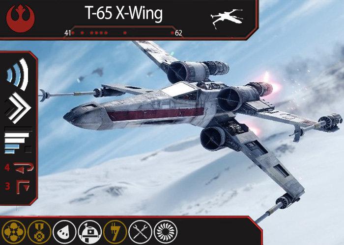
Wanting quick reference for what modifications my ships can take, I decided to create a card to put in my binder beside the pilot cards.

A few explanations:

-The title bar includes a point range for the pilots available, with points plotted along the bar in a rough distribution. (I recognize that this data piece may become outdated, but it gives a general idea.)

-The maneuvers are represented in the symbols to the left. Banks, turns, and straights, with their respective difficulties. S-Loops, K-Turns, and Tallon Rolls are shown via red indicators on the end of the standard maneuver. (This detail isn't perfect yet! I'm open to ideas on representing abnormal maneuvers like those in some other fashion!)

-The bottom bar shows the mod slots available across the entire X-Wing field. I'm thinking about greying out those that are only present on some vs. those that are on every single X-Wing, but I'm not sure I want to do that.

Take a look, and please leave feedback!

Rebel T-65 X-Wing.jpg

Edited by saturnflight

That's pretty awesome! I like the idea of shading the upgrades that aren't available to everything. Maybe make them yellow. Any plans to do this with every ship?

Oh yes. Every ship.

But I wanted to get 1 right before I apply an erroneous template to everything.

Are you able to fit more straight maneuvers in that space, for ships that have them? Stops and reverse maneuvers could easily be marked with the red on the bottom rather than the top...

I guess with so much room dedicated to the art, I feel like you might as well just lay out the usual maneuver spread, though? Easier to read than an entirely new system?

I certainly like the idea, and would love to see what you come up with moving forward, either way.

Edit: Also maybe do it in profile instead of landscape, really? I like the few full-art cards I have, but for something functional like this I think I’d prefer for it to face the same direction as the majority of my cards.

Edited by SpiderMana

I agree that the art could probably go away. The whole point of these cards is data (right?), so focus on that. Make the maneuvers more readable, like in a table or a picture of the dial.

If you want a picture, I’d use the ship icon that is used on the maneuver dial chits. I see you have it in the title bar—move it down and to the right with the movements on the left side.

And as long as you’re putting data on there, you might as well add a base size icon.

That’s my only “change” feedback. I think this is a great idea and would definitely use them. Good stuff.

The extended art is definitely a style preference for me. As most upgrades are horizontal, I ended up deciding it wasn't all that inconvenient to look at it sideways.

As for the maneuver chart, I don't like the poor use of space and overall aesthetics of the traditional maneuver chart. I could maybe compact the arrows, but still would end up with that abominable christmas tree shape.

May I suggest making the menuver section bigger? That might allow for a little symbol to show what red parts are turnaround maneuvers.

While I do agree that the art is ultimately unnecessary, having it is fun.

But yeah, looking pretty cool so far.

Design concept 2: add an atypical maneuvers area to the bottom?

Upside: can easily show any maneuver (Quadjumper was gonna give me fits!)

Downside: adding numbers ruins the design.

Edited by saturnflight

Your banks are 90 degrees, which is confusing - they should only be 45 degrees

I think this is looking great and I agree with your choices to include the art and come up with a more compact and aesthetically pleasing maneuver set representation. Really nice work.

I say, if you want clearer information, you have to let that prioritize taking up some more space.

In this case, you're prioritizing a pretty image. (Which is also nice)

I would take more room to show the maneuvers. I would really suggest you list the Tallons and sloops and kturns a bit more clearly. (perhaps separately). They might become confusing to read on a ship that has a lot of red moves, like the Bwing.

8 hours ago, saturnflight said:

(This detail isn't perfect yet! I'm open to ideas on representing abnormal maneuvers like those in some other fashion!)

I'd just increase the proportion of the 'template' coloured differently.

Also note the potential issue where the 'end around' move isn't red. I think in most cases that would be a blue-with-a-white dot (I can't think of any ship where the moves are white/white) but the potential is there.

7 hours ago, gadwag said:

Your banks are 90 degrees, which is confusing - they should only be 45 degrees

You're right. I will shorten those arcs. I stole a wi-fi icon and was relying on curve vs. right angle to differentiate.

6 hours ago, Blail Blerg said:

I say, if you want clearer information, you have to let that prioritize taking up some more space.

In this case, you're prioritizing a pretty image. (Which is also nice)

I would take more room to show the maneuvers. I would really suggest you list the Tallons and sloops and kturns a bit more clearly. (perhaps separately). They might become confusing to read on a ship that has a lot of red moves, like the Bwing.

Did you look at the 2nd rough take? Does that work better?

So... how 'bout that JumpMaster?

59 minutes ago, ObiWonka said:

So... how 'bout that JumpMaster?

Jumpmaster is guaranteed to break my system. But I think I'd rather treat it as a special circumstance than go with more (unnecessary) data clutter on every other card.

2nd take isn’t quite perfect yet. Though idk how to suggest. Perhaps sit on it for a little bit.

Youre very close to a great handy design.

It seems to me that you could expand the maneuver template to be 6 complete sections: turn, bank, straight (including stop and reverse), K, Talon, Sloop. A lot of stuff would be 'greyed out' but it would be the same everywhere. Some corner cases, like the JumpMaster, can be denoted by a non-standard difficulty color, i.e. yellow. I would do the same for the upgrade bar. Have all upgrade icons colored with: grey = not available, yellow = available to specific pilots, white = always available. If all of the zones are highly standardized it makes it really easy to do a 'quick search' by splaying the cards and just looking down the column/row for the icon you are looking for.

add primary arc icon.

Also keep in mind that this is a summary, you do not need to represent 100% of every little nuance. Keep it as simple as possible.

fwiw, I like the art and the landscape layout.

X-Wings have wi-fi? Screw Scum, I'm Rebel since I was a kid!

56 minutes ago, McTavish said:

It seems to me that you could expand the maneuver template to be 6 complete sections: turn, bank, straight (including stop and reverse), K, Talon, Sloop. A lot of stuff would be 'greyed out' but it would be the same everywhere. Some corner cases, like the JumpMaster, can be denoted by a non-standard difficulty color, i.e. yellow. I would do the same for the upgrade bar. Have all upgrade icons colored with: grey = not available, yellow = available to specific pilots, white = always available. If all of the zones are highly standardized it makes it really easy to do a 'quick search' by splaying the cards and just looking down the column/row for the icon you are looking for.

add primary arc icon.

Also keep in mind that this is a summary, you do not need to represent 100% of every little nuance. Keep it as simple as possible.

fwiw, I like the art and the landscape layout.

These are some good suggestions. I don't want to represent everything here- just what I need to consider when I'm flipping through my binder. So the maneuver guide is a gray area I'm not going to wreck the design over, because I have a feel for how a ship moves, and aside from upgrades referring to difficulties, I'm seldom going to consider the ship's dial when I'm developing a rough list concept.

I'll have to see how many icons exist, and how many any 1 ship has. This design has space for 10 icons. That's not big enough for all of them, but I doubt 1 ship has more than that.

Edit: Unless I missed one, the Hound's Tooth holds the record at 9 upgrade slots. It may share that with a force-user in a larger ship, but I don't believe so.

Edited by saturnflight

I recommend changing the title of this thread. Everytime I see it I automatically think it is about modification upgrade cards - Shield Upgrade, Stealth Device, etc....

"Maneuver/upgrade bar reference cards" or something would be clearer.

Oh, you wanted feedback about the cards themselves, not just the thread...

The presence of art is very nice, but that is probably too much

Can't help you much with the maneuver section, I very much like the "standard" grid layout. It's clean, easy to read, and reasonably attractive

The point cost bar at the top, the dots are very difficult to see on a computer screen. Maybe they are more visible on a printed card, but I would enlarge and emphasize the dots a bit for readability.

37 minutes ago, Forgottenlore said:

I recommend changing the title of this thread. Everytime I see it I automatically think it is about modification upgrade cards - Shield Upgrade, Stealth Device, etc....

"Maneuver/upgrade bar reference cards" or something would be clearer.

Oh, you wanted feedback about the cards themselves, not just the thread...

The presence of art is very nice, but that is probably too much

Can't help you much with the maneuver section, I very much like the "standard" grid layout. It's clean, easy to read, and reasonably attractive

The point cost bar at the top, the dots are very difficult to see on a computer screen. Maybe they are more visible on a printed card, but I would enlarge and emphasize the dots a bit for readability.

I agree on the point cost bar. I actually had a very hard time getting Excel to plot on a line for me, so I ended up putting • characters in numbered cells and screenshotting that. When I fit the image to the bar, the dots ended up smaller than I'd have liked. I haven't printed it yet to know how the IRL readability is, but the computer screen readability has me concerned.

I really like the concept, and I think you’re on to something. I do have some suggestions.

1) I actually like the art, I do have issue with this particular picture though and this may be due to viewing it on a smaller phone. The blue and white of the maneuver dial blended right in to the snow and sky of the background. I didn’t immediately recognize those as maneuvers.

2) In regards to the placement and representation of the maneuvers, move it to the bottom, above the upgrade slots. Use your current design of compacted Christmas Tree, but add a left side and right side. Keep the missing manuevers greyed out. Then you can even represent that silly Jumpmaster dial.

215A5829-9AAB-4CFE-9DA0-40D1E993518D.jpeg

Considering the nature of this, maybe also add an Action bar now that it also plays a role in what upgrades can be equipped?

While the Jumpmaster was already cited, I can also envision titles and configurations causing problems, as they add new upgrade slots. The Firespray has three different titles which grant upgrades, while the Gunboat has two different configurations. Maybe a branch in the artwork to reflect the assorted options those provide?

As the pilot cards show the action bar, and I'll definitely be looking at those in the binder right alongside these, I don't see a need for action bars. Same goes for titles and/or configurations: they're in the binder alongside this, right next to the pilots.

I'm probably going to keep the Upgrade Bar along the bottom due to their being horizontally laid out in the document I'm pulling from; it'd be a nuisance to turn every icon individually.

As such, I'll probably have to keep the maneuvers on a side.

Check out the new take?

Edited by saturnflight