Suhawks Guide to Making His Own Mistakes

By Suhawk75, in Runewars Painting and Modeling

Well that escalated quickly...

Having spent last month pondering whether to buy one core set of Runewars my collection now consists of two Core sets and eleven various expansions.

And, for the first time in 25 years, I’ve picked a paintbrush up (having spent a small fortune at the FLGS buying paints, brushes etc).

I do need some advice though. I don’t think I’ve got a great eye for colour. Additionally I’m so bewildered by all the incredible inspiration on this forum that I’m not even sure which direction to pull.

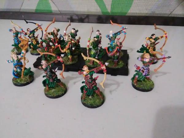
My first Spearman looks ok (to my eye) for a first attempt but I’d like to brighten him up a bit.

I coated him in Grey citadel spray then based and shaded. Figure he’s good enough for the tabletop but he took about 2hrs start to finish. I assume I’ll get faster but feedback is always appreciated.

8C807B16-9FC0-4432-BE4B-7074A6BE8743.jpeg

0FE06A22-D080-4DAB-B77A-9F0C4476F008.jpeg

And I just spotted a bit I missed ?

how I can look at that model for two hours and not see that till I posted....

Funny how the photo shows the imperfections so brutally. I was going to post the far away shot to hide how poor it actually looks close up but decided to weather the harsh lessons.

Edited by Suhawk75

The one thing I would say is that the dark-with-dark-with-dark color scheme makes everything seem just dark. I would probably do something lighter (silver, gold, a not-dark red, or something like that) for the trim on the breastplate or the edges of the armor.

Edited by Xelto
4 minutes ago, Xelto said:

The one thing I would say is that the dark-with-dark-with-dark color scheme makes everything seem just dark. I would probably do something lighter (silver, gold, a not-dark red, or something like that) for the trim on the breastplate or the edges of the armor.

I did wonder if it’s possible to make the shoulder plates white (or white and blue). It’s all a bit of a dogs breakfast really but it’s all learning (I hope)

3 hours ago, Suhawk75 said:

And I just spotted a bit I missed ?

how I can look at that model for two hours and not see that till I posted....

Funny how the photo shows the imperfections so brutally. I was going to post the far away shot to hide how poor it actually looks close up but decided to weather the harsh lessons.

I feel the same way!

Though your model really doesn't look bad. I can see some flesh on the helm and some blue on the knee, so yeah, it's not perfect, but those things don't detract from the overall look. And at gaming-distance, you won't notice it at all.

Edited by Budgernaut
4 hours ago, Budgernaut said:

I feel the same way!

Though your model really doesn't look bad. I can see some flesh on the helm and some blue on the knee, so yeah, it's not perfect, but those things don't detract from the overall look. And at gaming-distance, you won't notice it at all.

Those are exactly the things that I spotted 0.00000002 seconds after posting. I blame the gin and tonic dependence for the shaky hand ?

Remember kids, never paint when sober....

The same advice is true for shopping on Amazon....

In seriousness though, the nerves started to play up when I went to do the face. Despite being a 42 yr old single father of two with a mortgage and career to worry about I’m now mostly nervous about painting a plastic soldier.

Something to remember, you are not painting to be seen up close. Very few people paint to a, “Golden Demon,” level and even they don’t go to all that effort for each individual infantryman in their tabletop armies. Paint unit figures to look good in a unit, give Heroes a bit more effort and never sweat the camera close-up stuff.

The camera is always cruel, it shows so much more than the naked eye. So don't sweat the details when you see them on a picture.

That said, your paint job is really nice. My suggestion would be to just brighten up the blue parts somewhat, so make them stand out more against the dark metal. I think it will then look really cool on the table.

6 hours ago, Suhawk75 said:

Those are exactly the things that I spotted 0.00000002 seconds after posting. I blame the gin and tonic dependence for the shaky hand ?

Honestly, I didn't see those things at first. I had to look for them and only looked for them because you said there were some blunders. But then, I'm a relative newcomer to the painting world compared to some.

Haha... welcome to the game! Also, amazing job! ESPECIALLY if you haven't painted in 25 years! I really like the hand painted, two color shield, very sharp! This guy will look great on the table.

I think he looks good as he is, but if you're looking for ways to brighten him up, the cloth is always a good starting point. Trim (maybe white to match your shield) would help it stand out. You could also try darkening the brown you use for the boots and gloves. It's the same tone as the blue right now, and muting it will help the blue stand out.

Do you use dark washes at all? My personal condition on getting into Runewars was that I found a way to paint everything quickly and learning about washes has been a godsend. I use army painter quickshade, but citadel has equivalents (or just water down black). If you aren't using it already, I'd recommend looking into it. It'll speed things up and cover over a multitude of sins.

Looking forward to seeing more work!

So I sat down and tried to take the lessons from Spearman no 1 (Alan) through to no 2 (Bob). I also added a gold dry brush to both (got a little bit too much gold on them but hey) and based them.

Then my son and I sat down yesterday evening and tried to make a tree with twigs. We had fun even if our “tree” looks a little scraggly.

615FB4C1-8E99-4508-81B5-038961C5352C.jpeg

Bob has an all white shield and blue shoulder plates which doesn’t look as good as Alan’s two tone shield and metal shoulder plates. The dry brush really helped Alan brighten up.

Otherwise I’ll be mixing and matching glove and boot colours to try add a bit of variety in the unit.

@ Hepitude - I used Citadel Nuln Oil on the armour, Reikland Fleshtone on the face and spear shaft, a dark blue on the cloak (can’t remember the name)

You’re right it’s such an easy step to make them pop out in detail.

Edited by Suhawk75

Yesterday I painted Colin and Dave. Colin got a Mephiston Red cloak while Dave got a black cloak. I used a blue dry brush on Dave’s cloak to try and give it some depth and definition. I may have gone to far towards blue but it looks ok I think.

My gf prefers Dave, I prefer Colin. I wanted to try different colours and see if I preferred either over Blue as my army base colour.

I now have a quandary.

I like all three colours (prob red best, “black” least). I’m now considering having approx 1/8th of my spearman with Red cloaks. I’m seeing them as veteran leaders in the each individual block of 8 - sort of sergeants or experience legionnaires with plumage to fit their status. Obv they have no effect in the game itself - it’s just fluff in my head.

The main colour could remain blue I think. Each block of 8 could have matching shield patterns to match their Red cloaked veteran. Alternatively I could switch them. Blue for veterans, red for the majority.

Will it just look like a mishmash though?

As always feedback is greatly appreciated.

9BA61965-D57E-4140-9337-5FD6541DF0C7.jpeg

Edited by Suhawk75

I have fought about adding a small selection of differently colored troops to my Daqan. Since 12 Baronies each have their own colours, I would imagine that the majority of a force is made up from one barony, but a smaller contingent might come from a different one. And I think having a unit of re-liveried spearmen among the majority of blue (or vice versa) would look great on the table.

I imagine the cavalry being the knights and lords of a barony and the spearmen being their men-at-arms (that's why my spearmen have the same design on the shields as the cavalry, but without the stars). Given that. it would make sense to have a tray or unit of cavalry also match your alternate spearmen color scheme.

@Uthoroc I think I may have been inspired by (aka stolen) your colour scheme and feel (without the same level of quality). I was going to PM you to apologise but thought that might seem weird.

Before I started painting I was scrabbling around for inspiration in all the various threads and I think yours ended up being uppermost in my mind when I put brush to plastic. I love what you did (especially the knights) and hope you don’t mind if my army looks like a poor homage to it in some small way.

An apology would indeed have been weird. :D It's all about getting inspired what you see done by other people and in turn inspiring others. I'm happy you like my stuff!

2 hours ago, Suhawk75 said:

Will it just look like a mishmash though?

My Latari army has each elf having its own family colors, in addition to the basic hunter green that they all have. The archer's color scheme is:

  • Cloaks, leggings, tunics, and shoulder armor is hunter green. Most of them have gold trim on the upper boots and gold glitter on the shoulder armor, and some of them have copper trim on the shoulder armor.
  • Boots and arm guards are brown, with parts of it having gold glitter.
  • The prominent central belts are mostly black and brown, but occasionally have a family color in it.
  • The various straps are in family colors and brown.
  • The torso armor, that giant clip across the torso, the arrows and fletching, and the bows are in whatever color I felt like. There's a general pattern to them (most of the bows are in brown or reddish shades, most of the chest armor is in a metallic shade, etc.)
  • The poofy trim all over the place that I think is supposed to be fur (though what it's doing on the bows, I have no clue), as well as the giant prominent plate-like things that have the anchor symbols, on them are done in that figure's family color. The anchor symbols are done usually in yellow or black.

Family colors are anything I felt like when I grabbed that figure. Yellow, orange, sky blue, dark blue, lime green, black, brown, rust, electric blue, white... you get the idea.

Now, given how chaotic that all sounds, you would think that it's an absolute mishmash. But because I went with a standard pattern and have most of the unit being in a base color, it seems less less chaotic than it sounds.

Excuse the lousy image quality, my phone doesn't have a good camera:

IMG_20180220_071852.jpg.92bd3b583cb99285c0240b4279b323e8.jpg

I wouldn't go quite that individualized for Daqan (my own Daqan forces are identical, except for things like horse color), but I thought that it would fit the elvish persona to have them not identical. And it would hide my early mistakes as I tried to remember how to paint figures again (it's been a couple decades).

A quick addendum to what I said earlier: if you anticipate having multiple units of spearmen, two or more color schemes is a good idea (my son regularly runs one large unit, followed by a smaller unit with rallying cornicern). Use a different set for the different units, and it's easy to tell who is who.

I fully support the use of as many bright colors as humanly possible. :)