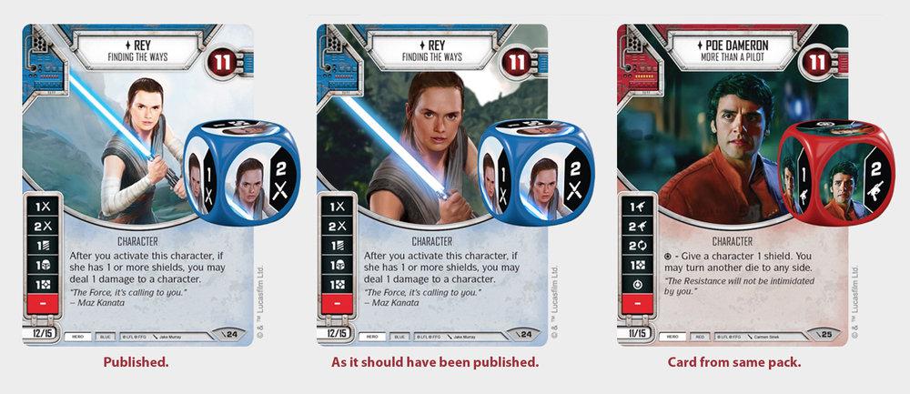
See the large image here https://goo.gl/ZFumdS
First, sorry my bad english. When I saw the new Rey card the first time I thought "Wow, so bad this illustration." And the worst: the illustration was used in everything, in the card, in the box, in the publicity material. The illustration in the card shows a very "pale" Rey (bad colors), "lost" in the card (bad composition), etc., and this was repeated in the other materials. But okay, go on. So yesterday I was using this card illustration to create a graphic piece to our group of players... I search for the big picture and I did not find it. I got the name of the artist (Jake Murray) to try to find the larger image. I entered the site of the guy and BOOM, my head exploded how good the guy is and made several illustrations for Star Wars (see https://goo.gl/4GweMk) and finally I found Rey's image... and when I saw the image... my anger increased... see only the original https://goo.gl/wGcWRa GUYS, THE ILLUSTRATION IS SO AMAZING! In short: the illustration is great and somebody in FFG DESTROYED destroyed everything. I do not know who you are, designer of Fantasy Flight Games, but I cursed you now. Shame on you. The guy took all the color of the picture, cleared and lost details of texture, put a generic background and dont think that the card comes with another (Poe Dameron) that has a different identity (the two cards formed a set). In the image below, i made the middle card in 20 minutes with the artist's illustration and a generic matte-painting background. But man, is Disney right? Let's this work right.
Edited by rodrigomotta