Alt Art
That looks pretty neat.
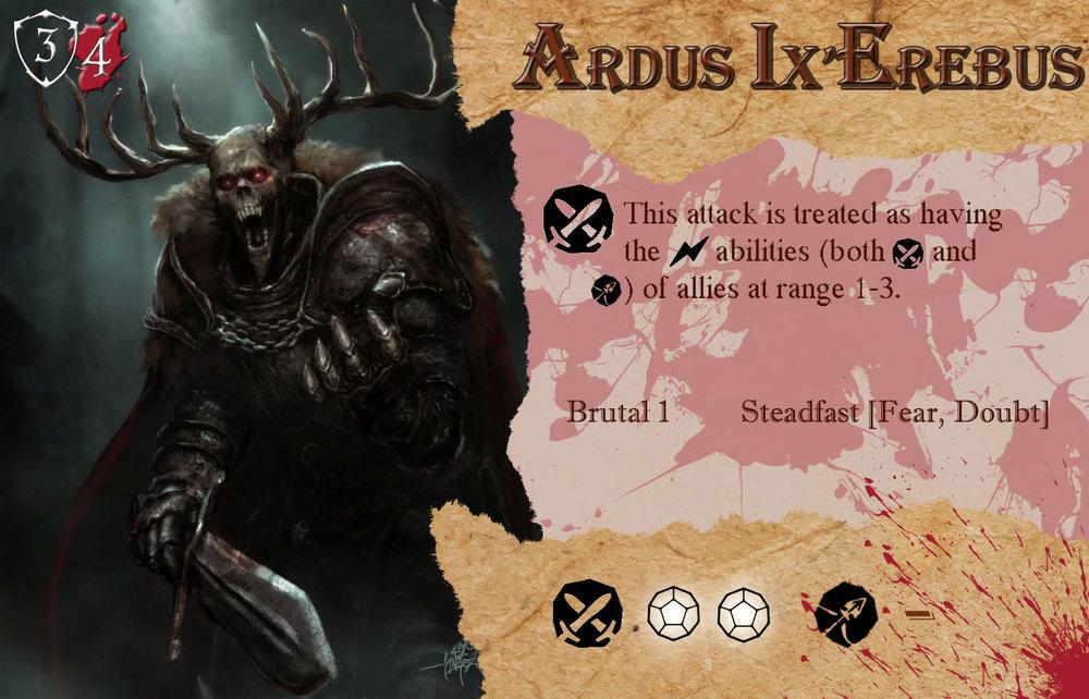
One thing I might change would be to fade the red splatter under the special rules text a little more to make the writing easier to read.
I think it looks awesome! What other cards are you working on?
The art is amazing, and I love your take on no helmet Ardus. I would say the background splotches are a bit loud, I would prefer a white/grey, but still, really awesome.
Personally I think since there is no ranged get rid of the ranged attack icon.
39 minutes ago, Curlycross said:Personally I think since there is no ranged get rid of the ranged attack icon.
We could see an upgrade down the road that grants a ranged attack. Imagine Ardus throwing those axes
1 hour ago, darkjawa103 said:We could see an upgrade down the road that grants a ranged attack. Imagine Ardus throwing those axes
Then his card won't have the icon, the upgrade card would.
I find it odd he still has antlers in your art. Clearly he would not be able to wear a helmet at all, but hey, we all have our problems
9 minutes ago, Darthain said:I find it odd he still has antlers in your art. Clearly he would not be able to wear a helmet at all, but hey, we all have our problems
not if his helmet has a notch down the side for him to slide over the antlers...
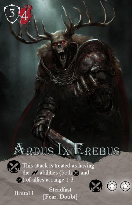
I love that art, and being able to showcase it more might make a big difference. What if you flipped the card vertically since Ardus has so little text on his card?
Wow, I do like it, and I like the blood splatter in bottom right. I'm glad you didn't just get rid of it, maybe add some faded behind his name, just make sure it doesn't distract from the name. Since his card has so little on it, maybe increase font size just a bit? This will make things a bit easier to read.
I think he saw Maegan's Moose and now has antler envy
I think what I dislike about this alt art is that the picture is so dark, and the paper is so bright it doesn't blend well together. The defense and health also stick out like they are an after thought, and not part of the art. I might consider a faded circle or shape behind the defense and health, and also make them smaller.
I do appreciate fans that put this kind of stuff together, I'm just noting what I personally dislike, but props for making this custom to your own style!
1 hour ago, backupsidekick said:I think what I dislike about this alt art is that the picture is so dark, and the paper is so bright it doesn't blend well together. The defense and health also stick out like they are an after thought, and not part of the art. I might consider a faded circle or shape behind the defense and health, and also make them smaller.
I do appreciate fans that put this kind of stuff together, I'm just noting what I personally dislike, but props for making this custom to your own style!
Funny enough he got feed back to make them larger because they were too small before.


