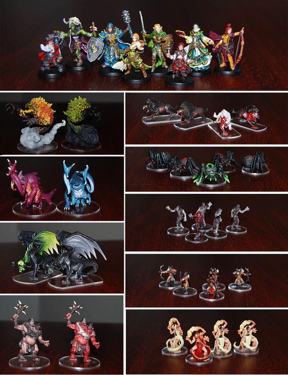
Yet another painted base game
Nice job. It's easy to tell when there is a group of minis, but the couples can de confusing. Why you didn't keep the original bases and painted them in different colors?
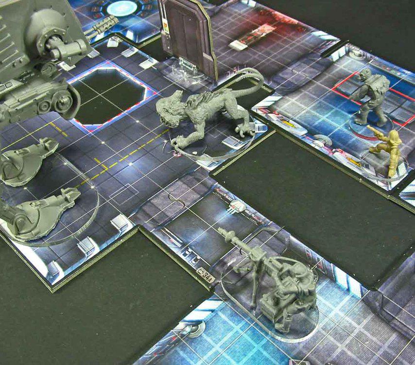
Thanks! I see. Well I wanted it as much blend-in as possible. Many use the red circles around the bases, but from my point of view it kind of disturbs the unity and life on the board. I didn't want to use the environment bases with grass, rocks and wood .. I felt like - what would all of it do in the dungeon hall right? I mean it looks great but I didn't even dare make such bases.
Since I've seen http://www.litko.net/products/SW%3A-Assault,-Clear-Base-Upgrade-Set-(36).html#.WMVPsmfavIU I knew that was my way to go :D... looks decent and you can still see all the pretty details on the map pieces. And it's 'the real' terrain that the monsters stand on, which was satisfying enough for me heh.
I didn't use exactly those as the shipping here to Slovakia was insane. I ordered:
https://www.aliexpress.com/item/50pcs-lot-25mm-Blank-Clear-Acrylic-DiscJewelry-Art-Acrylic-Circle-Round-Shape-1-0-AC1028F/32787862093.html for 1x1 monsters
https://www.aliexpress.com/item/30pcs-lot-50mm-Blank-Clear-Acrylic-Circle-Pendants-Wedding-Disk-Key-Chain-Laser-Cut-Eco/32651611977.html for 2x2 monsters
https://www.aliexpress.com/item/20pcs-lot-Blank-Clear-Acrylic-Circle-Ornaments-Discs-Key-Chain-Neclace-Scrapbooking-3-AC1045C/32297101727.html for 2x3 monsters whick I cut the sides as well as the sides from 2x2 for Barghests (1x2)
The heroes' bases are so small I decided to leave it black.. it didn't cover so much of the board
Well, actually you have a good point here. I never thought about the bases in the way you're talking. Interesting.
You could just paint a small red dot or something like that to point to the master monster.
Very well done!
I can't tell if this was the intended result, but the black and white zombies is a cool idea. Reminds me of old school TMNT. I may consider a grey scale color scheme for one of the monster groups. The zombies would be the best group for the style.
On 12/03/2017 at 2:05 PM, Alarin said:...for 2x3 monsters whick I cut the sides as well as the sides from 2x2 for Barghests (1x2)
I like the clear bases idea, what did you cut these with and am I right you'd have had to round off the edges too? Any tips on material thickness/cutting/smoothing from your experience?
Some people identify master monsters by adding scenery props to the bases so they're standing on something or have a victim in their grasp etc, that would be one other option for showing which are the masters on clear bases.
4 hours ago, Martinslair said:I like the clear bases idea, what did you cut these with and am I right you'd have had to round off the edges too? Any tips on material thickness/cutting/smoothing from your experience?
Some people identify master monsters by adding scenery props to the bases so they're standing on something or have a victim in their grasp etc, that would be one other option for showing which are the masters on clear bases.
I paint the edges of the base red to indicate that it's a master, minions are black. You can check it out in my topic:
You can also apply this to clear bases, its up to you!
Greets Miel
Alarin's point about not painting the clear bases is a good one (so they just show the tile not a distracting red/black border). The scenery base tip would only work if the choice would fit any location too, something they could stand on in any place, an icy rock for example may have the same problem of not suiting certain terrain. But then it's also what looks good, my ice wyrms are getting some glacial ice, even if they might turn up in a fiery dungeon, because it fits their origin, but I am a bit torn now with how sensible the clear/ environment adaptive bases idea is! My ice wyrms will be carrying their big chunk of glacial ice everywhere they go. Maybe swappable bases (joking, too much work I feel).
Thanks for the feedback!
8 hours ago, Martinslair said:I like the clear bases idea, what did you cut these with and am I right you'd have had to round off the edges too? Any tips on material thickness/cutting/smoothing from your experience?
For the cutting I tried a way the glass or floor tiling is cut. I cut a shallow line with a breakoff knife and hit it with something heavy (I used a heavy file which I used on smoothing the edges later on.... brilliant tool). This way, it was working pretty well, but it will depend on the material. This is some firm acrylic plastic.
Thanks
I took a picture of how it looks on the board ![]()
Looks great, also may be a benefit when you need to see things on the board due to obstacles/ things that people may use in a quest, very tempted to clear base my minis now.
![]() go ahead.. the links from Aliexpress are above :D.. although it took a month till they came... but no shipping costs x)
go ahead.. the links from Aliexpress are above :D.. although it took a month till they came... but no shipping costs x)
Just finished my Belthir... but I made a mistake. I put it on the base before I finisned with the fixative. I will have to change it...later
And the Lair of the Wyrm expansion
Fire Imps & Hybrid Sentinels
:: A little hint for anyone who would cut the original base - let the whole figure, painted or not, on a radiator for a few minutes. I will be much much easier to cut through... ''the butter hack''
Edited by AlarinAnd finally Reynhart the Worthy & High Mage Quellen with Summoned Stone familiars :D. I made them out of FIMO modeling clay. I know they look pretty weird and drunk but I hate those little tokens...eh
Edited by Alarin
Drunk looking or not, it's more craft work than I'm willing to do. Looks pretty darn good to me.
EDIT: stupid swear filter
Edited by Proto Persona54 minutes ago, Proto Persona said:Drunk looking or not, it's more craft work than I'm willing to do. Looks pretty darn good to me.
EDIT: stupid swear filter
Thank you! I'm glad you like it ^^
You have done amazing job with all the sculpts, but these summoned stones look really great ..
Edited by jopanThis looks fantastic!
I have painted* some of mine, and to distinguish the master I would band the base. I'd choose a color to set the master apart and do that. For example, the Shadow Dragons are black. The minion has dark green claws, spikes, eyes, etc. The master (when I paint it) will have fluorescent green instead, and will have a fluorescent green band on the base.
*My skill level is very low- I have no concept of shading or blending.
On 23. 8. 2017 at 6:34 PM, Lightningclaw said:This looks fantastic!
I have painted* some of mine, and to distinguish the master I would band the base. I'd choose a color to set the master apart and do that. For example, the Shadow Dragons are black. The minion has dark green claws, spikes, eyes, etc. The master (when I paint it) will have fluorescent green instead, and will have a fluorescent green band on the base.
*My skill level is very low- I have no concept of shading or blending.
Thanks! .. sounds good I think I will do that when I get down to painting the rest
I have finished some more meanwhile
Manor of Ravens

Shadow of Nerekhall

Lair of the Wyrm


