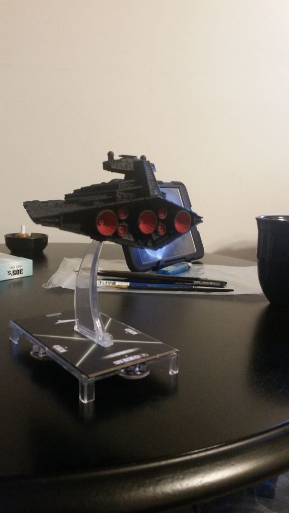
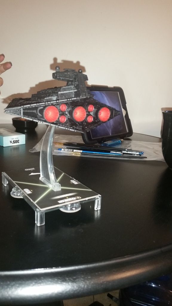
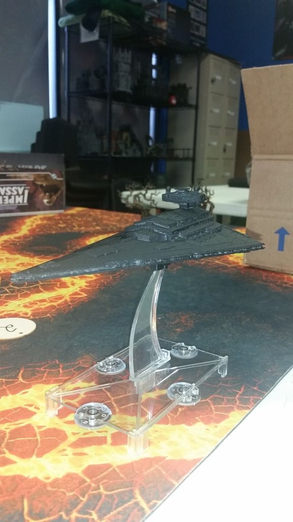
So I did my first capital ship repaint today, and decided to do the ISD-II Anakin Solo from the Legends timeline. Simple to do, albeit somewhat time consuming. Materials used were Citadel Chaos Black primer, Mephiston Red base, Evil Sunz Scarlett layer, and Agrax Earthshade wash. Eventually I may paint lit windows on it. But I need to find that perfect cool white that daylight LEDs put out. Let me know what y'all think!
Edited by DestraaFirst capital ship repaint - ISD-II Anakin Solo
I've never been sure what to think about black ISD's, but the more I see them, the more I like them. Sure, the lights might help a bi, but it seems to have gotten brought out anyway on the details. Still, the SSD style red engines really bring out the back. That really does work for me. Nice work, very nice.
I've never been sure what to think about black ISD's, but the more I see them, the more I like them. Sure, the lights might help a bi, but it seems to have gotten brought out anyway on the details. Still, the SSD style red engines really bring out the back. That really does work for me. Nice work, very nice.
Good work, man, good work! I do dig the contrast. Still think a highlight with dark grey would pop it even more. I may have to sacrifice one of my Blood Squadron ISD's and experiment....
We're aaaall there at some point, eh? It looks good though, striking. (did ya' add a drybrush to the bridge tower? It stands out surprisingly well on black). I think the gambit on the SSD red does compliment it well. Blue is a colour I use extensively and like (Most painters seem to simply get a 'knack' for certain colours and get vexed by others. For example: I'd love to try a green engine/lights ISD, but I'm not great with green and haven't worked up the nerve to try it ![]() ) but because it's a departure from the usual ISD-I blue engines, it feels unique. And unless you go with a very light blue, I think you're right, the red compliments it better in the usual way that red and black usually do. (I'd make some sort of OC joke but it's striking for a reason).
) but because it's a departure from the usual ISD-I blue engines, it feels unique. And unless you go with a very light blue, I think you're right, the red compliments it better in the usual way that red and black usually do. (I'd make some sort of OC joke but it's striking for a reason).
Good on ya for doing something unique, mate! It's always great seeing a unique fleet across the table, and red is a great choice for the Imperials. I hope you do decide to do up some more for us sometime, eh!
We're aaaall there at some point, eh? It looks good though, striking. (did ya' add a drybrush to the bridge tower? It stands out surprisingly well on black). I think the gambit on the SSD red does compliment it well. Blue is a colour I use extensively and like (Most painters seem to simply get a 'knack' for certain colours and get vexed by others. For example: I'd love to try a green engine/lights ISD, but I'm not great with green and haven't worked up the nerve to try it
) but because it's a departure from the usual ISD-I blue engines, it feels unique. And unless you go with a very light blue, I think you're right, the red compliments it better in the usual way that red and black usually do. (I'd make some sort of OC joke but it's striking for a reason).
Good on ya for doing something unique, mate! It's always great seeing a unique fleet across the table, and red is a great choice for the Imperials. I hope you do decide to do up some more for us sometime, eh!
And no dry brushing on the bridge tower, that was done with nothing more than Chaos Black aerosol model paint.
Edited by DestraaThat should work. I just finished up with some red stripes on a fleet and it does tend to work pretty good as a differentiation, even on a dark hull. There's a lot of fun to be have with markings, eh? Always something new and unique that can be done.
hmm, not bad, might just be that the angle left a bit of grey (which actually compliments the look from this view by making sure that the black doesn't matte down the details. It's sort of like a sort of zenith highlight in reverse which serves a ship well. Zenithal shade? Hmm. I've done a few things in total black and I end up having to highlight straight o near-white to get a similar effect while a straight grey drybrush over black tends to make the main body look dusty rather than black.) .
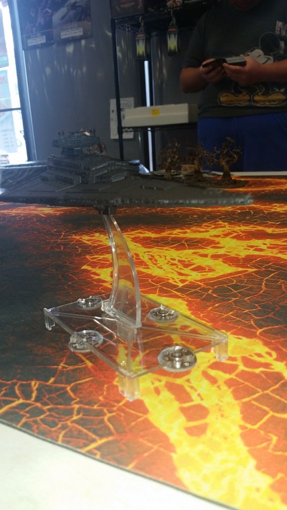
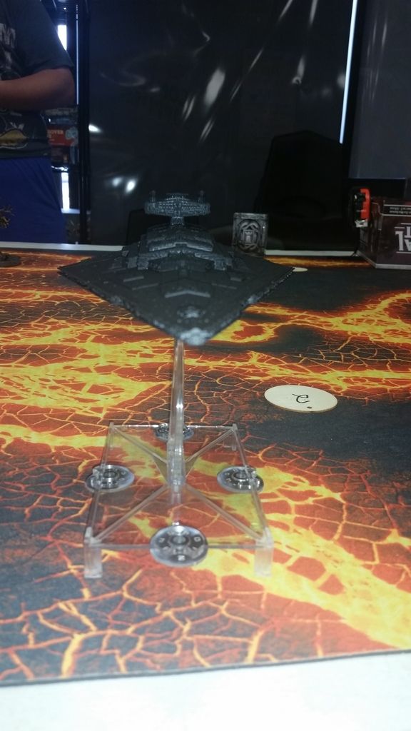
And by the by, that ship on a clear base looks magnificent on that table ![]() Seen that mat at my local shop too, nice and intimidating.
Seen that mat at my local shop too, nice and intimidating.
Yeah thinking on it I believe a linear highlight on the panels edges would be more effective, but very time consuming.
I love the stripe idea, but it would have to be a very clean application. Hmm.
Yeah thinking on it I believe a linear highlight on the panels edges would be more effective, but very time consuming.
I love the stripe idea, but it would have to be a very clean application. Hmm.
Hmm. Perhaps painters tape for masking may be more effective. I just eyeball it myself, but I have practice, lol.
Hmm. Perhaps painters tape for masking may be more effective. I just eyeball it myself, but I have practice, lol.
I was thinking a ruler so I could keep it evenly spaced. Having unevenly spaced stripes would hurt the look.
Painters' tape/masking tape are pretty good. I went with an overly expensive, albeit effective, Tamiya tape. I made a bottom line, then used a clear cheap ruler to get the distances, and aligned a second piece to fit it. Worked pretty good as it was a consistant 3mm band and I could even get a dashed line evenly spaced by cutting the tape.
But really, as long as you smooth the edges of the tape, it tends to work well. But a straight edge on a GSD will be fine given the distinct lack of greebles. Add a thin pencil line won't hurt either. I find straight brushes tend to feather the edges and make it look rough compared to weathered (where you can add some masking solution or the old salt trick to make it look chipped and weathered.
This sounds like a good technique, but I don't think I quite grok it. I'm a visual learner... Can we get a snap (or better yet a vidya) of your execution of masking?
This sounds like a good technique, but I don't think I quite grok it. I'm a visual learner... Can we get a snap (or better yet a vidya) of your execution of masking?Painters' tape/masking tape are pretty good. I went with an overly expensive, albeit effective, Tamiya tape. I made a bottom line, then used a clear cheap ruler to get the distances, and aligned a second piece to fit it. Worked pretty good as it was a consistant 3mm band and I could even get a dashed line evenly spaced by cutting the tape. But really, as long as you smooth the edges of the tape, it tends to work well. But a straight edge on a GSD will be fine given the distinct lack of greebles. Add a thin pencil line won't hurt either. I find straight brushes tend to feather the edges and make it look rough compared to weathered (where you can add some masking solution or the old salt trick to make it look chipped and weathered.
That would be awesome to see. I've got a little over three weeks to get these repaint done if I want them ready for the Florida regionals, and that would be helpful.
Great looking ship. I like the red engines. I would also suggest using a dark grey to highlight the edges and changes in elevation on the ISD. That and some drybrushing with it will help make the details stand out a little more. I think the. Going in and adding in the lights would really make it pop. You could go for a red glow and bright white dot or even a white glow and bright red dot for the windows. Also if you have a red glaze you could do some work on the engines to give them a little glow. Mix on some white and orange etc if you are feeling confident.
I won my black ISD from a tournament and later added some highlights and then the Windows to make it look better. Overall I like the look.
BMcDonald, that is gorgeous.
Thanks but I was more using it as an example for the white windows and red glow. Also you can see some of the gray highlighting around edges. I have a thread barried in this sub forum for my own stuff showing how I did it. I don't want to take away from the Ops work in this thread. I really like the bright red paint on the engines he did.
Oh indeed. I think the work you did on the windows has inspired him tough, lol. We live close by and are gaming partners, so we talk a lot. I think you will be seeing more coming from him soon.
Thanks but I was more using it as an example for the white windows and red glow. Also you can see some of the gray highlighting around edges. I have a thread barried in this sub forum for my own stuff showing how I did it. I don't want to take away from the Ops work in this thread. I really like the bright red paint on the engines he did.
He's right. In fact, I'm glad you commented, was wondering if you had any suggestions on what paints and methods to use to spruce mine up like that. I use Games Workshop citadel paints if that's any help.
Painters' tape/masking tape are pretty good. I went with an overly expensive, albeit effective, Tamiya tape. I made a bottom line, then used a clear cheap ruler to get the distances, and aligned a second piece to fit it. Worked pretty good as it was a consistant 3mm band and I could even get a dashed line evenly spaced by cutting the tape.
But really, as long as you smooth the edges of the tape, it tends to work well. But a straight edge on a GSD will be fine given the distinct lack of greebles. Add a thin pencil line won't hurt either. I find straight brushes tend to feather the edges and make it look rough compared to weathered (where you can add some masking solution or the old salt trick to make it look chipped and weathered.
This sounds like a good technique, but I don't think I quite grok it. I'm a visual learner... Can we get a snap (or better yet a vidya) of your execution of masking?
Righto, I put a tutorial thing up in my painting spot (so as to not distract from this topic, but I can put it here if ya'll want me too as well).
For the windows Id use some watered down red for the glow effect, and highlight with the white dot, but Ill let the painting Skaven, eerr, rat do his thing, lol. He must be from clan Skryre...
For the windows Id use some watered down red for the glow effect, and highlight with the white dot, but Ill let the painting Skaven, eerr, rat do his thing, lol. He must be from clan Skryre...
I'm not good enough at painting the colour green to be proper skryre ![]() Just another warlord clannner.
Just another warlord clannner.
Watered down red works nice, GW bloodletter glaze over a white or yellow is also very very effective for red tinted lights.
Clan Mors, I doubt not, but I digress.
I'll have to get with you over my vacation to give me a hand, Lupine. It'll be nice to be able to work with you on these repaints before regionals.
Wait, you got vacation?? PM me on FB, lol. Absolutely.
