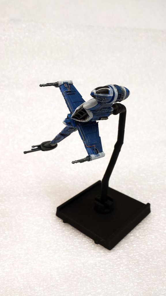
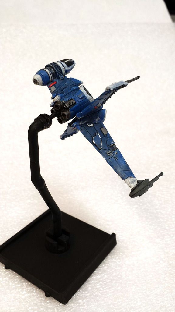
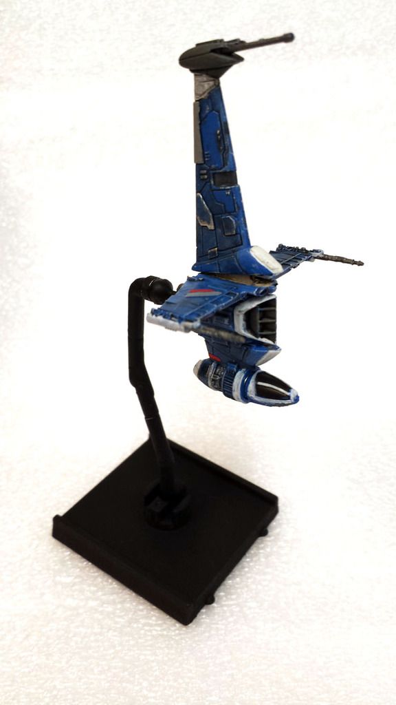
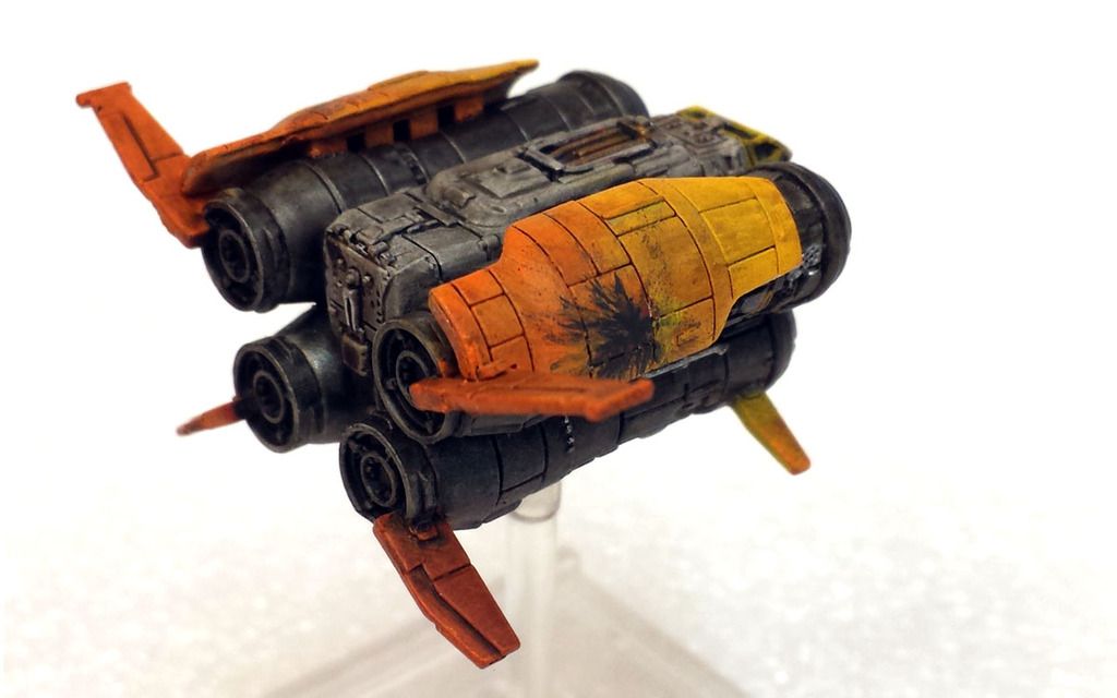
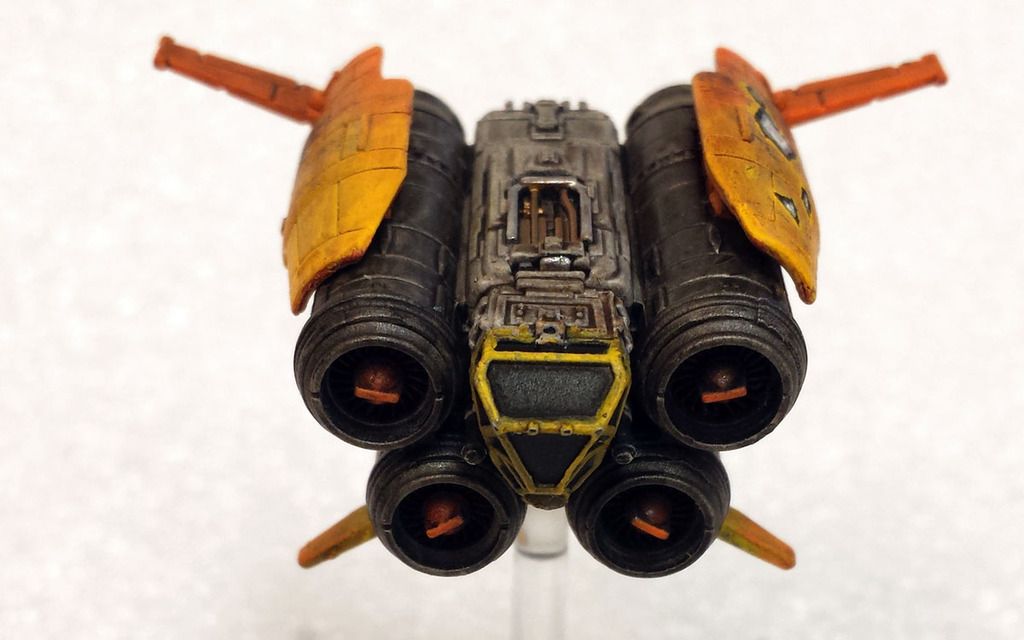
Two ships this time. A B & a Q.


Still trying to master "damage"


Two ships this time. A B & a Q.
Still trying to master "damage"
Excellent !
The Blue B-Wings look really good.
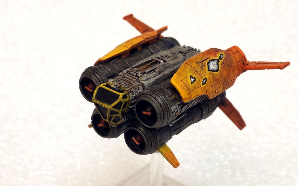
And your Jumper really stands out, Nice work on the Damage Force ![]()
All the best,
Barry.
On 2017-5-19 at 11:23 PM, Force Majeure said:Two ships this time. A B & a Q.
Still trying to master "damage"
Nice "lived-in" aesthetic you've achieved.
WRT battle damage:
The scorch mark on the right - assuming it's a glancing blow rather than penetrating - the effect looks very good, just perhaps too heavy with the amount of black coverage (assuming, of course it's glancing, thus shouldn't leave too much residue). I don't think you're very far off achieving the right look.
Paint chips on the left - the outer highlighting, black inner-edging and the shades of grey are relatively uniform in thickness (ie distance between each gradation) - however, the nature of this kind of damage should be more haphazard. If anything, you've possibly gone to too much effort trying to have that many layers being stripped back. Perhaps the lighter orange highlighting should not go the whole way around, instead using it in smaller amounts on one side of the damaged area, to give a sense of the direction of movement for the object that caused the damage. I think the black should be much less of the overall surface area of the damage - right now it seems to be forcing a sense of depth that doesn't match the other visual cues. Lastly, the panel lines "disappear" under the damaged sections, which makes it look the the exposed grey is on top of the main orange outer coat instead of underneath.
Two ships this time. A B & a Q. It's deja vu. It's deja vu.


I'm not 100% sold on the red-orange (more like 80% sold). The engines are painted silver & the "fuselage" is a light grey. It doesn't translate too well in photos however.


Edited by Force Majeure
A Buckeye-wing? Our honor defend!
I've painted this same ship four times, each time it looked worse and worse. I finally stripped it down to bare plastic, popped off the lasers and both sets of wings from the main fuselage. I know it's not as precise as some other painters out there, but I'm finally okay with it. Here it is, drawing inspiration from Rogue One's Blue Squadron.


Edited by Force Majeure
Also having been inspired by the coming expansion fix, I worked on this last night:

I basically chopped up a spare Khiraxz I have and made it look pretty close to the Vaksai version of the ship that I've seen. Mostly I removed material and re-positioned existing elements. The only thing I added were two short fins to give it a little bit more aggressive profile. Here it is next to my other Khiraxz for comparison.


Obviously, it isn't painted yet.
Edited by Force MajeureHere's the image I worked from for inspiration:

On 5/19/2017 at 5:23 PM, Force Majeure said:Two ships this time. A B & a Q.
Still trying to master "damage"
A trick for blast damage/scorch marks. Take a piece of paper and cut/tear a hole to the shape you want. Hold it very close to the surface but not touching and spray directly down on it using low pressure and very little paint. It should provide a soft edge for the scorch mark.
Here's the follow-up to the modded Kihraxz fighter.

Given those colors, I decided to give it a gloss on the top of the ship.


And if you were curious about what the undercarriage looks like, here you go. The model breaks apart into several smaller pieces. I chose not to replace the chunky bit that's normally slightly forward of the peg.

All in all, I really like the chopped look. I think I may do it again, but next time keep a more militaristic paint scheme.
Edited by Force Majeure
10 hours ago, Force Majeure said:Given those colors...
Given those colours, I expect the pilot has dreadlocks - and the cockpit has a smokey haze inside.
"You ever fly your Kihraxz fighter on Glitterstim?"

I guess no one remembers the Dave Chapelle movie "Half-Baked".
Anyways, I have a pair of U-wings to present. I really have hopes that a future upgrade will make this ship a force to be reckoned with, but as yet, in my experience it's still middle of the road. Cassian is my favorite pilot for the U. I usually have him running Expert Handling for extra maneuverability and Advanced Sensors so I can do my barrel roll, stress, and green maneuver that stress right off.


I realy like the green and yellow combo. Looks like there are Rangers inside, ready to blow a comm tower. Some rocket pods would make an awesome addition.
Photobucket is out. Imugr is in.
It's working great so far.
Beautiful U-Wings ![]() <3
<3
I've been pretty lax about taking pics & uploading them, but here's my latest batch:
Auztuks! I like these guys. Not because they look like my mini-van, but because they're hearty. My biggest complaint is their lack of re-positioning. Also, I felt that notching the guns on the side of the cockpit really helped give them a more finished feel. The "standard" paint scheme just had a few small touches here and there.


Here is a repaint of an A-wing, and my latest T-65.


The 65's call sign is "Poacher" after having taken down the only Decimator to show up in Heroes of the Aturi Cluster on his maiden flight. I think he earned it: being the last to shoot meant that a lot of shots that he was lined up for got sniped out from under him. Taking down the Deci was fair payment.


And here's my newest obsession to fly: Defenders.
Maybe I'm a little late to the party, but these guys are a lot of fun and very effective. My preference is for the TIE/D flown in pairs. One with Tractor Beam, the other with Ion Cannon.


Great growing collection of simple, complimentary color palettes.
That blue Defender is nice; subtle and understated. I like it. But that red one.... ****, man; that's sweet.
Picked up Guns For Hire and although I love the paint schemes, I wanted to add a little polish to what came out of the box.
I added some metallic dry brush to both ships to add a little definition and the red StarViper looked a bit too flat, so I repainted the red panels, giving them a gradient from a dark red to a lighter red. Hope you enjoy.

I think they may be the best yet out-of-the-box. But yeah, they are a little flat. I really like what you've done, and will eventually do my best to replicate it. Thanks for the art direction!
They look as if they have no details added. If you know what I mean, it's a compliment.
I was "inspired" by @FalconLugnut over on his thread to paint my Scurrg like his. Something about that color combo and dazzle camo spoke to me enough so that I had to try and replicate it. It's not the first time I've "stolen" a look, but I will always try and give credit where it is due.


