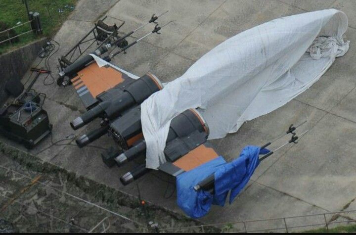
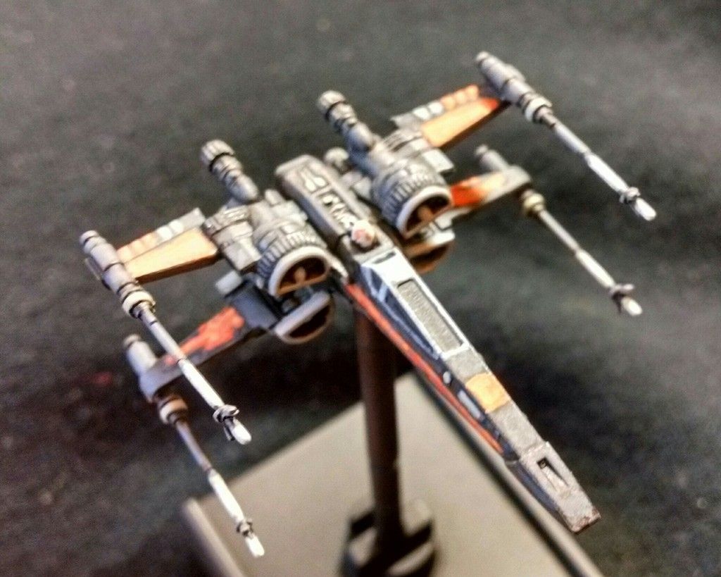
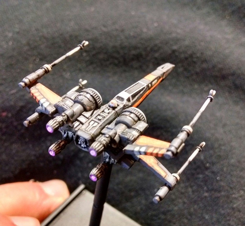
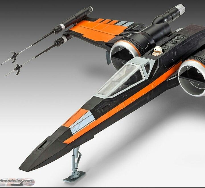
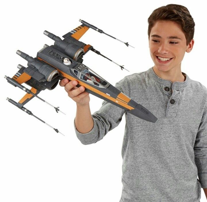
Poe Daaaaaaaaameron, photo reference for repaint and a crappy example.

By Velvetelvis, in X-Wing Off-Topic

Lots of really good Poe repaints flying around here (usually sidweways, blasting the pistols out of stormtroopers hands from three miles out,dodging everything and not spilling a drop of his coffee down the cup holder and onto his CDs of The complete works of David Bowie).

Finding decent pictures of his ship can be a chore. We are basically stuck using toys as reference with there questionable accuracy. But it is enough and by taking the best bits of the differences one can use a little artistic license and fill in the gaps to get as much visual interest as can be had from what honestly is sort of a bland paint design.

_20160126_090052_zpsknqdu9ar.jpg

_20160126_090038_zps6onr5urb.jpg

_20160126_090111_zps7g224tgb.jpg

Some things that can get a little extra detail are the tiny greyish/whitish/ er...metalish spots on the main body.

The grey lines on the left side near the nose

And what struck me was the significantly lighter color on the gun barrels.

Putting these details on help break up the hella boring black and orange thing going on.and speaking of orange...I chose to use the pinkish/purplish engine glow seen in episode 4. Because.....too much orange otherwise imo.

Also, black being a challenge to detail I found good results by thinly layering increasingly darker greys to get...somewhere near black as an illusion but can still be detailed and highlighted.....because...not really black.

Here's some crappy pics of a mediocre result...

_20160126_085804_zpsxbc4hjrw.jpg

_20160126_085830_zps6iufoltm.jpg

So anyways, just wanted to pass along some thoughts for anyone wanting to do a poe .there's some room to play around with details and break up the black.
You might find a better way to do black is to just use black and then edge the sharp angles very feintly with beige.

We used to so that with 'black tanks' with 'eavy metal at GW. It works very well.

At the mo it looks great but a little too grey

It definitely is very grey still. I just wanted to err on the side if not getting to black and then feeling stuck there. Good call on the beige edge work. That can totally save the day .

I need to get a better picture of this because I built in some additional flaws...er....differences as well.

I tried to go very ' impressionist' with regard to the black and orange. And see how it would work on a small scale. The orange markings are blktted with darn near yellow in the middle and the 'black' areas are similarly blktted with much lighter grey. The idea was something this small sitting on a table at a distance of a few feet ...the colors should merge and create a sort of blend....up close its obviuous but in game it sort of works maybe as a way to create some false depth.

I've never tried it before but figured why not experiment.

I think its often the way you have to do it.

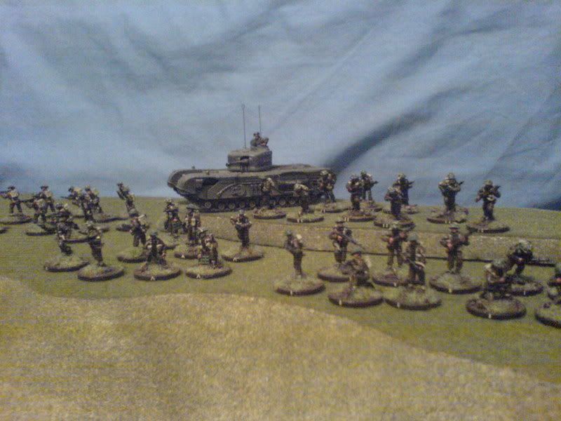
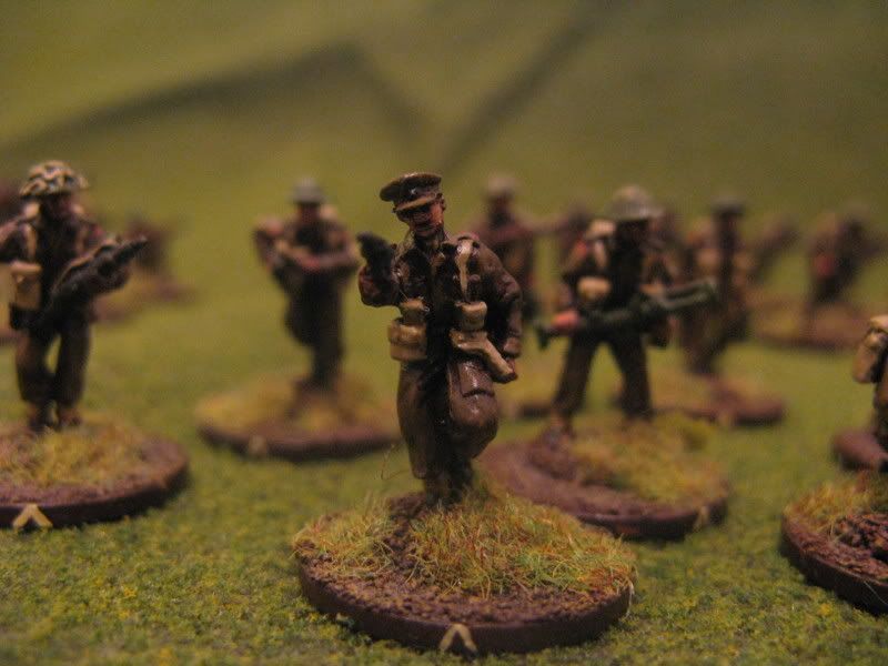
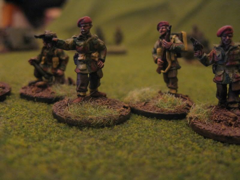
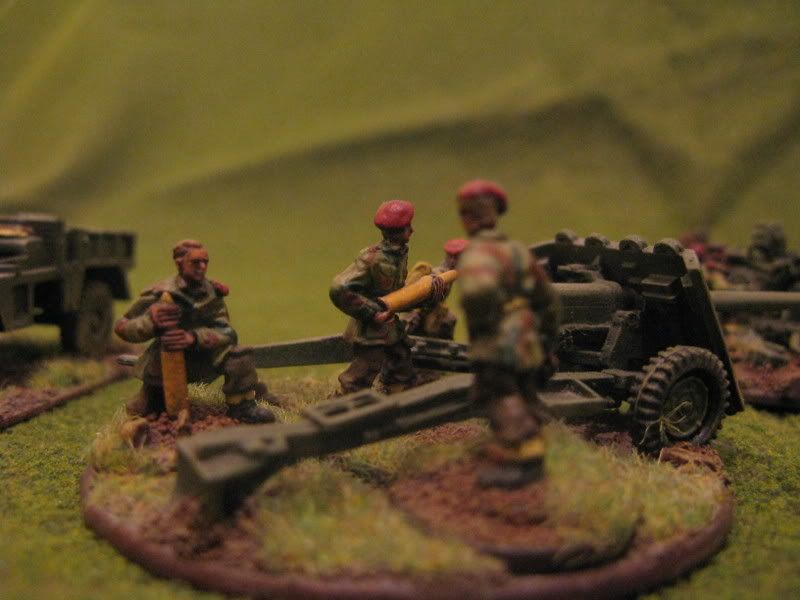
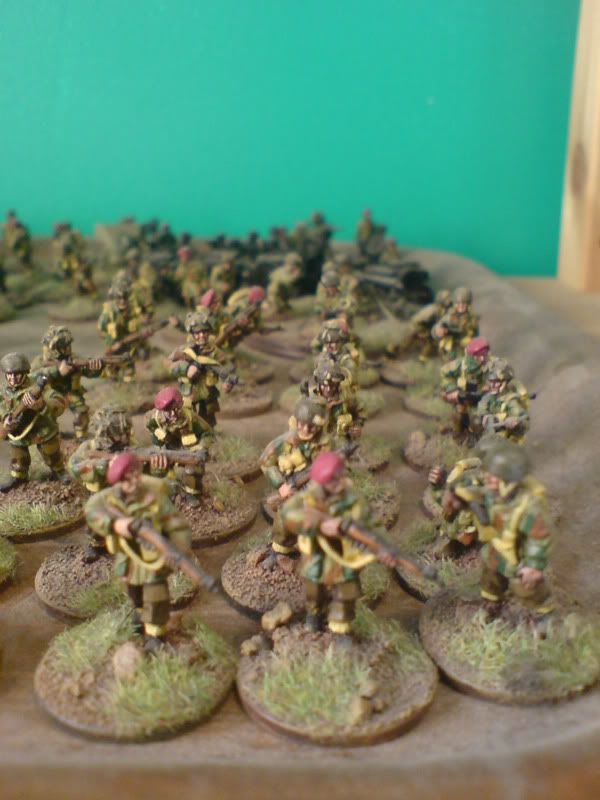
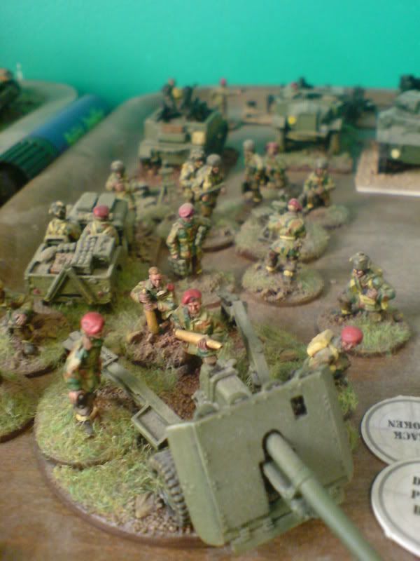
Like painting 20mm wwii brit airborne, if you try and paint the smocks *properly* it always looks 'wrong'

If you give the impression of the brush stroke camo and shades it works, you also have to increase contrast at such a small scale.

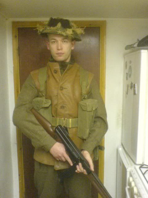
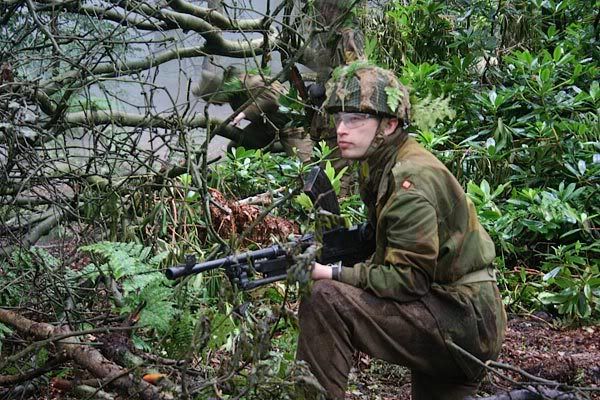
Like in reality wwii brit webbing was painted mid green but i always leave mine raw 'khaki' webbing, its wrong but if you paint it properly you cant actually see it on the model.

examples that are truly off topic here:

this is the colour the webbing should be (excuse the incorrect US M1a1, brit thompsons were not available as airsoft guns in the uk at the time)

DSC01606.jpg

paint it like that and it all looks one colour at 20mm scale.

i paint mine much lighter so you can actually see it in game

plattoon1.jpg

IMG_4025.jpg

and brit paras

IMG_4068.jpg

IMG_4060.jpg

DSC00092.jpg

DSC00093.jpg

because again if you paint it like it looks in real life its just a green blur in 20mm

bren.jpg

Edited by Gadge

Top notch!