Does the ISD look stubby?
You could say the other model is stretched?
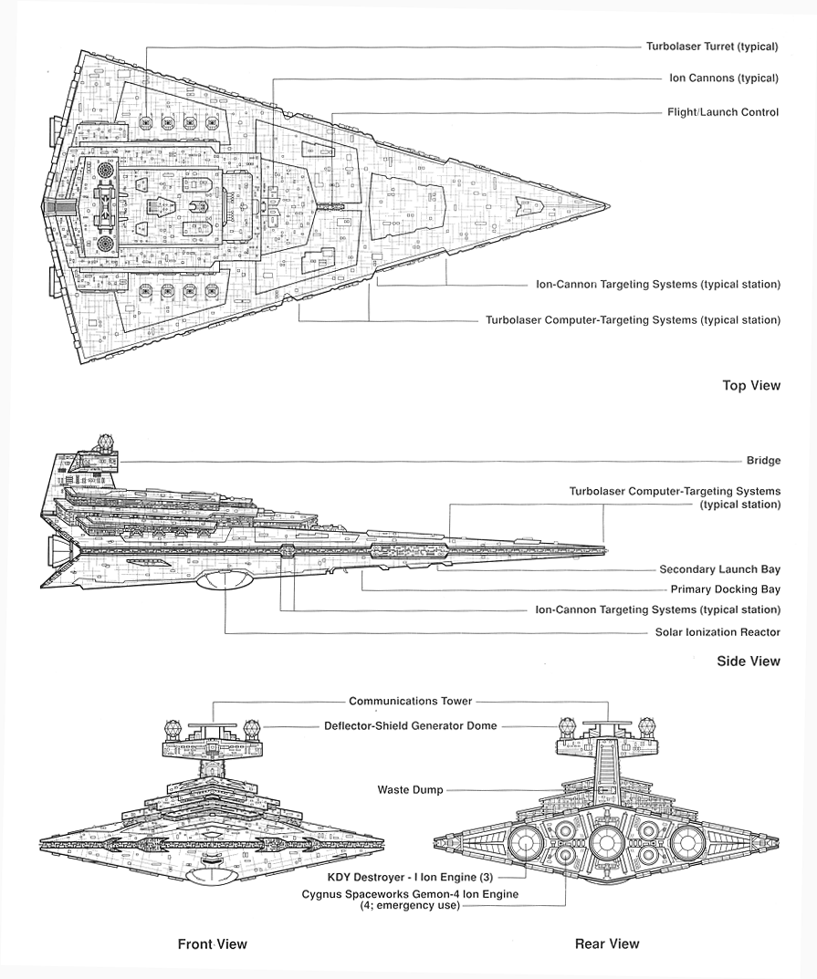
If someone has a printout of the ISD's blueprints from the first Guide to Vehicles and Vessels and a camera, could a comparison photo be snapped there? I'm reasonably sure FFG's modelers used the blueprints as a primary reference for constructing the model. One telltale sign is how the engine bells are visible from the top. They shouldn't be. But I know they are in those blueprints.
Edited by Norsehound
therea re apparently 2 accepted models. look at this image search. about equal in terms of stubby verison and longer version.
imo the longer version looks a little weird too.
I don't get why they don't just copy the original studio model up for display in that museum rather than basing themselves on the interpretations of others.That way you get the most accurate representation. Maybe they have though, I'm not in a position to judge, but to me it does look a bit too short.
That way you get the most accurate representation.
They're kinda limited to what LFL will let them use. So if LFL said 'use this reference' that's the one they use.
For X-Wing they had access to the original movie models, but if LFL doesn't want them to use that for the ISD then they use whatever they're given.
I'm not going to nit-pick the ISD in this game. It's an amazing model, end of story.
I don't even know what is being compared to in the first photo...
Surprisingly uncharacteristic of the Imperials to not have everything aligned in exacting details. The smaller version doesn't look "stubby" to me though, just slightly shorter. Still potentially lethal in a knife fight (The PIzza Slices Back!)
how anyone can find anything even the least bit doubtful about easily one of the most glorious models FFG has released is beyond me
Some are sticklers for detail. Particularly I liked some of the things about the original star destroyer in a new hope (Vertical targeting array, engine baffles, larger turrets) that were changed when they built the Empire Strikes Back model.
That way you get the most accurate representation.
They're kinda limited to what LFL will let them use. So if LFL said 'use this reference' that's the one they use.
For X-Wing they had access to the original movie models, but if LFL doesn't want them to use that for the ISD then they use whatever they're given.
I just presumed the modelers were looking for easy resources on-hand on the internet they could use... it could be that LFL just passed them the diagrams, saying they were right, and unaware that they weren't.
Still a beautiful model. And it's nowhere near as bad as WizKid's attempt to model the U.S.S. Excelsior. They depicted an entirely different starship class from fandom instead. Still mad about that...
I've stared at a lot o star destroyers in my day- it does look a tad stubby.
I think this gets accentuated by the panel lines (too high constrast) such that you see a lot more horizontal lines than you should which ruin the angles of the original model. I think if you repaint the thing in lighter colors it should get rid of most of that feeling.
Light colors are the way to go, mang.
I feel like making the ISD a more stark white color helped the look a lot.

The right-hand ISD in OP looks like complete tosh. Doesn't measure up to any of the images from the movies as far as i can see.
Perhaps the ISD FFG released is "stubby"...but I'd argue that it looks better. The primary reason I love the VSD over the ISD is the sleeker, thinner verticle profile; and I feel that the ISD FFG sold us takes on some of those aspects to make it look better. Also, contrary to the above points, the dark grey is FAR better looking than the white from the movies and pic above imo.
Also, contrary to the above points, the dark grey is FAR better looking than the white from the movies and pic above imo.
Entirely a matter of taste.
I get a bit eye-rolly when I see a black star destroyer.
Stark white is as much a message to the enemy as it is a stylistic choice, and integral to the soul of the Empire IMHO.
The right-hand ISD in OP looks like complete tosh. Doesn't measure up to any of the images from the movies as far as i can see.
Perhaps the ISD FFG released is "stubby"...but I'd argue that it looks better. The primary reason I love the VSD over the ISD is the sleeker, thinner verticle profile; and I feel that the ISD FFG sold us takes on some of those aspects to make it look better. Also, contrary to the above points, the dark grey is FAR better looking than the white from the movies and pic above imo.
I actually did some measurements using movie shots compared to those models. Taking into acount perspective the longer, sleeker Disney version is more movie accurate: from the base of the first superstructure elevation to the tip should be slightly longer than rest of the ship. It also has a bridge that is better proportioned than the FFG ISD, of which the bridge is not wide enough. As for the colours, white is the colour they had in the movies. I much prefer it to the medium grey FFG has given them, but that's a matter of personal taste.
Edited by Lord Tareq
The right-hand ISD in OP looks like complete tosh. Doesn't measure up to any of the images from the movies as far as i can see.
Perhaps the ISD FFG released is "stubby"...but I'd argue that it looks better. The primary reason I love the VSD over the ISD is the sleeker, thinner verticle profile; and I feel that the ISD FFG sold us takes on some of those aspects to make it look better. Also, contrary to the above points, the dark grey is FAR better looking than the white from the movies and pic above imo.
I actually did some measurements using movie shots compared to those models. Taking into acount perspective the longer, sleeker Disney version is more movie accurate. It also has a bridge that is better proportioned than the FFG ISD, of which the bridge is not wide enough. As for the colours, white is the colour they had in the movies. I much prefer it to the medium grey FFG has given them, but that's a matter of personal taste.
And? It doesn't change the fact that I like FFGs ISD more: dimensions and colors.
Looking at some of the google-search images, it looks to be somewhere between the two OP pictures. Not as narrow and not as "squished". However; I'm super glad they didn't do the ANH model, that tower looks like bantha poodoo (I know lots of you like it for some unknown reason ![]() )
)
I also keep getting **** when I say how awful the ISD in rebels look: it makes me wana throw up the model is so bad heh
I like the sleek, longer look of the Disney version, but the problem is that it does make the indentations in the superstructure look a little too extreme and silly. The two near the nose look like someone took a massive bite out of the ship...
Oh, so that's the Disney version.
I get it now.
No it does not look stubby. It's a glorious model.
No it does not look stubby. It's a glorious model.
Amen brutha, amen.
as a matter of measures ratio wide:lenght:
standard blueprint = 1:1.91 (1600 m/830m)
FFG model = 1:1.47
shorter of a 23%