Battle board

By Doctorius, in Forbidden Stars

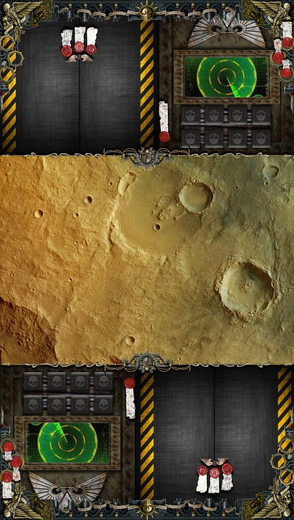
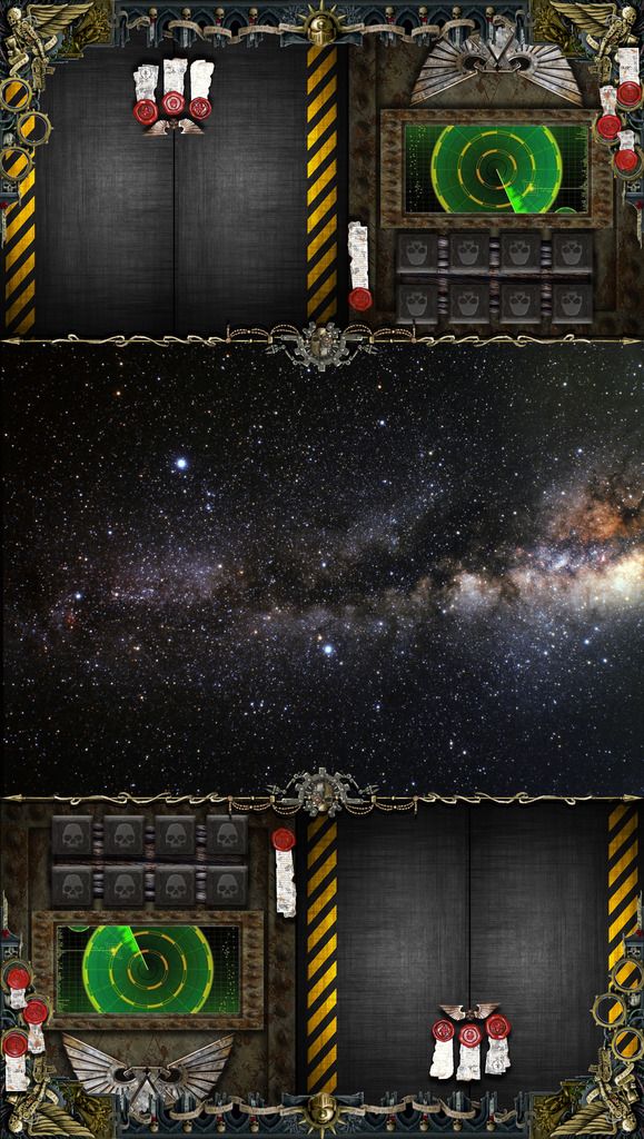
So i have been toying with the idea to design and make a good looking and thematic, but functional, battle board for this game so we can finally have that table top wargaming feel to combat when we clash with our armies. The board consists of :

#1 - Terrain - for armies and their reinforcements

#2 - Right panel - for combat upgrade cards

#3 - Left panel - for dice and tokens*

*the left panel can be used in a number of ways, you have 8 dice placement spots ( eg. for all the dice, or just the bolter dice results), radar ( eg. for tokens or shield dice results), and the aquila (eg. for the aquila dice result, or it doesn't have to be used at all).

Any way, this is my vision for the board, i would like to hear what you guys and gals think of it and what config did you find most useful

http://files.geekdo.com/geekfile_download.php?filetype=application%2Fpdf&filename=PRINT+FRONT.pdf&filecode=s5nfjozp4a&validationcode=70eaf6831735faaebf00bccfa2504709

&

http://files.geekdo.com/geekfile_download.php?filetype=application%2Fpdf&filename=PRINT+BACK.pdf&filecode=s5phrsw926&validationcode=68149f9195b2c73a5ea3a7e4f066e89f

Being a total noob, i couldn't find figure out a way to attach a file here, so i'll just leave a link for the images :)

Edited by Doctorius

Hey I'd like to see your pics but the links don't work.

Sure thing, ill try to upload it this way. I'm having some trouble uploading images & files in general, so i hope this will be better. (i cant seem to be able to upload a higher quality image tho)

Ground combat board (front side)

PRINT%20FRONT_zpsbxxtvuye.jpg

Starship combat board (back side)

PRINT%20BACK_zpssdxsuygs.jpg

Edited by Doctorius

Those are strong

Tnx, glad you like them :)

Yah, they look really nice. Good work

I was thinking of doing faction specific boards, but it may be very time consuming

These are excellent. You've done a superb job! They look great and the layout is thoughtfully done. I've saved the images and as soon as I'm able, I'll be printing these out and adding them to my copy of the game!

Thank you and do try it out. We use it every game now, and it has made for a better experience and a even more thematic one, imho :)

Wow. A great thanks for making this! I have some 1/8 board in the shop that I am going to cut a slat to paste these images on. I love it.

Awesome work!

Tnx for the feedback, glad you liked it :)

How are these supposed to work? It "looks" like you put the units on the ground/space area.. and the cards where you have the purity seals.

The problem is that this will not work... when you place cards you need to do it in a way that can "fan" to allow you to see the additive bonuses.

I'll try this out next game. I edited it so I'm only using the end sections, but they look great!

You actually have enough space for all the cards on the part with the three purity seals, you just need to overlap them so the previous card will show only the left side symbol :) . If you can find a more practical solution do send some feedback :D

Edited by Doctorius