CenterPoint Forge

By CenterPoint, in Star Wars: Armada

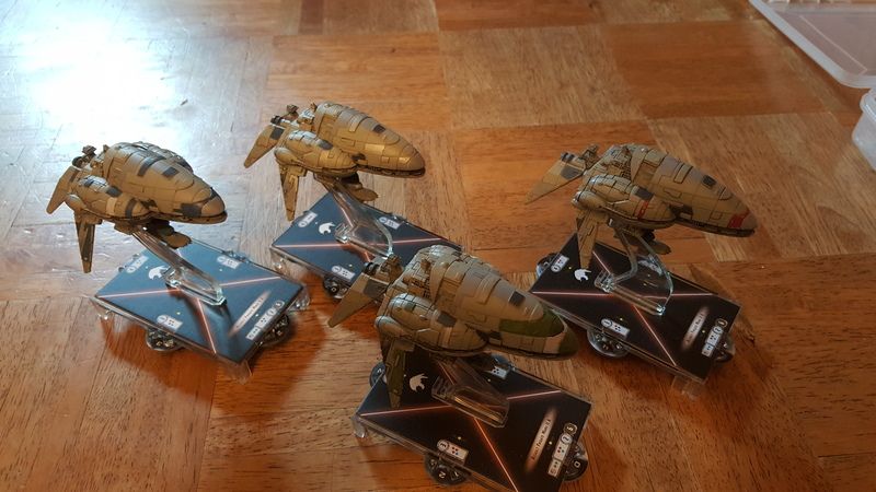
Managed to paint up my ships.

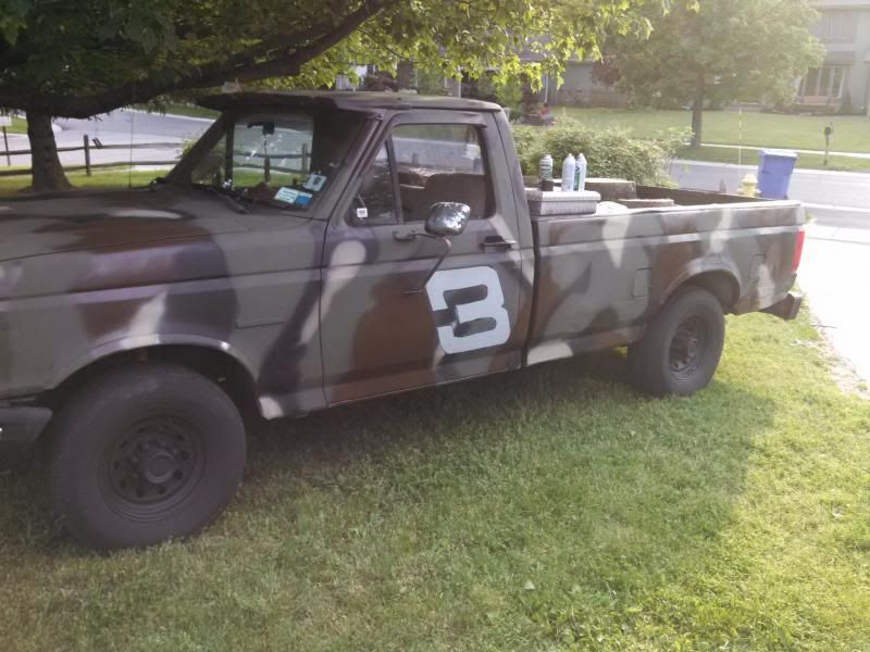
gotta say I do a lot of painting - but usually I'm painting cars and trucks, houses and other large things.

my specialty is spray paint, so this model painting with a brush is new to me

This is what i usually do
IMG_20130531_190040_236-1.jpg

that being said i managed to paint up most of my ships

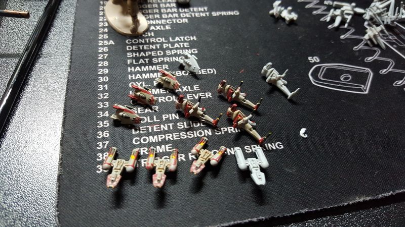
Starting with the fighters

20150624_102024.jpg

20150624_102052.jpg

20150624_102116.jpg

20150624_102146.jpg

20150624_102212.jpg

20150617_120621.jpg

20150617_101943.jpg

then the capital ships

20150628_094239.jpg

20150628_094306.jpg

next im looking for paint schemes for my star destroyers. honestly i want them all to be different so that its easier to play them on the board and know from a distance which ship is which.

Edited by CenterPoint

That's no armada.... It's a FULL BATTLE FLEET!!!

"ALL HANDS MAN YOUR STATIONS! THIS IS NOT A DRILL! "

FOUR MK.II Assault Frigates? Remind me to stay on your good side!

Awesome work mate, the subtle panel differences are what the Rebels are all about, imo! :)

lol 4 are so i can play 1000pt games. i have 4 vsd's too. havent decided how i want to paint them yet though

Corporate Sector Authority!

VERY nice!! Can't wait to see them in person (I'm one of the guys from Buffalo from the meet up thread). :)

so, after being truly inspired after seeing some well painted Vic Stars, I painted my imperial capital ships.

i felt as though if i did not paint them i would be doing a disservice to the empire,,, However most imperial ships are light grey/white

so i took the star wars universe into my own hands

let me present the Yamato:

20150708_1103581.jpg

20150708_1104061.jpg

From Left to right

A cloaked Demolisher

the Insidious

the Yamato (with all windows painted)

the Warlord (blue stripe)

the Vigilance (painted to look like it just came out of dock)

20150708_1215581.jpg

20150708_1215501.jpg

A better picture of the Warlord

20150708_1216071.jpg

all 4 with the un modified corrupter in the middle

20150708_1356531.jpg

Nicely done sir. I love the bold color choice.

The Warlord is pretty freaking cool!

Tiger stripes on an A wing... why have I never seen such a thing before?

There is a tie with Emerald panels.... Emerald. May I ask, Centrepoint : how did you do that? -stares in rapt fascination at the bejeweled TIE-

I'm liking the boldness of the destroyers: You know, I was thinking about a similar look for the Yamato on some X-wings or headhunters, but white instead of black. I rather like it on something as big as a destroyer. Altogether it reminds me a bit of the Eclipse .

I really-really am liking that Warlord most of all. It reminds me of something that either a vibrant admiral or a post-Empire warlord would have in their fleet. So it fits the Outer Rim/ independent suppression fleet theme. I'm still wrapping my head around how to make the scale look, you might be able to mix a bit of the blue with grey and use the faintest bit of a drybrush on the leading edges of the upper hull decks to pick out the lines from afar (it just differentiates the sections a bit. I haven't got a clue on how to do that with the Yamato 's black without painting each plate (drybrushing black makes it look dusty). Anyway, I like the natural blue and yellow contrast of the warlord's plate and the windows...I knew it, I need more windows!

I like the Vigilance (name is great), I just wonder if the lateral sections (the side trench and mid decks beneath the bridge) could use a faint dark-blue or dark grey wash to give it the impression of shadow (a diluted black wash might simply be too harsh, and quite often shadows are blue in hue). It is film like. Is it just me, or do the 'cleaner' ships like the Vigilance simply look bigger than the others?

Keep it up, really love when people try some striking variants for ships. Can't wait to see what you come up with next, mate!

Edited by Vykes

Tiger stripes on an A wing... why have I never seen such a thing before?

There is a tie with Emerald panels.... Emerald. May I ask, Centrepoint : how did you do that? -stares in rapt fascination at the bejeweled TIE-

I'm liking the boldness of the destroyers: You know, I was thinking about a similar look for the Yamato on some X-wings or headhunters, but white instead of black. I rather like it on something as big as a destroyer. Altogether it reminds me a bit of the Eclipse .

I really-really am liking that Warlord most of all. It reminds me of something that either a vibrant admiral or a post-Empire warlord would have in their fleet. So it fits the Outer Rim/ independent suppression fleet theme. I'm still wrapping my head around how to make the scale look, you might be able to mix a bit of the blue with grey and use the faintest bit of a drybrush on the leading edges of the upper hull decks to pick out the lines from afar (it just differentiates the sections a bit. I haven't got a clue on how to do that with the Yamato 's black without painting each plate (drybrushing black makes it look dusty). Anyway, I like the natural blue and yellow contrast of the warlord's plate and the windows...I knew it, I need more windows!

I like the Vigilance (name is great), I just wonder if the lateral sections (the side trench and mid decks beneath the bridge) could use a faint dark-blue or dark grey wash to give it the impression of shadow (a diluted black wash might simply be too harsh, and quite often shadows are blue in hue). It is film like. Is it just me, or do the 'cleaner' ships like the Vigilance simply look bigger than the others?

Keep it up, really love when people try some striking variants for ships. Can't wait to see what you come up with next, mate!

So the yellow stripes are from rebel dream (the book) when they talk about the Tanab Yellow Aces. always thought an A-Wing was alot like a bee and now they look like it

the emerald green is cheap testors metallic green flake that i picked up at AC Moore for 3 bucks - i just painted it right on top of the black primer coat i painted on it.

The Inspiration for the Yamato came from a German WW! biplane. but i figured the rising sun look needed a japanese name

Ironically on the mat with out the camera flash, the Vigilance creates its own shadow. i did hit the trench with some nuln oil but the real shadows give it the best look imho

The Vigilance was a Venator-class Star Destroyer that was part of the Republic's Open Circle Fleet. It served as a flagship of General Obi-Wan Kenobi during the final year of the Clone Wars. ( i just really liked the name too XD)

thanks for the feedback - cant wait to paint wave two!!

im thinking i will leave one standard but weather it a bit, one is getting painted like the vigilance, and the last one will be painted with a blue wash to give it a faint tint (thrawn's admonitor was blue tinted)

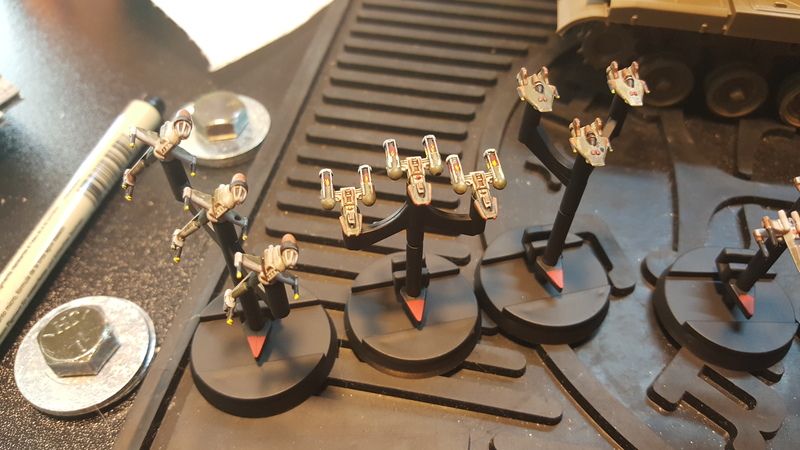
So after being inspired by my game with DrunkTarkin and his sweet looking fighters, I decided to retry some of my rebs

looking for tips and suggestions to keep getting better. honestly im having fun painting these things so i was kind of thinking of repainting all of my rebs fighters.

20150722_162558.jpg

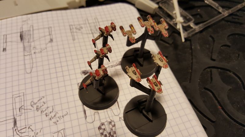
Up on stands

20150722_195721.jpg

Looking good buddy!

thanks, i really liked the sepia wash on your fighters, and went for a similar look. i have another set I hope to paint this weekend with greens and browns.

we should definitely get together for another game! Ill bring the rebs this time!

We need to have a Buffalo vs Rochester area battle, us vs you! :)

Preferrably on a weekend day.

sounds good to me - i can bring another player perhaps for a 2v2 game even

So with more practice comes better painting...... right?

I started repainting some more of my reb fighter's to get them looking better. the old variations just didn't look like I wanted them to anymore, and I have been trying out some new techniques and wanted to see what I could do on my fighters.

so side by side -

here is Endor Squadron and Red Squadron

20150802_101511.jpg

20150802_101515.jpg

My lighting isn't the best, but I went with a green brown color scheme. The flight leaders have a dot on their wings to represent the death star (my pens are too big to draw a death star 2)

I think these look a lot better, and I will be looking for new ideas to go over all of my other fighters with.

Ill try to get some better pictures up later today.

Edited by CenterPoint

Excellent work.

Is that the new space tank I see in the background?

:)

Yeps, more practice, better painting, often when starting you can progress extremely quickly in seeing results. As long as you try something just a little new or more challenging every time, you tend to get a better feel for techniques as well as 'instinctive' parts of what works. It's the same process as painting something big, eh?

Think you have too by-the-by. The Y-wings are really looking sharp in particular, and despite everything... I don't think I've ever seen the Death Star kill mark in my life. How weird is that? Hmm, hard to tell on that lead A-wing by the picture, it might been a touch of extra paint to smooth out its light coat on Endor Squadron.

Red Squadron is sure looking good too, X-wing two-tone is pretty bold, a bit of blacklining (drawing in the component parts using the edges as a guide) might give a little more definition. Think I saw some of that on the B-wing, it's just a touch hard to see with that particular picture.

How is the red point showing up on the dials? Still, great work and keep it up mate. :)

Is that the new space tank I see in the background?

:)

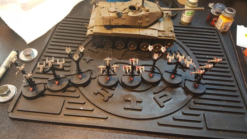
Heh - that is an M41 Walker Bulldog. I decided that it may be worth my time to try painting at an intermediate scale (somewhere between armada fighters and my truck lol) to work on some finer shading and brush painting techniques, I haven't started painting it yet. in this picture the glue was drying.

'

Yeps, more practice, better painting, often when starting you can progress extremely quickly in seeing results. As long as you try something just a little new or more challenging every time, you tend to get a better feel for techniques as well as 'instinctive' parts of what works. It's the same process as painting something big, eh?

Think you have too by-the-by. The Y-wings are really looking sharp in particular, and despite everything... I don't think I've ever seen the Death Star kill mark in my life. How weird is that? Hmm, hard to tell on that lead A-wing by the picture, it might been a touch of extra paint to smooth out its light coat on Endor Squadron.

Red Squadron is sure looking good too, X-wing two-tone is pretty bold, a bit of blacklining (drawing in the component parts using the edges as a guide) might give a little more definition. Think I saw some of that on the B-wing, it's just a touch hard to see with that particular picture.

How is the red point showing up on the dials? Still, great work and keep it up mate. :)

Vykes, thanks for the input. Honestly for the Death star I was thinking of when the Verpines were painting Wedge's X-wing in one of the novels and the comment was made that Wedge was one of a very select number of people who had a hand in killing both Death stars. It was also funny that the tie fighter stamps had to stand for 10 kills each - and they still didn't all fit

yesterday got crazy so i wasn't able to post new pictures, but i will try again tonight.

The red shows up well in my opinion. it was a quick step that i think really creates good contrast.

So after finally getting all of wave 2 ive started painting!!

Because im heading to a tournament today, i wanted to make sure that the ships i was bringing are at least painted.

So without further ado

Say hello to the Spade

20151202_112746.jpg

20151202_112734.jpg

I tried to do a few things different then i had when i first started working on these ships. Firstly i wanted to do some differential shading. I paint with Citadel paints, so i hit the whole thing with a light coat of nuln oil, wiping the majority off of the large flat plates with a cloth. Then i hit a few panels each with sepia, earthshade, fleshshade, camoshade, and nightshade. that varied the base coat enough to make them look like it was beat a few times and pieced back together.

The Second is the Sidewinder:

20151202_221640.jpg

20151202_221643.jpg

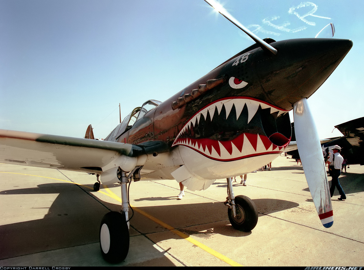
As soon as i saw a picture of the mc30 (and seeing its armament) i decided it had to be painted like a P51

1333796.jpg

Again i did the differential shading, and battle damage, but i also tried thinning my nuln oil with lahmian medium to knock the black down just enough to keep my od green hue.

I think they turned out well. Ive got alot more ships to paint, so ill be getting them up as i finish them,

Managed to do a few more this past weekend.

I started with the ISD's as they looked like alot of fun. i figured it would be a huge canvas to paint something fun on, but i held back as the imperials aren't exactly prone to such things.

First up is the Admonitor. I'm really surprised both that FFG did not release thrawn as a card yet, and that Disney has not solidified his cannon existence.

aside from that, Thrawn's ISD was painted with a dlightly blue tinge to reflect his Chiss heritage.

20151205_212902.jpg

Next is the Chimera. The Chimera is Paleon's Flagship (another person i'm surprised is not in the game yet). His ship is painted metallic black and definitely looks intimidating

20151205_234738.jpg

A bit better perspective on color with an unpainted ISD

20151205_235145.jpg

I also managed to Paint all of my Raiders

20151205_222245.jpg

Now For the Rebs.

After being inspired by the large painting area of the ISD, and my need for a cohesive looking unit i stared re painting some of my older ships

First is my new favorite i think: The Dragon

inspired by my tattoos, i painted this one up

20151206_154845.jpg

I started by free handing the dragon onto the ship.then i followed up with the other colors i wanted on the ship itself. The fleet im building is gonna have a black and high contrast color paint scheme, so for the dragon i chose purple. I wish i had been able to prime this one black, as the abandon black is a bit too shiny for my taste, but all of my issues with this paint job are completely negated by how cool the dragon looks overall.

20151206_172010.jpg

20151206_172018.jpg

Next in my squad is the Hammer.

This one i was able to prime black and i feel it looks alot better.

20151206_174606.jpg

20151206_174614.jpg

Next ill be painting the AFMKII Thuunder Fire, and the CR90 Fire Newt

Cant believe i forgot to make my MC hammer joke :/