
Thank you. Thank you. Thank you. Thank you.
I thought my cell phones Brouwer was broken when I jumped on.
Reset it twice before I found this thread.
Wtf were they thinking changing everything white.
So bad looking.
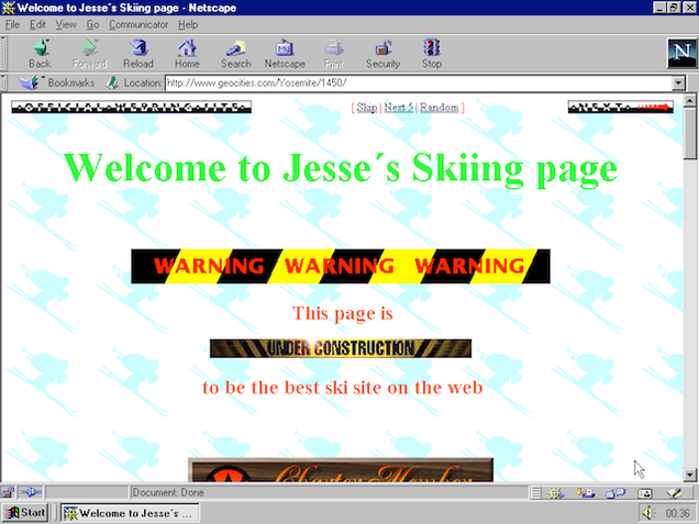
90's websites looked better
Thank you. Thank you. Thank you. Thank you.
I thought my cell phones Brouwer was broken when I jumped on.
Reset it twice before I found this thread.
Wtf were they thinking changing everything white.
So bad looking.
90's websites looked better
My lord the changes to this site are not very good at all ...
I couldn't even post this without putting my sunglasses on ...
I really hope this color scheme is temporary ... the previous one was much nicer/more gentle to my poor eyes ...
Do you know php, Java script, html or any other languages to qualify you for the position? If so how long have you done it?
I took an after school webdesign course a few years ago. All i'm saying is, if we turned something in with a #FFFFFF background and light grey menu's we'd get a fail before they would even look at the code.
Shame that the news is also ruined
Also, bikini angels and TIE Advanced in the same website. Yup I'm on the Internet.
Edited by KilkakonI live in Las Vegas, and as such, I need to pose the following question ...
Assume this site has 10,000 unique users. What is the over/under on the number of unique users that stay with the new design?
I think that number is less than 100.
And if this is anywhere near accurate, I sure hope FFG didn't spend too much time and/or money on the new design.
It is a lot more likely that only 1% of people (100 of your 10,000) will switch back.
You should look at the difference changing an option from opt-in to opt-out makes. People love the default.
And, seriously, it's not that bad...
I'll admit it was a tad bright on my work monitor, but on my MacBook at home the new theme looks very nice!
I don't mind it. Also the main page is actually responsive (try resizing your browser and see how it changes) which is really nice. Much more user friendly.
My lord the changes to this site are not very good at all ...
I couldn't even post this without putting my sunglasses on ...
I really hope this color scheme is temporary ... the previous one was much nicer/more gentle to my poor eyes ...
Do you know php, Java script, html or any other languages to qualify you for the position? If so how long have you done it?
I am assuming that you are just giving me a hard time without intending any malice ...
Ignoring what my background may be in computers ... I know bad web design when I see it, or in this case, when I **** near go blind looking at it.
Edited by any2cardsOH MY GODS I MISSED GREY
i would not mind an off white. but this is wayyyyy too bright.

Grey is good.
My lord the changes to this site are not very good at all ...
I couldn't even post this without putting my sunglasses on ...
I really hope this color scheme is temporary ... the previous one was much nicer/more gentle to my poor eyes ...
Do you know php, Java script, html or any other languages to qualify you for the position? If so how long have you done it?
I am assuming that you are just giving me a hard time without intending any malice ...
Ignoring what my background may be in computers ... I know bad web design when I see it, or in this case, when I **** near go blind looking at it.
Or I could have been just getting an idea of your knowledge base on web design as I'm in the middle of a project.
I live in Las Vegas, and as such, I need to pose the following question ...
Assume this site has 10,000 unique users. What is the over/under on the number of unique users that stay with the new design?
I think that number is less than 100.
And if this is anywhere near accurate, I sure hope FFG didn't spend too much time and/or money on the new design.
It is a lot more likely that only 1% of people (100 of your 10,000) will switch back.
You should look at the difference changing an option from opt-in to opt-out makes. People love the default.
And, seriously, it's not that bad...
I'll admit it was a tad bright on my work monitor, but on my MacBook at home the new theme looks very nice!
Actually it is more likely a fair number of people simply leave never to return, without bothering to try and change the scheme to something palatable. Judging by the reaction on just this forum I'd bet more people change to gray (unless in the next few days FFG tunes down the blindingness of the 'new' theme), then a fair portion depart this fair realm, then a few stick with the Hoth-like colors.
Just because most people don't change something even if they dislike it doesn't mean they won't abandon ship when the ship is frozen solid.
You guys must all really hate Google. And Facebook. And Reddit. And other popular sites with multi-million unique visitors per month (week? day?) that have pure white backgrounds.
You guys must all really hate Google. And Facebook. And Reddit. And other popular sites with multi-million unique visitors per month (week? day?) that have pure white backgrounds.
First one gets used for 1-2s at a time, second and third are useless to me.
I hope FFG kicks the but of the person who made me go out of my way to push a button. My time is too valuable to waste on such things
You guys must all really hate Google. And Facebook. And Reddit. And other popular sites with multi-million unique visitors per month (week? day?) that have pure white backgrounds.
First one gets used for 1-2s at a time, second and third are useless to me.
I'm guessing you also don't use Yahoo, Bing, Wikipedia, LinkedIn, Twitter, eBay, PayPal or Apple?
My point is, regardless of what websites you personally frequent, many of the top 100 most frequented websites have very light color schemes, and I disagree with konradkurze's theory that "a fair number of people simply leave never to return" and that "a fair portion depart this fair realm."
Oddly, other than Paypal I really don't use any of those. Even Flickr, which is sort of a Yahoo thing now, doesn't have a pure blinding-white scheme.
Yuk awful, thanks for the tip. Button pressed normal service resumed.
The new design is also not technically pure white.
It's #F5F5F5 (pure white being #FFFFFF), so it's grey at 96% brightness!
Which is actually slightly darker than BGG's background (#F5F5FF).
This is pure white!
Edited by KlutzAlso, don't know if many people noticed this yet, but the new X-Wing Product page has a nice way to see where each expansion is at in the printing/boat/etc process. Just expand the "Expansion packs" header under "Products".
No more scrolling through the super-long upcoming page to find the X-Wing expansions!
I like the new responsive theme, that is now actually viewable on a tablet, phone or computer in bright lighting conditions. Thanks FFG web people!
That being said, I'm glad they left the old theme as an option for people surfing in the dark.
I like the new responsive theme, that is now actually viewable on a tablet, phone or computer in bright lighting conditions. Thanks FFG web people!
That being said, I'm glad they left the old theme as an option for people surfing in the dark.
Is it terrible of me to be suspicious of first-post accounts being the only group that seems to like the theme.
Also, responsiveness is completely divorced from whether the theme "looks good". Even if the new theme is responsive (I don't use enough computers with differing resolutions to tell), it looks awful due to being so crazily bright.
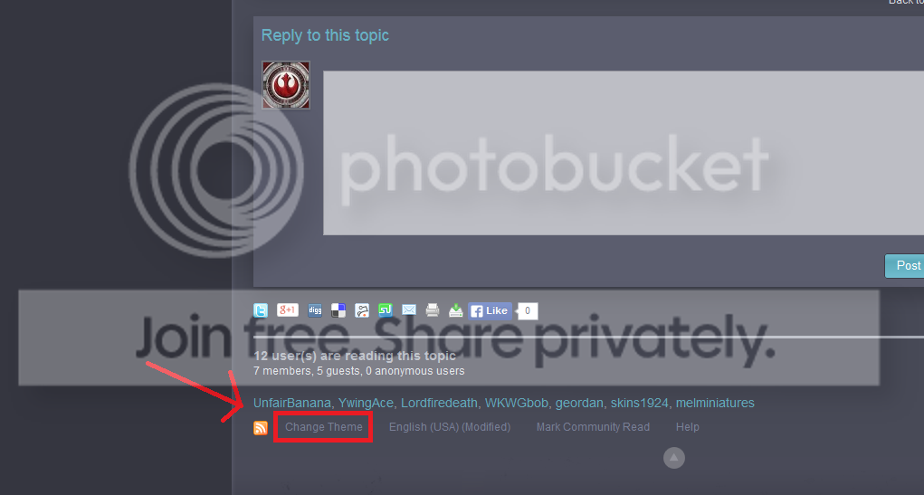
For those having trouble, it is right there
I only use the supreme browser (Firefox) so any of you Chrome people may have it different or something. I dunno. But here it is for me.
Post a thread on how to change theme please ![]()
