Just thought it would be cool to hear everyone's ideas ![]() did you ever think "really that's the image they used?" Or "it would be cool if they used "x" instead." For me I thought for ruthlessness it have been cool if they used Tarkin instead of that mystery lady or if they had more pictures of ships shooting missels like on the proton rocket card or ion torpedo instead of just pictures of the missiles themselves like every other card. What about you what would you change
did you ever think "really that's the image they used?" Or "it would be cool if they used "x" instead." For me I thought for ruthlessness it have been cool if they used Tarkin instead of that mystery lady or if they had more pictures of ships shooting missels like on the proton rocket card or ion torpedo instead of just pictures of the missiles themselves like every other card. What about you what would you change
what images would you use if you could redesign card art?
I think it would be much cooler if unique cards showed the pilot rather than the ship.
I would use more art done by a local artist so I can get him to autograph more cards <3
I really don't think anyone can complain about FFG's art direction...
I really don't think anyone can complain about FFG's art direction...
Gold Squadron Pilot card art.
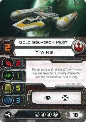
Compare the engines and how they are mounted.
They keep using this art and I don't know why.
I was about to say Gold Squadron looks really wonky. I'm also not a big fan of the artwork for Blackmoon Squadron either... the image just looks fuzzy to me.
Onyx squadron looks like a screen shot. You can even see the pixels, lol.
Not really related to the artwork, but I wish the cards had a space for flavor text for the unique pilots. The card backs are basically wasted space, putting some flavor text and additional art there would have been nice.
Gold Squadron Pilot card art.
Compare the engines and how they are mounted.
They keep using this art and I don't know why.
Cannot. Unsee.
Thankfully I have enough promos to never actually look at it
Gold Squadron Pilot card art.
Compare the engines and how they are mounted.
They keep using this art and I don't know why.
I KNOW!
They use that art whenever a Y-Wing shows up in all of their game lines, and it's painful to look at!
I ended up with a Gold Squadron promo from somewhere though, so I don't have to play with that version anymore.
I actually really like the artwork, yes sometimes someone gets it a little wrong but that's artist interpretation and all that. If I did have to replace artwork...Blackmoon and Lt Blount because to me they look like a 3D render which looks out of place with the rest of the games art.
Onyx (straight up 3D render) and Delta (wonky top wing).
Gold Squadron Pilot card art.
Compare the engines and how they are mounted.
They keep using this art and I don't know why.
Oh man, this has been bugging me since I bought the Y-Wing. How could they look at the picture and say "Lets use it!" ? Boggles the mind.
Gold Squadron Pilot card art.
Compare the engines and how they are mounted.
They keep using this art and I don't know why.
Oh man, this has been bugging me since I bought the Y-Wing. How could they look at the picture and say "Lets use it!" ? Boggles the mind.
Pardon my ignorance, but what's wrong with the y-wing engines?
Pardon my ignorance, but what's wrong with the y-wing engines?
The starboard engine is anchored in the wrong spot. Should be near the front of the engine.
Edit: Well the front-ish (first 1/3) part of the engine.
Edited by Jaster MereelThat's going to haunt me forever
I know. I feel ashamed for not noticing it before this thread.
Gah, why did I read this thread. I could have been blissfully ignorant.
I think it would be cool if they changed the artwork up for cards when they get re-released.
Say Push the Limit or recon specialist, two cards that come in a few different expansions. It would be neat if each expansion had its own art for the card. Probably wouldn't cost any more since FFG has a bunch of LCG artwork they could recycle.
Oh great, thanks for nothing you guys! As has been said, cannot unsee!
Tarkin would have been cool for Ruthlessness, but then that would get confusing when the Tarkin crew card comes out!
I thought about warning people to not look at the Gold Squadron engines, but I concluded it would have been futile as it'd only draw more attention to it.
I feel sorry for the artist, that illustration has got to be like being the guy in journalism class who made the horrible headline typo and has to watch everyone stare at it in shock. Somebody had to have noticed before X-wing and Edge of the Empire went to print, I'd say digitally editing it after completion would have been better than leaving it, assuming there wasn't time/resources to redraw it. There are a few illustrations that have some major digital artifacting and I don't mind those gaffes nearly as much, even a blurred or pixelated Y-wing engine would have been preferable here.
Push the Limit should be a shot of the A-Wing being chased by Interceptors in the inside of the Death Star II.
I feel sorry for the artist, that illustration has got to be like being the guy in journalism class who made the horrible headline typo and has to watch everyone stare at it in shock. Somebody had to have noticed before X-wing and Edge of the Empire went to print, I'd say digitally editing it after completion would have been better than leaving it, assuming there wasn't time/resources to redraw it. There are a few illustrations that have some major digital artifacting and I don't mind those gaffes nearly as much, even a blurred or pixelated Y-wing engine would have been preferable here.
I dunno, it's in the Edge Core Rulebook, the SWLCG generic Y-Wing card, and the Gold Squadron Pilot for X-Wing. They may have finally caught on though, as the Age of Rebellion Core uses the Renegade Squadron Y-Wing art instead.
Actually, there will be new alternate PtL cards with the new league kit box (or tourney box, I forget which). It has TIE Interceptors on it!