Thinking Outside the Box: On Card Game Graphic Layouts

By dlawson, in General Discussion

Okay, so I don't know if this is the right place for this, but I have this card game pet peeve and a second edition of AGoT seems like a good excuse to start a discussion about it! So, here goes:

I hate the graphic layout that everyone uses for competitive card games. I have never played one where the card art wasn't crushed into a little box, taking up around a third of the card's total real estate, surrounded by a bunch of wasted negative space. And I don't get it. Well, I mean I get it: Magic cards have looked like that since the 80s and nobody wants to stray too far from the great grandfather of competitive card games. It's an instantly recognizable look and people are comfortable with it—and there's nothing inherently wrong with that.

But I think it's time that someone decided to do justice to their artists and rethink the way card layout is designed and implemented. And, given that FFG produces and commissions the highest quality card art in the industry, bar none, it seems like they're an ideal candidate to mix things up a bit.

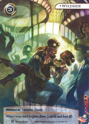
Well, all right, they've already done that. Sort of. Take a look at Android: Netrunner's promo card layout:

Netrunner-alt-art-wyldside.jpg

And compare with the regular version:

Netrunner-wyldside-01016.png

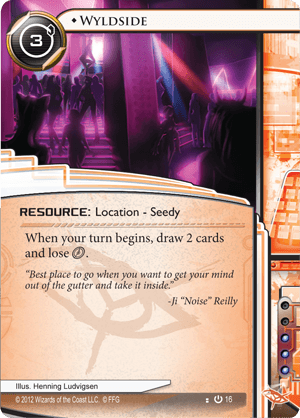
The former centrally showcases some fantastic art by Wylie Beckert; the latter showcases a lot of empty space and some cool border design (and also half an illustration by Henning Ludvigsen). What is weird to me is that the regular card manages to look both cluttered and empty at the same time, at least when compared with the elegant, richly colored, open design of the promo card.

So what I would absolutely love to see is an FFG card game that does justice to the beautiful work created by their resident and freelance artists. It doesn't have to be exactly like the Netrunner promos—I do understand that certain issues arise when you have longer ability text. But card games (and gamers) shouldn't have to settle for slightly tweaking the Magic graphic design formula forever. It's time for something better.

I agree. Since new art is one of the arguments FFG gives for making a new edition, I think it should be given more room - and I don't mean in the rulebook. Let's forget the classic MTG-like format !

What they did with Conquest's warlord cards is great, I hope they can do the same for characters in GoT2.

I think we've seen a trend toward more artwork space, but I don't think they can go full-bleed alt-art. The promo cards are harder to read and have drastically limited text space. Because they're promos, those aren't terribly problematic because they can choose popular cards that everyone knows, and cards with relatively simple effects that don't need a lot of text space.

Another thing is that it is very easy to recognize faction by normal card template. Promo versions are harder to read and not so easily recognized.

But yeah I like those promo cards, but there is reason for using big templates...

Edited by Hannibal_pjv

Yes, please. I know it would cost more to make, but in that case just ask more for it? I'm sure people will buy it regardless. I know of several people who mainly buy LCG's for the nice art, and didn't get aGOT core for obvious reasons.

You have your own manufactoring place. Let's have the cards all be like this. The symbol on the lower right says what faction it is. When all cards are sorted in your drawer anyway, what's the point? And they can still use colours on the text-box to indicate affiliation, yet chose not to (it would look slightly worse, indeed).

And almost nobody reads the flavor text anyway. You want flavor? Good art is enough flavor on itself.

I know there are promo's for OP events, but from experience, when we host them, nobody cares about 'em. They sometimes don't even want the cards, so go figure. The playmats and deckboxes are nice already, and they can still make alternate art ones.

Edited by Marginal0

And almost nobody reads the flavor text anyway. You want flavor? Good art is enough flavor on itself.

Longship Golden Storm. Your argument is invalid.

*ducks, runs*

And almost nobody reads the flavor text anyway. You want flavor? Good art is enough flavor on itself.

Longship Golden Storm. Your argument is invalid.

*ducks, runs*

That said, count me in favor of flavor. This is a literary-based IP; of course it should have snippets of lore when the cards have room for it. There's nothing uglier than an empty text box. (Note that I'm not saying that a text box should be incorporated into the template when there is otherwise no need for one; that'd be dumb.)

While I certainly hope we won't need borders and can get full-bleed art (in the sense that it runs to the edge of the card), I actually disagree with the OP. I'd like cards to have a recognizable template that clearly identifies card-type, a text box that doesn't change size as a function of the text included, that *has* flavour text.

Sure, that Wyldside is pretty bad - only about 33% art and I'd love to increase that proportion, but not to the extent of using the full-art, full-bleed promos. On the whole I think Netrunner's art 'template' is very clean. Each faction uses the same space/template, with differences in colour and secondary 'pattern' to delineate factions. Lord of the Rings, a fantasy game also based on a literary work with a wealth of flavour quotes, is also a good model.

This is in contrast with Conquest, which has considerable variation in between factions (A unit's attack is in an oval "bubble" for Eldar, a square for... ), to the point of detracting from consistency of templating.

Edited by -Istaril

I agree with Istaril on all points. An entire game with the card layout of that alt art wyldside would be a disaster.

I think have to agree that the absolute full bleed art like the promos wouldn't be great as the regular template for a game. Even on the AGOT promos we have now, text and graphical features like strength and icons are so reduced that the only way they easily work is by their rarity. There are only a handful of them around and they are fairly commonly played cards, so communally, most people recognize them on sight.

Honestly, I've been wanting more detail than the current regular frame for quite awhile. When I look at the newer games like LotR with the little details and vinework, I miss the old dragonscale and other interesting features that AGOT used to have in the very first releases. Plus, having a uniformity of frame in factions and between card types helps a lot of people grok what's going on at a glance.