Sry, but this card reminds me more of the Cthullu LCG. It's terrible.
What do you guys think?
Sry, but this card reminds me more of the Cthullu LCG. It's terrible.
What do you guys think?
I don't know why you reference Call of Cthulhu LCG wtih the terrible art, it has many types of various art from amazing to not so good.
I don't think that art on Courage Awakened is bad, it's just proportions and Frodo being portrayed very exhausted physically, so it's not appealing to wide audience. But I wouldn't call it bad or even worst.
Speaking of bad art, it reminded me of the worst art piece I've seen in all of the FFG's LCGs:
I dont reference Call of Cthulu LCG with terrible art!!! For that game it's absolutely perfect.
But a card that reminds me of a CoC card does not match with LOTR. In that sense it's terrible, understood?
And once again I disagree. As LotR does, CoC utilizes many different art directions. To top it off, same artists draw for both LotR and CoC.
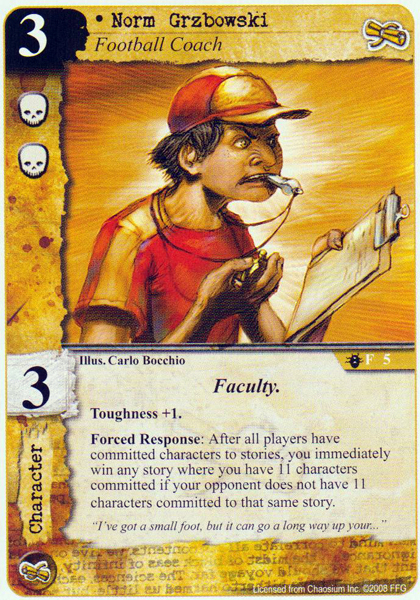
Diferent brains, diferent opinions. Btw: I had to laugh a lot about the Football Coach :-D
I agree that Courage Awakened art is just a bit off.... which is funny considering the same artist did Free to Choose (great art) and Tom Bombadil. Bilbo's face seems wierd here but not in FtC.
Lotr LCG generqlly speaking has amazing art (I have a weak spot for core Gandalf) but to me, the weakest is The Wizard's Voice, which looks like something out of the 80s. Just terrible. However the same artist did Erebor Record Keeper and Riddermark's finest, which shows that even a great artist has a few bad pieces.
Magali's art is awesome (that Galandriel, hhhhhnggg) but I still think Zigil miner is mediocre, it doesn't look Magali at all. So what?
Ugliest cards in the game are in the Hobbit Saga. The trolls are painful to look at and who can forget the red-eyed insectoid goblars they try to pass off as goblin miners?
Edited by FetaCheeseI really like Courage Awakened and Free to Choose (same artist). They are definitely in a different style than the majority of other pieces in LOTR but I don't think that's a bad thing. It's just more of an exaggerated, kind of cartoonish style which can be cool. I find the white blood really interesting!
I agree with Narsil. I like all art pieces done by this artist.
One of the worst, to me, is the new boon Mithril shirt. Frodo looks like a pig. 0.o
This was on my mind for a long time...
Core set art work:
Eowyn hero card...art looks like hungover man with very bad light. No girl like hitler mustashe and pig nose photos.
(Some male hero cards look like shampoo advertising and balance towards unisex style! Whyle Eovyn is same as Mithril shirt card Frodo...0.o) This is the card i will edit and print myself.
Boromir (tactics) hero card... is he wearing capewig or somenting on head? And that oversized bulky horn he have in hand, makes me feel like im cheated a bit.
On the dorstep: (I agree with "Fetacheese" about Goblin miners)
Goblin axeman artwork reminds me world of warcraft cartoon style Orc, not goblin at all. To bodybuilded and armored. Here comes question : is Goblin and Orc is the same by physical atributes? As i understud there is unwriten canon that goblins ar small frame and somehow disfigured, orcs are ugly averege man size, and Uruks sceary, strong, tall man size humonoids. This goes for many cards.
Nightmare decks: Latly in underground themed artwork appears halogen light in back of enemy, wich decrese atmosphere. This bit wrong becouse if you do dark underground adventures, only light comes from your torch or lamp. I bet Goblin swordsman was succseses of Khazad Doom expansion. Also oversaturated turquise color dont feel good at all.
Spear of Mark: Sad but spear itself is only 2% of card. Bearly can see it. Looks like card can be Spearthrowing - Skill, not item.
Generaly i dont like encounter cards with different colored background. The best is when all locations and enemy card have same color gamma more or less for each quest (staying mostly grim and dark). Then staging area looks like adventure all conected and not randmly colored circus. Also notably we can see that most and the best artworks are painted reality style, not cartoon style artworks.
Sorry if this is to strong critics but i really feel like this.
I disagree on pretty much everything you said about encounter cards. First, if every card art featuring underground places had as its only light source the torch, making everything else black, it would be very very boring. I actually like how recent nightmare packs have art that have this greenish light, or orange, or red. It gives the art diversity and makes the card more recognizable, but it also works from a graphic and artistic standpoint. If every underground art was mostly black with some red or orange on it, and if every location and enemy from a given scenario had the same color palette as you suggest, it would certainly get very boring after a while. One thing though that I would like to see is that they made a "style guide" like they do in Magic The Gathering, which has concept drawings that depict the general appearance of different factions and races, as well as locations. This would give the game a more unified aesthetic instead of having insect-goblins and WOW-goblins in the same scenario. But that's just appearance. As far as color goes, they've done a good job IMO, especially in the latest Nightmare scenarios.
In Tolkien's legendarium, orcs and goblins are the exact same race. Orcs was considered by Tolkien to be the "true" name of the race and is used in The Lord of the Rings, with goblins mostly being used in The Hobbit, being an earlier work and not necessarily situated in his world when he first wrote it.
The idea of goblins and orcs being separate races, with goblins being smaller and orcs being bigger, was developed by later fantasy worlds, with Warhammer being a good example (though not the only one or first). I assume that many artists are influenced by this type of distinctions which has become pretty standard in fantasy, so when they see goblin, they draw the creatures differently than they do when they see orc, but there is no distinction in Tolkien.
p.s. Note that there were different types of orc, though, so it is appropriate to draw the orcs of moria as being smaller and scrawnier, while the Uruk-hai were definitely much bigger and stronger.
One of the worst, to me, is the new boon Mithril shirt. Frodo looks like a pig. 0.o
loooooooooooool made my day!!